Lirael's Graphics

Lirael

I love to read and discuss pretty much anything!
Veteran
Joined
Jul 17, 2006
Messages
2,904
Age
34
Location
United Kingdom.
Gil
0
My very old sig thread is now in the archives, so here's a new one! Only one sig to show today, but I'm going to get moving and create more very soon! :) I need to discover a new style!


The focus was on making it look washed out and a little dark. It was really missing something until the final layer; the spiky default pattern which looks a little like thorns! :)

MaideninBlacksig.jpg


I'm not sure who drew the Maiden (Yuffie?), but here's the site I took the original picture from.
http://www.zerochan.net/171643
 
My very old sig thread is now in the archives, so here's a new one! Only one sig to show today, but I'm going to get moving and create more very soon! :) I need to discover a new style!


The focus was on making it look washed out and a little dark. It was really missing something until the final layer; the spiky default pattern which looks a little like thorns! :)
MaideninBlacksig.jpg


I'm not sure who drew the Maiden (Yuffie?), but here's the site I took the original picture from.
http://www.zerochan.net/171643

I'm liking the sig.. awesome background :wacky: and it blended in very well hehe keep up the work :)

 
Another one, just finished! Lots of smudging and spatter-like brushes involved. :)

Appleseedsig.jpg
 
I must say, the 2nd one looks very, very nice. And you followed that tutorial very nicely. It looks exactly the same outcome. Kudos.

The House sig however needs more work on the blending. I like what you did, perhaps try adding some gradient layers and a light source, not too bright.
 
I quite like the second one on the new update :D lightning is blended in quite well :wacky: the background is nice and the text goes well with it good work :D

Also... i put up the psd and the render u wanted in the clan thread
 
I must say, the 2nd one looks very, very nice. And you followed that tutorial very nicely. It looks exactly the same outcome. Kudos.
Thanks! I had to adapt it here and there, since my colours were a little different, and I used a different method for the more solid smudges over Lightning, but I was aiming for the sig to look similar in the end. A very good find, I thought!


Also... i put up the psd and the render u wanted in the clan thread
Awesome! :D I shall get to it later today and post it this afternoon. =)
 
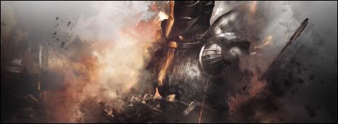
Okay, a better version of this may appear later. I had originally planned to only half-complete this, as it's one of two sigs I'm making with Ollie. However, he hasn't responded to me :S so I decided to see how it would turn out if I completed it.

In short, this is all my own work. A different version may appear later, which will be a collab piece. (Looking forward to seeing that, actually! :D)

DemonSoulsCollab-1.jpg

I like what u done sooo far... looking pretty awesome.. the smudging looks amazing you did a great job on that
 
You have an amazing touch for smudging, I wish I was half as good with the stuff you smudge. The latest sig is another prime example of how badass it looks. Did you get to that point yourself, or did you use tutorials? :gasp:
 
Your style is interesting to me. I see multiple varieties. You got great smudging talent, and your hardcore usage of contrast really makes me fall in love with your work.

DemonSoulsCollab-1.jpg


This one right here is pretty sick. I think there could be a few more touches of brightness and contrast here and there, but still is quite good. Me likey very much. ^_^
 
You have an amazing touch for smudging, I wish I was half as good with the stuff you smudge. The latest sig is another prime example of how badass it looks. Did you get to that point yourself, or did you use tutorials? :gasp:
Thank youu! :) I got to that point myself! The lighting is actually the first attempt with the render set to 'lighten.' :)

A new sig with three variations...

I found a wallpaper of the group from FFXIII but ended up cutting out Lightning then re-placing her against the background so that she was in front of the nicest part of the scenery! Blending and various colour alterations followed, with some gradients, C4Ds, and distortions, some brushing, sharpening etc...

Lightningsig2.jpg


Lightningsig-1.jpg


Lightningsig3.jpg
 
Last edited:
Lightningsig-1.jpg


this one looks well win... it's amazing :grin:... the effects are just amazing and lightning is blended in just amazingly... and great choice not to use text :) just an awesome sig overall :grin:
 
Thank youu! :) I got to that point myself! The lighting is actually the first attempt with the render set to 'lighten.' :)

A new sig with three variations...

I found a wallpaper of the group from FFXIII but ended up cutting out Lightning then re-placing her against the background so that she was in front of the nicest part of the scenery! Blending and various colour alterations followed, with some gradients, C4Ds, and distortions, some brushing, sharpening etc...

Lightningsig2.jpg


Lightningsig-1.jpg


Lightningsig3.jpg

I think with the three versions, it would look pretty grand with Version 1's colors(so that Lightning isn't overtaken by the warm colors), and the effects of V3 so that it has a bit more depth to it.

Overall, I really like it, and the idea you're going for is great, it just needs some touching here and there. ;)
 
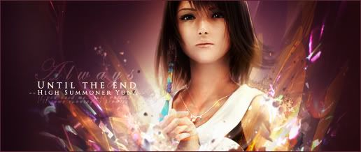
New sig! :)

YunaSig1copy.jpg


I wanted the tones to be pretty gentle, and then offset by more vibrant tones in the effects...


Edit:
And another!
Yunasig535copy.jpg


I'm very much in a FF mood atm! =) Should really make sigs for Auron, Lulu, Tidus, Khimari and Wakka! =)
 
Last edited:

This is perfect. I love how the lighting comes off from the subject, and the effects are amazing. It's so good, I can imagine it working even without the text. Nice depth and stock placement and I like the border as well. There's nothing lacking here. I love this. :gonk: <3
 

These are both gorgeous!

The first one is so soft and gentle looking. I love how bright and pretty it all is. Such pretty text and the pink half border goes lovely with it. <3

The second one is beautiful!

First of all it's a lovely image of Yuna and the vibrant light around her makes her stand out nicely.

Love the font used and how nicely the text is placed. <3

Lovely work!
 
YunaSig1copy.jpg


Oh nicely done here. I love it. the pastely background, flower-like effects, and just fucking awesome look. I do think the border could've been a lighter shade of magenta, but overall a nice tag. Good job on ya there. :ryan:
 
Your last two signatures are too gorgeous! Dx!!!
Omg! *touches them* They're so soft and so pretty; they're colorful without being terribly intense and that's the type of style I like the most. (Omg Gabe, we would have never know.)
The lighting is so well-placed and the text is just great. The text on the lighter one I think should be a tinny bit bigger but it still sits on it great.
*still touching the softness of the signatures*
....Don't mind me. >///>
 
Back
Top