Navigation
Install the app
How to install the app on iOS
Follow along with the video below to see how to install our site as a web app on your home screen.
Note: This feature may not be available in some browsers.
More options
You are using an out of date browser. It may not display this or other websites correctly.
You should upgrade or use an alternative browser.
You should upgrade or use an alternative browser.
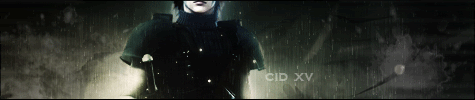
Cid's Newbie Graphics
- Thread starter C i d
- Start date
- Tagged users None


EDIT (November 2011): The first few pages of this thread consist of very old works that are not very good. Skip to the last few pages, or view the first post in the thread for my newer works.

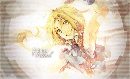
a new attempt by me, a Serah sig.
What do you think?
I need more opinions because I am still very new. I feel that all my works are mediocre for now
a new attempt by me, a Serah sig.
What do you think?
I need more opinions because I am still very new. I feel that all my works are mediocre for now
Last edited:
I like this one the most:

Looks good to me, broz.
Looks good to me, broz.
- Joined
- Feb 25, 2010
- Messages
- 3,732
- Age
- 32
- Location
- Southend, UK
- Gil
- 0
- FFXIV
- Yuno Mizuno
- FFXIV Server
- Lich
- Free Company
- Silver Lining
Like I said before your work is like proper awesome XD keep the good work up
Also... Posted this from a iPad in HMV XD
Also... Posted this from a iPad in HMV XD
Like I said before your work is like proper awesome XD keep the good work up
Also... Posted this from a iPad in HMV XD
Thanks
") I really appreciate that. But when did you 'say it before'
I really appreciate that. But when did you 'say it before'  I can't recall.
 And in case you got mistaken too, that Mog XIII-2 sig is NOT made by me.
I personally feel that I have very little talent in graphics. But what's most important to me about this is that I really enjoy the process of making each sig.
I just hope I can improve eventually.
Lol btw I'm posting this from my iPhone.
Lol so far you've not gotten very helpful feedback  I'm no GFXer but I'm hoping I'm able to give you some ideas on how to improve.
Have you been checking out the tutorial sections of this site? I had a rummage and there are a lot of helpful threads you could use. Also lots of nice font packages etc for you to download! Have a looksie!
You seem to wash the colour out of your sigs too. They're very dull and lifeless (sorry to say) perhaps try to make them a little more vibrant? Less blurry and have the focus on the pictures used rather than having the pictures blurred into the background.
Like I said I'm no expert haha you're better than me at gfxing") you're new and you'll improve! Keep it up mate!
you're new and you'll improve! Keep it up mate!
I'm no GFXer but I'm hoping I'm able to give you some ideas on how to improve.Have you been checking out the tutorial sections of this site? I had a rummage and there are a lot of helpful threads you could use. Also lots of nice font packages etc for you to download! Have a looksie!
You seem to wash the colour out of your sigs too. They're very dull and lifeless (sorry to say) perhaps try to make them a little more vibrant? Less blurry and have the focus on the pictures used rather than having the pictures blurred into the background.
Like I said I'm no expert haha you're better than me at gfxing
you're new and you'll improve! Keep it up mate!Lol so far you've not gotten very helpful feedback
Have you been checking out the tutorial sections of this site? I had a rummage and there are a lot of helpful threads you could use. Also lots of nice font packages etc for you to download! Have a looksie!
You seem to wash the colour out of your sigs too. They're very dull and lifeless (sorry to say) perhaps try to make them a little more vibrant? Less blurry and have the focus on the pictures used rather than having the pictures blurred into the background.
Like I said I'm no expert haha you're better than me at gfxing
wow thanks
This is what I need.Nah I am sure if you try you will be better than me in no time.
Okay I will check the tutorial section.
Yea I realise I always made sigs that are dull. The characters are rather in the background. Hmm... I will see what I can learn and improve upon this aspect.
thanks again.
Just a small bit of advice: Try and keep one focus in your sig. You don't want anything else distracting from the render. Your Vivi sig is nice, but there's a lot going on on the opposite side of Vivi, so that could be cleaned up a bit  For the Serah sig, it's reaallly blurry
  I can't really read the text and I feel it could be a bit bigger (and possibly sharper) And it could just be my monitor, but some of them could use a bit dimmer lighting and maybe less of it. That's all I can think of right now
For the Serah sig, it's reaallly blurry I can't really read the text and I feel it could be a bit bigger (and possibly sharper) And it could just be my monitor, but some of them could use a bit dimmer lighting and maybe less of it. That's all I can think of right now Just a small bit of advice: Try and keep one focus in your sig. You don't want anything else distracting from the render. Your Vivi sig is nice, but there's a lot going on on the opposite side of Vivi, so that could be cleaned up a bit
thanks man =)
yeah. that's what I felt about my vivi sig too.
The Serah sig was small because I meant it to be used in another forum where the sigs are required to be short in length
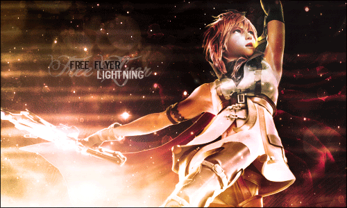
But I agree it's blurry. I wanted the text to be part of the background, but I guess it failed.anyway, I attempted this just earlier:

how's this one?
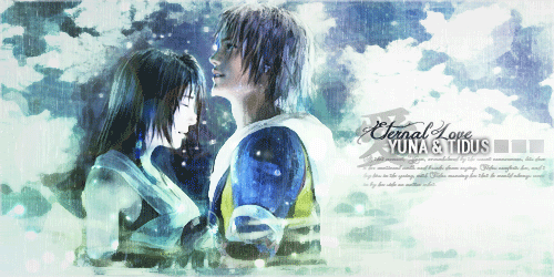
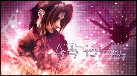
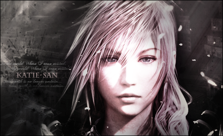
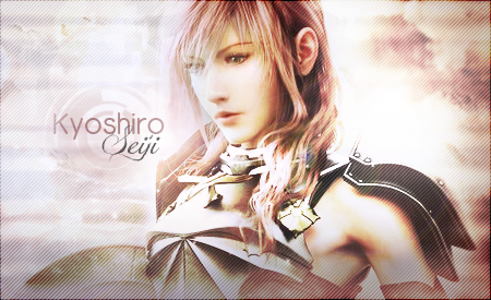
It's not bad, but move the text closer to around her eye level. Corner text is bad from how I learned, and it distracts from the focal point. Question: What file extension are you saving/uploading them as? That can effect the image quality if they're .jpg instead of .png.
Edit: Just checked the Lightning sig. It's .jpg. Not sure if tinypic did that or if you saved it that way
Edit: Just checked the Lightning sig. It's .jpg. Not sure if tinypic did that or if you saved it that way
Your works so far aren't bad, they are pretty good, actually.
I'm no GFX'er like a lot of the people here on the forum...but I do know that I like what pops to the eye. Not necessarily overly done bright colors and etc...but from what I've seen of your work, a lot of it blends really well together which makes it seem just a little on the plainer side...to me anyways.
Subtle effects, boarders, and a focus in a sig help a bit too.
Like I said, you are doing well...just a few tweaks here and there


Saving your signatures as .pngs first would be my first advice, as Draklor said. It's a larger file, but the image quality improvement will certainly be noticeable, as one glance at your sigs here told me that you saved them as jpegs.
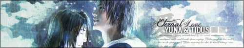
Your Lightning sig definitely shows a noticeable improvement, though be careful with the blur tool as the front of her hair looks overly blurred. As I said before with blending, some gentle smudging often works really well for me, so give that a try. Experiment a bit with borders as well for that finishing effect.
Experimenting with depth may also be something you want to consider - see what you can do to make certain effects and renders pop out. If you're feeling brave, you may want to see whether you can incorporate some C4Ds into the pieces (seeing tutorials would be advisable to begin with). Just err, don't ask me about C4Ds. I've not properly bothered to learn how to use them to great effect and all I've done is make a mess whenever I use them. xD
I'm not actually much of a proficient GFXer in general (as I don't actually even touch Photoshop or broaden my own horizons that much anymore), so my advice is probably extremely basic or perhaps even inadvisable here or there, so uhh, well, at least I gave it a shot.
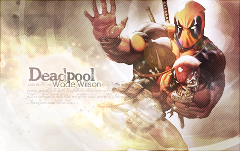
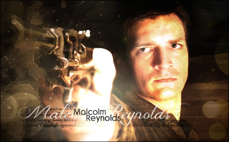
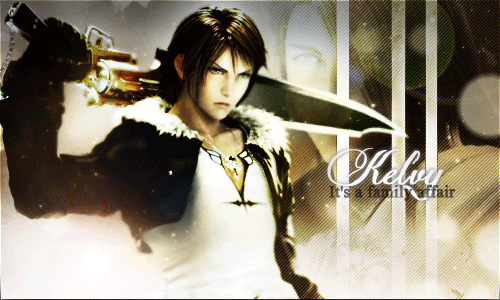
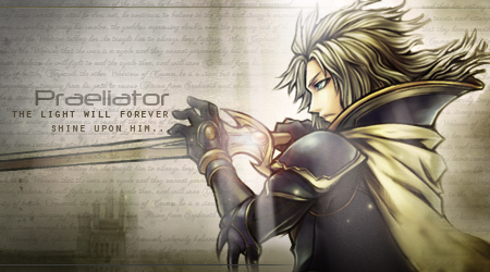
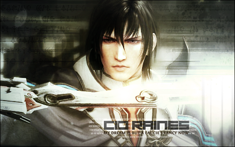
Not a bad attempt actually as the text is nicely positioned. The render on the left though, looks like a bad quality image otherwise I would recommend sharpening it at the very least so he doesn't look as blurry as he does. The blending of the render into the background can also be improved with some soft smudging for example, and the additional Caius from the logo on the right doesn't seem needed in that it takes focus away from the main focal point of the signature.
The Caius signature was a failed attempt
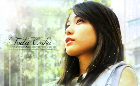
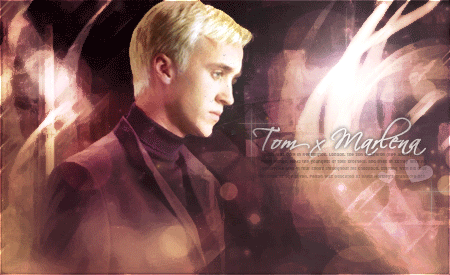
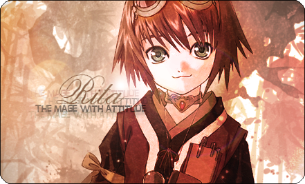
Quite good actually as it's getting there. Again, this could really do with being saved as a png file. For the text, it's probably just me being fussy here, but I'm not a fan of text being by the lower corners of a sig. Try moving it and "Viola" up towards the centre left and see what you get.
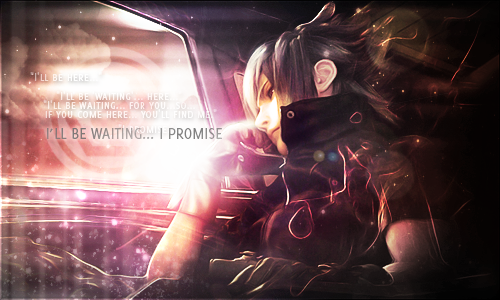
Sig for Summoner Amaterasu
I really like this one. Once again, I don't think the "Vivi" on the lower right is needed. As for the text in the middle, it distracts from the focal point as Draklor has mentioned already. This sort of applies to the left hand side of the sig as well.
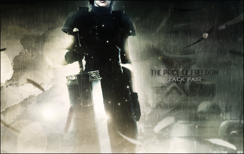
my current sig
Not too bad either. It's certainly eye-catching. I'm not too fond of the text positioning once again, or the choice of font to be honest, though someone else may disagree with me on this. The flow may I add, is nice and constant.
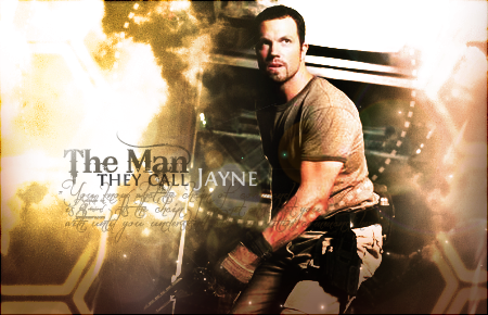
first try on real life pictures
Yeah, it's too blurry. It's a simple case of sharpening and perhaps an increase in the contrast. While you wouldn't want text to be too dominating and distracting, you wouldn't want it to be illegible and washed like that either.
Your Lightning sig definitely shows a noticeable improvement, though be careful with the blur tool as the front of her hair looks overly blurred. As I said before with blending, some gentle smudging often works really well for me, so give that a try. Experiment a bit with borders as well for that finishing effect.
Experimenting with depth may also be something you want to consider - see what you can do to make certain effects and renders pop out. If you're feeling brave, you may want to see whether you can incorporate some C4Ds into the pieces (seeing tutorials would be advisable to begin with). Just err, don't ask me about C4Ds. I've not properly bothered to learn how to use them to great effect and all I've done is make a mess whenever I use them. xD
I'm not actually much of a proficient GFXer in general (as I don't actually even touch Photoshop or broaden my own horizons that much anymore), so my advice is probably extremely basic or perhaps even inadvisable here or there, so uhh, well, at least I gave it a shot.
- Joined
- Feb 25, 2010
- Messages
- 3,732
- Age
- 32
- Location
- Southend, UK
- Gil
- 0
- FFXIV
- Yuno Mizuno
- FFXIV Server
- Lich
- Free Company
- Silver Lining
sorry for the crazy post before  i'll do a real helpful one XD
got to say this is your best one by far ... vivi blended in quiet well looks like ur using gradients very well your text choice is pretty good as well, but a few bits of advice, firstly ur renders can be blended in a bit to well.. on a few of your sigs, you can't really see the render because it blended in to well also u need to put ur render nearer to the center of the signature, putting them right on the left can cause alot of empty space on the other side, finally on a few i think the signature needed to be bigger, but for a beginner ur doing really well... can't wait to see your next update
one more tip.. like others said u really need to save ur images in PNG, much better quality XD
i'll do a real helpful one XD
got to say this is your best one by far ... vivi blended in quiet well looks like ur using gradients very well
your text choice is pretty good as well, but a few bits of advice, firstly ur renders can be blended in a bit to well.. on a few of your sigs, you can't really see the render because it blended in to well also u need to put ur render nearer to the center of the signature, putting them right on the left can cause alot of empty space on the other side, finally on a few i think the signature needed to be bigger, but for a beginner ur doing really well... can't wait to see your next update one more tip.. like others said u really need to save ur images in PNG, much better quality XD
Draklor
Stella Nox Fleuret
Lady Meyneth
Stevie Wonder
Thanks so much guys
That's really helpful. Really appreciate your opinions and advice.
I never knew PNG files are better lol. Okay I will do that.
so, I like to make lists so I can remember advice and stuff:
-save as PNG file
-avoid corner text
-borders
-don't blend way too much
-don't make text too blurry nor distracting
-don't distract the focal point
-smudging
-C4Ds
-put render nearer to the center
EDIT:
-I did try saving in PNG, but when I uploaded to tinypic, the extension in the url is changed to jpg. Does that affect quality? Or should I use other hosts?
Last edited:
- Joined
- Feb 25, 2010
- Messages
- 3,732
- Age
- 32
- Location
- Southend, UK
- Gil
- 0
- FFXIV
- Yuno Mizuno
- FFXIV Server
- Lich
- Free Company
- Silver Lining
Draklor
Stella Nox Fleuret
Lady Meyneth
Stevie Wonder
Thanks so much guys
That's really helpful. Really appreciate your opinions and advice.
I never knew PNG files are better lol. Okay I will do that.
so, I like to make lists so I can remember advice and stuff:
-save as PNG file
-avoid corner text
-borders
-don't blend way too much
-don't make text too blurry nor distracting
-don't distract the focal point
-smudging
-C4Ds
-put render nearer to signature
EDIT:
-I did try saving in PNG, but when I uploaded to tinypic, the extension in the url is changed to jpg. Does that affect quality? Or should I use other hosts?
the to much blending can be solved.. are u using graidents.. if soo just turn the opatiy level down a bit..
on tinypic i never used it.. I use photobucket and i never had a problem, i even get unlimited space XD
- Joined
- Feb 25, 2010
- Messages
- 3,732
- Age
- 32
- Location
- Southend, UK
- Gil
- 0
- FFXIV
- Yuno Mizuno
- FFXIV Server
- Lich
- Free Company
- Silver Lining
Thanks. Yeah I used the gradient tool quite a lot. I did control the opacity though.
I think I will try photobucket later.
I dn then... but it not really a problem it more what i prefer.. but ur vivi and lightning ones are awesome.. the renders just need moving more to the center.. that my one and only concern XD
I dn then... but it not really a problem it more what i prefer.. but ur vivi and lightning ones are awesome.. the renders just need moving more to the center.. that my one and only concern XD
thanks
yeah will do that for future works
And even though I said your sigs could have have more variety, I admit it's kind of hard to try on different things without failing XD
- Joined
- Feb 25, 2010
- Messages
- 3,732
- Age
- 32
- Location
- Southend, UK
- Gil
- 0
- FFXIV
- Yuno Mizuno
- FFXIV Server
- Lich
- Free Company
- Silver Lining
thanks
yeah will do that for future works
And even though I said your sigs could have have more variety, I admit it's kind of hard to try on different things without failing XD
loool no ur right i use the same effects every time it something i have noticed and i need to get out off