Alak's FF Portfolio

Alak

Blue Mage
Joined
Mar 29, 2010
Messages
224
Location
USA
Gil
0
I've done a couple of Final Fantasy sigs since I started using photoshop in 2003. I haven't done anything recently besides a wallpaper, but maybe I'll be inspired to try something new. Here's what I've made in chronological order since 7 years ago. Hopefully, you guys can notice the improvement lol:

Old Stuff

DeathsSiggy2.jpg

FF-XSiggy.jpg

Alakdilion.jpg

AdvancedCloudSiggy.jpg

SOTW2.jpg

FinalFantasyXIIstretch.jpg

CloudStrifeSiggy.jpg

CloudSig.jpg

CloudStrifeSiggy2.jpg


Somewhat Recent Stuff

FinalFantasyXII2.jpg

FinalFantasyVIIISiggy.jpg

CloudStrifeSpriteSiggy.jpg

PaineSiggy.jpg

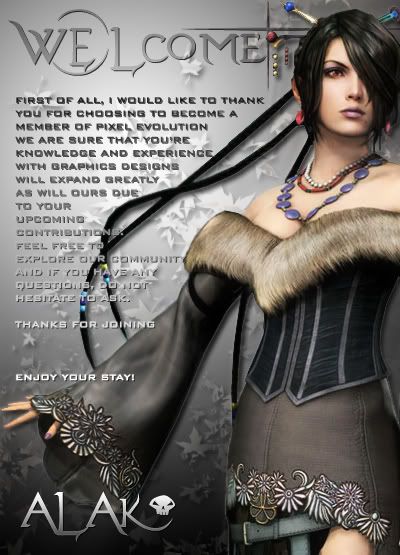
EvolvedWelcomePoster.jpg

AdventChildrensig.jpg

CrisisCoreSig.jpg


That last signature was made back in 2008. Unfortunately, I haven't done anything related to Final Fantasy until today when I made this wallpaper:

http://alakdilion.deviantart.com/art/Final-Fantasy-VII-Wallpaper-158764777

My DeviantART page has most of my recent works but nothing FF-related. I should probably change that lol.
 
Ooh, the Payne one is sexy. :jess: Purple, ftw.

I also like the Squall one and the Sephiroth one. I love the colors in the Sephy one. Nice work overall and the wallpaper is well done as well. You've got talent. You should keep it up. xD
 
Thanks! I'm really tempted to do a Cloud signature since I haven't really done him justice in the past 7 years. I also want to do Garland because I felt pretty attached to him in Dissidia.
 
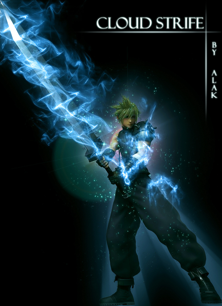
Cloud Limit Break

Here's something I made tonight which eventually became my signature:


CloudStrifePoster.png
d1yt0i4
 
Huh. I really love the cross design you made under the text. Looks reall nice.

The swirls around Cloud's sword are gorgeous! Really 'adrenaline-wave' like looking. Although I think a background would've worked better, this mysterious 'black hole' he's in right now, works rather nicely too. I think it would be better with a subtle, and dark background though, to make it feel less random.

xD I really love those blue swirls... They flow around his sword and arms nicely, making it almost look like it was from the original picture. :8F: Though, I'm assuming you did this yourself.
 
That is sexy. I love that effect around the sword. Looks like Blade Beam :hmmm:

I love the omnous background he is in and the focal looks very good. The text effect was a very good add-in and it makes the overall piece look great.

I love it :x3:
 
Great man! oww, Cloud :P
I love the effects!
Nice, i want Tidus's Limit Break!! Could you make one, please? :)
 
Yeah, sorry about the lack of background guys. lol it was the result of lack of creativity.

Great man! oww, Cloud :P
I love the effects!
Nice, i want Tidus's Limit Break!! Could you make one, please? :)

Sure, I'm willing to try it out. I'll have to surf the internet for some renders, first.


***EDIT***

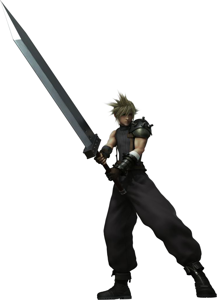
Here's the original Cloud render, in case anyone wants to know where I found that image:


Cloud_Dissidia_CG_render.png
 
Wow! That would make a kick ass banner!!! It's so sick looking.

Can I use it? I just love how you made those swirl-things around him. Bloody brilliant, mate. Bloody Brilliant.
 
Definitely go ahead and use it. It's available to anyone who likes Final Fantasy lol. Just don't forget to give credit.
 
looks great man, the sword effect looks real cool and it fits with the background color. it really focus on cloud. overall it's a cool picture real great work :D
 
I love the Paine one also! Looks really cool, and the colours are gorgeous!

I like how you have a logo for your name, but I feel that sometimes it takes over a bit too much of the signature. Maybe make it a water mark, or something smaller? Your signatures are really cool looking.

I especially like the Paine, and last Sephiroth one. The wings in the background look creepy! o.o
 
Awesome, so seeing it's a render you did do literally everything yourself! :D

Props for that, I'd have a hard time with positioning the stuff on there. xD I should go practice in Photoshop some more... :hmmm:

Really inspiring. :D
 
Thanks! I definitely know what you mean about the name/logo being distracting. I started reducing the opacity or just flat out not including it in recent works(see current sig). As for the Sephiroth sig, it's actually Cloud + Sephiroth. The left half is Cloud and the right half is Sephiroth:

gradventchildren.png
 
  • Like
Reactions: Six
OH WOAH!

I didn't even catch that O.O That's cool! Major props to that, dude!

Great graphics once again.

+ rep.
 
Yea, that last one is amazingly well done!

And my fav one is the Paine sig. It's beautiful!
 
Yea, did you use brushes or something? Cuz, it's so good xD

I wish I could do stuff like that, C:
 
I used Jashin's Fractals brushes, the eraser (very important for shaping brushes), lense flare, radial blur, filters, and some night sky brush set that a friend gave me years ago.
 
well that has inspired me to have a crack at a nice banner, that means you are officially inspirational. lol
 
Back
Top