Favourite GFX Design by other artists

Six

𝗦𝗼𝗹𝗶𝘁𝘂𝗱𝗲 *★.• ·
Staff member
Admin Support
Social Media Team
Veteran
Joined
Mar 24, 2009
Messages
11,758
Location
Saturn.
Gil
1,913
Revamping this oldie, too. Everyone has them, favourite artists, favourite GFX design styles, favourite signatures etc, let’s see some that inspire you.

The design does not have to be from our website but just make sure to credit the author if you know who made the piece, or include a link to their DA, if you found the image on google, just say so.

You can also post your own work, believe it or not some of us are really proud of the work we create, nothing wrong with posting your own piece that inspires you to this day.


----

I'd like a bit to collect some of my favourites, so I'll post here again soon. =] What are some of your favourites?
 
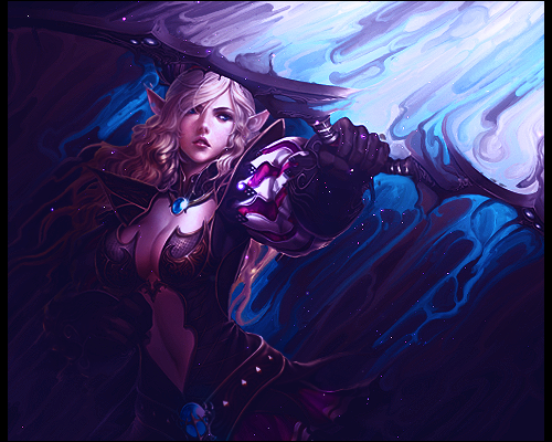
angelicminajgift_by_kippyy-d6xages.png


I adore the focal point placement, the purple colors are so dreamy and reminds me of space. i love the depth in the signature, the way they pull the viewer in is so talented. the c4d and clipping mask they used is just righty. this is actually one of my favorite signatures i've ever seen. it's what i look at when i want to get inspired to create.

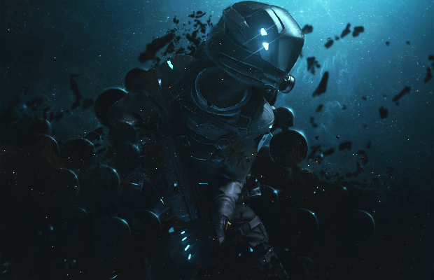
space_man_by_joshuadesigns-d61zbzf.png

this one is absolutely the wildest signature i've ever seen. the depth is by far the best used depth i've ever seen. the spacey black orbs give off this negative dark matter-vibe while the blue background sprinkled with the dust gives off this vision that he's in a nebula. this is another signature i gaze at when i feel like being inspired and insanely jealous :lew:

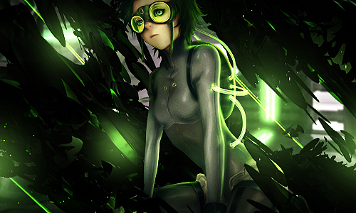
conform_by_divinesaga-d783jgr.png


i love the use of c4ds in this one, the way they're all around her but not taking the attention is excellent work. the green light sources are spot on, and to this day it astonishes me that anyone can make light sources like this look so natural. the green and black is my favorite part, though. they're two of my favorite colors.
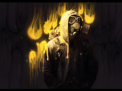
gas_mask_by_jeniality-d6hakf0.png

im not sure how i could explain why i like this piece but i just enjoy how he's in the gas mask and the coloring in the background looks like something toxic dripping on to him. very talented.

as_if_by_jeniality-d7m8pv9.png

the smudging on this is so beautiful. i love love love the blues/purples combination used. it's a little flat but the lighting is so ace it doesn't really matter

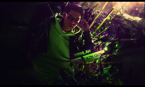
azn_guy_by_wishlah-d84mdum.png


UGHHH :gonk: the stock placement and the way the vectors are wrapped around his body is fantastic. the font, though, is my favorite part. i love how it looks almost 3d and so shiney. the light source in the top right corner is also worthy of mentioning. it looks very natural.
anyway, these are my favorite sigs and my favorite artists. right click the images and you'll see the artists name from dA ^_^
 
Most of those are artists from GFXResource. :lew: Sometimes they add in their smudging, and I really don't care for that, but those signatures are stunning. Kippy and Wishlah have a lot of stuff I like on DA as well.
 
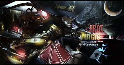
cards_magic_by_rodthesecond-d5vntdk.png

This signature banner by RodTheSecond is a definite favourite of mine. I love how well he has incorporated every element and his effects are spot on. I find a lot with these kind of graphics that often times the effects and C4Ds are a little over the top and end up cluttering the piece, but the artist here has shown a lot of consideration for his composition and use of space. What stands out to me in particular though is the lighting, not only is it well placed and realised but he's subtle about it. I like it that he hasn't just placed these patches of colour with a soft brush, and called it a job well done. He has layered the colours, faded them out and made them look like the way lighting should, none of this intense random colours dropped in and left like some sort of mad tie-dye experiment.
 
RKJQc5x.png


Something about this piece really caught my eye. Some may say it looks messy but I just think it's extremely well blended. I love the text used, and even though a piece without text was provided this was definitely my favourite. Gorgeous lighting.


ECS.png


HK4-1.png


EX.png


Colours! That circle in the middle. :gonk: The piece is so intriguing. Definitely one of my favourites.
 
One of my favorites is actually an artist that I know personally; we met over at Fanfiction.net, in the Azumanga Daioh section. On deviantArt, he currently goes by mhazaru His stuff is inspiring and beautiful (plus, he's helped me with my own art to an un-quantifiable degree... he's very helpful and very generous). Two of my favorite pieces by him are:

http://mhazaru.deviantart.com/art/kitchen-482751397

http://mhazaru.deviantart.com/art/mother-385594653

Seriously, that second piece is one that I think would make an amazing summon for the Final Fantasy series, lol. Reminds me a bit of Diabolos.

Lol, I agree on the second one. Artist did a great job there.

I really love stuff like this too: http://skmoon.deviantart.com/art/Tiger-351936709 though I'm more into the signature / avatar scene. :D
 
Back
Top