Front Covers of Final Fantasy Games

strifehart

Blue Mage
Joined
Jun 26, 2008
Messages
232
Gil
0
Ok, so this has been kinda buggin me for a while, and I apologize if it's already on a different thread or something.

But, I've noticed that some of the front covers of final fantasy games don't really fit the games themselves. They depict characters that don't necessarily appear in the game as much as others, or aren't as central to the plot. Here's my analysis of each one. Post your thoughts.

FFI:
moz-screenshot-2.png
FF1_USA_boxart.jpg

Generic RPG fare. Ick. OK, so its the first one in the series. You have been forgiven.

FFII & FFIII: Ok, so I couldn't find a release version of this game that I thought was really representative of these games. I'm trying to avoid using re-releases for this initial post. If someone else want's to do these two, feel free (either originals or re-releases)

FFIV:
Japanese Version
Ff4ebox.jpg

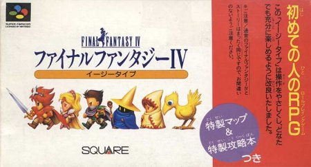
The japanese cover is pretty straightforward. Basically have what looks like Cecil (with red hair? where's his flowing silvery hair), followed by Rosa, Edge the ninja (in green for some reason?), and a random black mage, white mage and chocobo (NONE of which play a significant role in the story). Where's Palom, Porom, Tellah, Golbez, Yang, Edward? WHERE'S KAIN?!?! The coolest, and arguably the second most influential character in the story? Bogus.

NA Version: Super boring. Not gonna post it here, look it up if you want, no art whatsoever, just red background with "Final Fantasy II" printed on it (remember it was renamed for the states...)

FFV:
Final_Fantasy_V_Box_JAP.jpg

Classic. Simple. Bartz and Boko, looking out over a cliff. Maybe it could have incorporated crystals or dragons or exdeath, but overall, I think this is really good.

FFVI:
Japanese Version
242px-Ff6jbox.gif

Really cool. Terra, main character, on a mech, an important part of the game (in the beginning anyways), next to some weird steampunk city. Very appropriate to the theme and style of the game. No real arguments here. Maybe could have included Locke (the leading man IMO) and Kefka (one of the most iconic and unique villains up to that point in the series).

NA version:
160px-Ff3usbox.gif

OK, this is what I'm talking about. A dragon type shadowy purple shape (no relevance to the story) with a random sword as the T in Fantasy. The feature of the cover art? On one of the many characters, Mog. Although a staple of the series, not a significant part of the story at all. At least, not as much as Terra.

FFVII:
438px-Ffvii_usbox.jpg

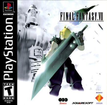
Awesome. Main character. Two of the biggest plot devices (Shinra and Meteor). Lacking: Sephiroth. Once again, shouldn't villains be represented? They are pretty big parts of these games.

FFVIII:
401px-Final_Fantasy_8_ntsc-front.jpg

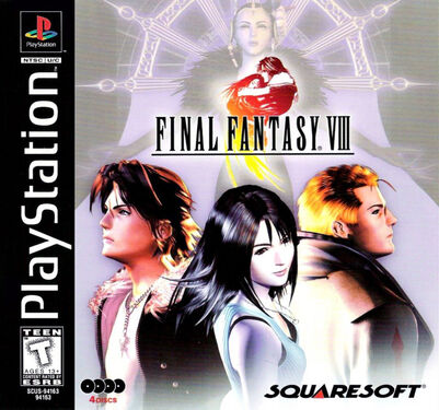
OK great. You've included the villain. I couldn't be happier. Plus you've included the main protagonist, his love interest (double points since the love story is the main focus of the plot) but you've also included Seifer. WHY?! He plays a minor role at the beginning of the game and then shows up later but completely drops out after your fight with Adel. I don't think he plays a big enough part to be on the cover.

FFIX:
439px-Ix_usfront.jpg

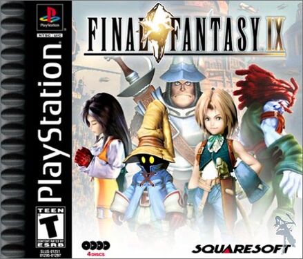
Cool. Finally a cover with an entire cast on the front...but wait. You forgot some people. Where's Freya? Quina? Eiko? Were they not important enough to make the cover? How do you make that call? I bet their agents were pissed.

FFX:
265px-X_usfront.jpg

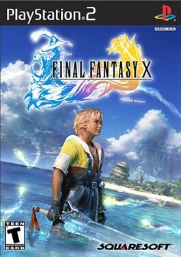
I like it. Simple. Shows the environment, and the main protagonist. It could use the love interest (as the love story is a huge plot device). Maybe some hint at Sin? But he's not a typical villain. Its probably best he isn't on the cover.

FFXI: skipping it.

FFXII:
263px-XII_NAfront.jpg

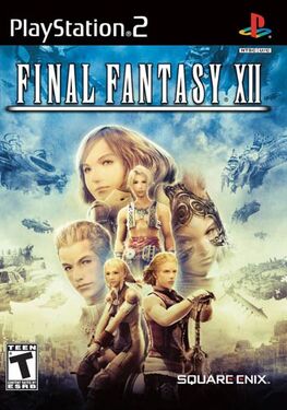
Another full cast photo. Very cool. Like how they're arranged too. How do you decide who gets a mug shot and who gets a full body shot though? Probably want Ashe over Basch, but who's to say that - all the characters are soooo poor developed in this game, its tough to decide who's the main character. Background is kinda uninspired (airships), but fitting.

FFXIII and FFXIV: Haven't played either, so I'll refrain from commenting. Anyone else is more than welcome.

Thoughts overall? More covers to add?
moz-screenshot.png
moz-screenshot-1.png
 
I think when it comes to the cover of video games in general they're more focused on drawing people in best they can instead of representing the story very well. Some time their ideas work and some they don't. If they can both draw people in with the cover and represent the main focus of their game at the same time than major props to them.
 
I agree on some of the earlier game covers, although one could argue that the NA versions are made to be generic to appeal to wider, less informed audience maybe? :hmmm:

I disagree about your opinion on Seifer's inclusion in the FFVIII though. He is one of my fave characters in general so I'm not completely unbiased, but I thought he was a very important character in FFVIII, so his inclusion made sense. Also, there was a very vague love triangle thing going on between Squall, Rinoa and Seifer, so that may explain the trio in front of the mind controlled-Edea.

FFXIII's cover for Japan was just the game's logo, while the NA cover had Lightning. Nothing particularly spectacular, and a little misleading about Lightning being a main lead when she really wasn't, but it was simple so not much to really pic at in terms of cover art. Would've been nice to have something along the lines of the FFX cover. So far it's my fave FF cover ^^
 
I think a better person for FFVIII's cover (instead of Seifer) would have been Laguna or maybe Ellone. They played such key roles in the game, more so than Seifer, in my opinion.
 
The UK releases were different, and it's too early to post them all, but folk know.

VII - Meteor. Yeah, I didnt understand what it was when i first played, but it all made sense toward the end of the first disk, so yeah, it fit

VIII was just rinoa and squall, so...again...yeah

IX, though it was a crystal and it fit, I think a black mage or something else would have fit much better. I just wasn't feeling the crystal

VI. Magitek armour was it...?

minds drawing a blank at the earlier ones and they are so close to me as well. Ah well

Erm. X. yeah, Yuna dancing

XII. Judges, they played a massive part, othough an image of an occuria could have been interesting

XIII was just lightning. Although it did fit, it was a bit boring
 
There was a Final Fantasy X cover that had Tidus, Yuna and Auron on it. I thought that was the best cover for FFX personally.

jez.png


See? That's pretty neat.
 
Yeah, sorry bout that. I forgot that a lot of the people on this forum played the European releases. with FFVIII's european release, makes so much more sense without seifer. with that cover of FFX, do you guys really think Auron belongs on there? He even says in the game that it's "your story" or whatever, implying that it's Tidus' story. I get having Yuna on there. That makes sense to me. But Auron? I dunno. Maybe a summon/fayth would've been better?
 
I felt the European releases were nicer especially since every cover felt like part of the genre because the covers were minimalistic. I liked the installment specific logos and thought the majority of them were all the visual stimulus one would need before actually playing the game.

With regards to the idea that villains should be featured more prominantly on the case I'd disagree. The player is in the role of the protagonist and in any case I feel there shouldn't be so much emphasis on the character so much as the underlying themes in the stories.
 
We just have plain front covers with the logos here in the UK, bar FFXIII where they decided to go along with the rather lame North American cover and shrink the logo to one side while plastering Lightning right next to it, essentially breaking the PAL release tradition.

In my opinion, I prefer our plain covers. It doesn't mean I hate the NA covers though. The Tidus render for FFX and the cast ensemble for FFXII look really good, but I think the logos by themselves are more effective. The FFXII logo with Gabranth has to be one of my favourites and I would choose to have that over the FFXII NA cover. The rest of them - FFVII, FFVIII, FFIX particularly, don't quite appeal to me as much. The FFVI Japanese SNES cover is pretty nice though.
 
Only one I fancy commenting on is FFVII. If they put Sephiroth on the cover it'd make him the main thing you're fighting against - you're not. Shinra is the reason everything --EVERYTHING-- in VII happens. It's a game about Cloud and his ties to the company that's changed the world for years and years to come. It's a massive company and the central point of the game.

Sephiroth IS the main villain but only as a face. He's still a product of Shinra and, other than wanting to frollock with his tentacle mother, is completely driven by reasons caused by Shinra. So, the VII cover is perfect.
 
So I decided to take a look at these plain covers you redcoats have been talking about. I like em. Real classy. Besides, the logos for each installment kinda give you a taste of what the game may be about. I also like the continuity. Kinda gives the entire series an overarching connection. About the whole villain thing, I like how VIII does it. Faded and in the background. That's what I'm talking about, when I say incorporate the villains a bit.
 
Like others here, I'm from the UK so we didn't get most of those here (ours tended to have a white case with the logo on it), but I have to say that I can agree with you on some of those covers in that they either don't fit, or are probably not the best cover design possible. I'm glad I got the plain white cases as they look much neater and consistent.

With the early FF games I guess they just hadn't decided on a style at that point. Some of the cases provided there do not even have the proper FF logo (for whichever game) on it. I'm guessing that that is either because they didn't decide to use consistent logos at that point (I'm not sure when the FF1 logo with Warrior of Light was designed) or if that was purely for the NA releases, as they released FF1, FF4 and FF6 as 1, 2 and 3 and hence couldn't use the other logos.

The proper logos for all of the games work quite well, I think.
FFI - Warrior of Light = A standard representation of any character a player might decide to create.

FFII - The Emperor = The game's villain.

FFIII (I’ll leave this one out as I don’t know if the DS logo was the actual logo for the original, or if it even had one)

FFIV - Kain = A major character, and a designer favourite.

FFV - Wind Drake / Dragon = Dragons played a prominent role.

FFVI - Terra on Magitek armour = Terra, Magitek and Terra's previous servitude to the Gestahlian empire are important.

FFVII - Meteor = A major part of the plot.

FFVIII - Hug = Squall and Rinoa's love is a huge part of FFVIII.

FFIX - Crystal = The crystal which holds life together is crucial to the mythology of FFIX.

FFX - Yuna doing the sending dance = A very important dance for Yuna, a memorable scene in the game, and shows Yuna performing some of her duties as a summoner.

FFXI - Shows lots of people = A large cast shown so that anyone could see themselves in that crowd and believe that they are on the case of the game (same with FFXIV to a lesser degree)

FFXII - Judge Gabranth = A major character in the game, but also so that the person picking up the game can instantly recognise that this game is to be set in Ivalice (if they had played FFTA and been aware of Judges beforehand)

FFXIII –
Crystallised Cocoon
= A crucial moment in the game, and also the same shape as Serah’s pendant.


As for the covers themselves, and everything other than the logo... Some of them are bad choices, but they are not the worst choices. Most of them work as covers and would not look too out of place, but there are some pretty strange and odd decisions.

Some examples…
I’m really not sure how Amarant got on the FFIX case. As cool as he was, his role in the storyline was tiny in comparison to characters such as Eiko (who would have looked awesome on the case in Amarant’s place as a sort of mirror image of Garnet).

The FFIV case has surprised me too. It looks as if they tried hard to depict some of the characters, but then gave up with the rest. I believe that the Black Mage and White Mage probably are meant to be Palom and Porom, but they just failed at putting their sprites on the case. Cecil also looks like a generic FF1 fighter, so it is a very odd case considering that they at least put Rosa and Edge on there.

As for the first Final Fantasy… I think it was likely because the series was new. I think that some of the artwork for the game was of a similar style, as I recently saw a strange-looking image of the Prince of Elfheim from FF1.
PrinceOfElfheim.png

It looks really strange given the usual art styles of the Final Fantasy series. It makes FF look like D&D. My guess is simply that the game was very old and FF was very new at the time, and therefore none of it was defined at all. Alternatively the above may not be official artwork, but I'm not too sure as it does match that of the cover.

As for what is depicted on the FF1 cover provided in this thread… I think that is the Flying Fortress being shown inside Matoya’s crystal ball. It’s perhaps not the most fitting thing in the world but it still makes some sort of sense.

With regards to the FFVIII case, I can understand Seifer being on there. He wasn’t as important later on, but he was a good contrast for Squall and it looks good on the case to have them mirroring each other. I’m glad they chose Seifer and not Ultimecia, as Ultimecia would have been quite a bit of a spoiler as nothing is known about the character for the majority of the game.

I also slightly understand Mog on the case for FFVI / FFIII. I think Mog was used as a selling point for the game as he was used in some of the old TV advertisements (there is one with Mog holding auditions for monsters to take part in the game, and he zaps all of the monsters and shouts “NEXT!”… or something like that). He had a fairly limited role in FFVI, so people may complain about false advertisement, but still… Mog was seen as fairly important to the people who designed the case and the related advertisements, probably because moogles were starting to become iconic creatures for the FF series and FFVI did have the series’ first and only playable moogle (/s if you count the 10 moogles of Narshe) in a main title.

So all in all… Most cases fit, I would say, though perhaps not always in the best possible way for the people who have played the game all of the way through.
 
I actually liked the really plain covers for the NA FFIV and FFVI (here "II and III") :hmmm: They allude to an epic fantasy story without giving too much away--part of the fun is not knowing what's going to happen when you get into it. And the latter has a moogle, which is one of the overarching mascots of the series, and moogles actually play a somewhat significant part in a certain part of VI.

The cover for VII is really good too, it's visually appealing and is more symbolic than just showing the actual characters doing nothing, like in VIII and XII, whose covers I didn't care for as much :hmmm:

And the cover for IX is decent, it's colorful and eye-catching, though it is a bit disappointing that they only included a few characters. Actually, if they were going to omit anyone, it should've been Amarant, because IMO he seemed the least likely to
become a PC storywise, and I found myself unsurprised when he joined the party
because I'd already seen him on the box and in the intro credits. Which is fine for multiple playthroughs, but on the first run through it's not as much of a surprise, and I like to be surprised by who
joins my party
in games :/

X's cover I liked as well for its simplicity--knowing nothing about the game beforehand, the impression that I got from seeing a dude standing in the water with a sword by himself was, "Hmm, this game must have lots of interesting locations, and it must take you through a lot of complex things to have such a humble start" (I'd thought maybe it started in a beach location). So I did think that one was good as well.
 
Yeah, sorry bout that. I forgot that a lot of the people on this forum played the European releases. with FFVIII's european release, makes so much more sense without seifer. with that cover of FFX, do you guys really think Auron belongs on there? He even says in the game that it's "your story" or whatever, implying that it's Tidus' story. I get having Yuna on there. That makes sense to me. But Auron? I dunno. Maybe a summon/fayth would've been better?

Auron was Braska's guardian and is responsible for bringing Tidus to Spira which allowed all the events with Tidus' influence to take place. I'd say Auron has a right to be on the cover. Auron or Jecht really. So I'm not bothered at all with him being on the cover along with Tidus and Yuna.
 
I don't know about everyone else but I also prefer the American front covers to that of PAL. Although ours just have logo for that game which is equally as good.
 
Interesting picture Argor. Yeah it's clear that they really didn't know what they needed to advertise for the first game. Definitely has a D&D style feel. I didn't really consider the dynamic of mirror images. Like the mirror of Squall with Seifer. That makes a lot more sense now. Still feel like just Squall and Rinoa would've been great. Of course, at that point, you'd want to have them in an embrace, but that's exactly what the logo has. Gotta pick your battles. The mirror with Eiko and Garnet on the FFIX cover is awesome. I totally see that now.
 
I like the simplicity and the overarching theme of our PAL releases. The logos fit the games very well most of the time, are nice to look at, and don't clutter the cover with images.
I was very surprised to see a full render of Lightning on the PAL release of XIII, which meant that XIII broke yet another long FF tradition.
 
Back
Top