Justins' GFX

Ness

SHAZAM
Veteran
Joined
Aug 7, 2008
Messages
859
Age
37
Location
Virginia, USA
Gil
2
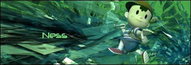
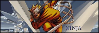
I've finally decided to try my hand at GFX. With a little help from a fine tutor (cheers Cassy :cassy:), I'm showcasing my first efforts. It's true what they say, this is addicting. =) I've turned out these first three tonight...
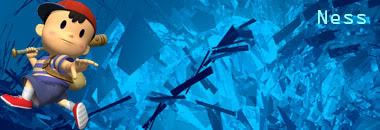
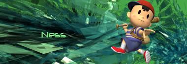
FirstSigNess.jpg

GreenSigNess.jpg

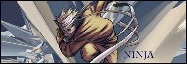
GreenSig2Ness.jpg

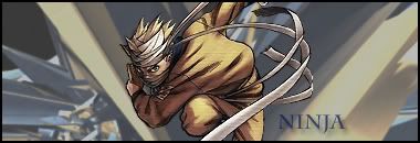
NinjaNaruto.jpg


Two and Three are naturally the same, just with a border and some changes to the render. Two is the rough draft, if you like.

Feedback would be appreciated, as this is my first day on the job, so to speak. I'll be updating this as I create more things. Thanks!
 
Yayyy. :D

Well, the last is definitely the best. The placement is all good but I know you can blend it all in a little better than that. :P

You've started off superbly, much better than I did. Well done. :monster:
 
After these, I'm taking a break so that I'm not dead at school tommorrow. =P

Here is the Ninja from above, with the render re-done:
Ninja2Naruto-1.jpg


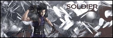
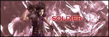
Also, one with Zack:
SoldierZack.jpg


I guess everyone is their own worst critic, but I'm not too thrilled with the last one, in particular I'm unhappy with the text. I dunno, something about it just bothers me. Let me know what you guys think. =)
 
Oh wow, I didn't expect you to get Photoshop this soon. :D But yes, quite addicing isn't it? I'm glad you got it! =]

Now then, you're doing very well for a beginner. You should take advantage of blending mode layers and experimenting with the colors using gradient maps and color balance. You'll find those on the very bottom-right. There should be a circle icon, click that and you'll have options to experiment there. Also, Filters work really good.

As for your placement, to get a better composition, try not to put the subject too far too the left, or too far to the right. Avoid making it centered though...just place it something in-between. (Near-centered, if you will). This is called "The Rule of Thirds". Lots of GFX artists follow that, but some prefer to keep their own style. It's up to you. =]

Your effects are pretty good and I see you've already got started on the use of C4D! You have an advantage to become extremely good at this, I'll tell ya' that. xD

As for your text, double-click the text palette and it'll bring up the blending options. You can mess with various effects, such as drop shadow, inner shadow, outer glow, inner glow, etc. But a tip: don't over do it. :D Sometimes simple texts work better with signatures. As for text placement, try to keep it somewhat near the subject. It's kinda awkward-looking to place it at the top where it almost touches the border or at the bottom. Again, near-centered is effective here. :D

Anyway, that's all for now. If you need any help we're around to give a helping hand. Hope to see more from you!
 
Thank you all for your comments, I'm trying to take your advice to heart!

Well, I've got a few more things for you. It seems that I'm using the same C4Ds and renders, it's because I am. For the time being, I've got a limited supply. I'm just using what I've got (over and over =P) to give me plenty of practice. I hope you don't mind. =)

Remastered Ninja:
NinjaNaruto3.jpg


Remastered Soldier:
SoldierZack2.jpg


These next four were a series I sort of got an idea for. I present for your viewing (and critiquing) pleasure, the Element Series!

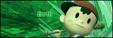
Earth:
EarthNess.jpg


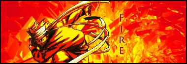
Fire:
FireNaruto.jpg


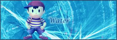
Water:
WaterNess.jpg


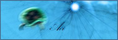
Air:
AirMetroid.jpg


I'm particularly proud of the Water one, but that's just my opinion. =) What do you think?
 
Already, you're getting even better. =] I like your water one yes, but I like the Air one more. Did you use motion blur on the subject? Kinda looks like it. It has a nice effect overall and seems somewhat of an abstract style. I really like the text you use as well.

The water tag is decent as well, and I can see where you've tried to make a water effect in the BG. My only suggestion is to be careful with your use of C4D. The one that Ness is stepping on is fine as it is, but the one in the right seems to be a little messy and overwhelming. Perhaps lower the opacity on it or erase here and there to make it more subtle-looking and won't take away the focus from the main subject.

Overall you're doing a great job. =]
 
Good, you're blending well, and you're putting those C4Ds to good use. I'm liking the borders also. =D

Nice job. :cassy:
 
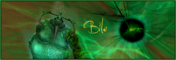
I did something new:

BileCuchi.png


I was going to try some slanted text, but it fell into place so grandly that I couldn't help myself. =P

Comments?
 
Last edited:
Appealing colour scheme, nice size, good use of effects and colour... it's definitely your best so far, definitely.

I see you did some smudging behind the render as well. Nice. :cassy:
 
Good mix there, buddy. Show us more of these renders! :neomon:

I just think the text stands out a little too much against the background. The background itself is blended well, though. Good job. :cassy:
 
Time for a long-awaited update...

Two previous SOTW entries:
no7bck.jpg


29prz49.jpg


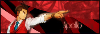
Here's one I did for myself when I was contemplating a name change:
SigApollo-1.png


One I made to let off some steam a few nights ago:
2lbjeqb.png


And another on a similar theme:
2h2ds08.png


With the Knuckles one I hate the text...but eh.

Can I please get some C&C (something more subtantial than "that looks great")? Not that those sorts of comments aren't appreciated, but I'd prefer more on the criticism side, so long as it's justified and constructive.

Thanks. :gasp:
 
Alrighty then. ^^

I like the color theme here. I generally like red/orange/yellow theme on my tags, if you can't tell already, but I think your color theme has that hard solid look to it, which you can fix by making them a bit softer. Try adding some Gaussian Blur to it but don't over do it. Just enough to get that subtle effect. I like how you have a creamy yellow behind the subject...now you just have to work on blending him in a little, just to make him have that glow surrounding him. Don't be afraid to erase some parts of the image as that's one way of blending him properly and just slowly taking your time with the effects.

As for the text...something as strong as discipline...I think that bolded letters work best. I view cursive more for elegant-style tags, so I don't use them too often. Overall though it's pretty good so keep it up. ^^

This one's fairly decent. Very cute and I like the simple design in the BG and the text is pretty good, I think. It's good to experiment with text in the beginning anyway and not just stick to plain ones. You're in the experimenting stages, so by all means, experiment away.

My only thing is that the effects are a little messy and quite random. But this is not too bad actually.

Now I like the outlook of this one. I see that you blurred him a little to kinda give that motion blur look. The background is quite appealing and different, and you seem to have more control of how you want to make your tags appear. Basically I see three layers put together and that's very nice to see. I especially love the text here. Simple but nice.

Pretty nice. A little too bright red though and the subject is kinda hard to see. Perhaps a very lighter shade of red be better, or maybe something white with some reddish tones here and there. The effects are quite nice and not too overwhelming, which is good. Text is unique, but I'm not too sure about the white outer glow to it.

Now this is quite different. Good job for taking a different approach when it comes to new styles. Now to make it better...I suggest making both sides (blue and red) clash together in the middle (or even better have some blue reach the red's side and vice versa) and not have that solid separation because then it looks to awkward. But perhaps something that slowly meshes them together as it reaches the middle and beyond would work.

I'm not too sure what to make of the text being in the middle like that since right there and there defines the solid separation of the tag, which is probably what you're aiming for anyway. So I guess that's fine, although I think it may be better if it's horizontally-placed instead somewhere near the bottom.

As for the effects...pretty decent. A little too sharp-looking but it still works. Maybe a C4D as a lighting source in the middle where it can touch both characters might be cool, but you'll have to experiment with that.

Anyway, that's all for my critiques. I hope I was able to help out a bit. =] You're doing a great job and it's nice to see someone asking for proper critiques. xD Keep it up and I hope to see some more from you!
 
:ness:

C&C, as usual. This is one of those project I started to get disillusioned with, but had to finish. =P

EDIT: I did four new sigs today...but I don't want to double post. >_>

Keep in mind, all of these were requests...yeah, just remember that. =P

2ahe6uw.png


:ness:

:ness:

:ness:
 
Last edited:
You're definitely improving, but you need to experiment more in quantity. :P

I suggest picking some render/effect and use it a bunch of times in one sig and try to get as close to being comfortable with it as you can. I'm sure somewhere along the line you'll feel brave enough to get creative and make great effects.

Also, tutorials, tutorials, tutorials. Obviously, you'd be wasting your time trying to read every single photoshop signature tutorial there is in the world of the internet, so what you should do is look at a signature (presumably by somebody else whose work you admire) and pick an effect you like and search for it on the internet. If you're not sure what it's called, PM the sig creator or ask us. Can't say we know everything though. :P
Good way to start branching out, methinks.


I see the fire theme. Don't like the colors though. Blue and red here don't seem to go well together. If you try to do something like this again in the future, maybe choose a different darker background or something or change the color of the stock by using an overlay layer or something. Also, you could try making the background really bright, or stick with this , and make it look like there's this bright light right behind it using Render > Lighting Effects.


I think this one is better. The colors seem to belong together. I like the transparent image on the right too. (Hint, hint: Use more of that stuff, that's looks really nice, but make it subtle like you did here :D).
Choose a better render though.


Yes, too much warm colors. Not too much contrast. Avoid it like the plague! :gasp:
If the guy in the middle wasn't too bright, it might've worked with good blending, but either way, it doesn't seem to be your style. I'm hoping you were experimenting with this one lol. :P

If you edited it to make it look this way, you could use this kind of effect in the future as a really bright background or a great smudging base.
See: tutorials on smudging. :D
Actually, I think it would look really nice all smudged.


Did you edit the ninja, 'cause that color scheme is really nice. Violet and red over the whole stock for some reason is really appealing to everyone. I say work on the background more though. Maybe something lighter to make the stock stand out more.
If you want to make it more complex, add more effects to it and/or add a light source.


Stock placement is good, but you could work a bit more on the color though. Maybe add a light source, darken some parts to highlight Vincent and Tifa. Otherwise the effects and other images are good to go. :monster:

Overall, you're improving. You should branch out a bit more and experiment with things you haven't quite looked at yet (I mean renders and effects). Plus, look at what other people did in their sigs and tags that you liked and try to emulate what you got from your observations. I'm sure it's how everyone learns.

I recommend you looking at:

- blending tutorials
- smudging tutorials

if you have any time. Can't remember the site though. >:(

Also, try and get more comfortable with lighting and using inner glow and outer glow and opacity (in layer options). You'll be amazed how you can get awesome results using those wisely. :D

EDIT: I need to read more. Completely skipped the requests part. :P
 

OH. :gasp: I really like this one. It feels complete and everything flows together well.


This one, yes. The best from that post, definitely. Although I would suggest using the Brightness/Contrast tool for it and it's good to go!

You're experimenting with the texts as well! Your works are definitely getting better. Kudos! Keep it up. :)


(*I would suggest you try that when you are making tags, do NOT lower the opacity of your focal, or if you must, let your limit be 80%. ;))
 
Look at that! -Whistles- Look at how much you've improved! =] I really love those sigs. The House one is very interesting to look at. I like the slightly blurred BG - not too much effects going on but they're very effective. It's so clean and smooth-looking.

As for the 2nd one, I like the color theme there. Interesting choice of render and you really managed to keep control of your effects. Nice depth and text - just absolutely fabulous. I can't really critique since I really don't know what I'd be looking for. :wacky: Great job, Ness!
 
Mercy me, haven't updated in ages. :wacky:

Callout against Bella Swan:
vo4ky0.png


Callout against Final Keyblade:
:ness:

Competition entry elsewhere:
:ness:

I think this was my last SOTW entry here in a while =\:
:ness:

Another competition entry elsewhere:
:ness:

Request sig:
:ness:
 
Last edited:

I really like this one. I'm a big fan of Akuma, he's a badass... generally I like badguys or goodguys that look like badguys. But the colors are nice, I like how its kinda orange washed, so you can still see his original colors but with a yellowish orange tint that matches the background colors.
 
Back
Top