My Bad Attempts At Sigs

Rockman X

Over 9000
Veteran
Joined
Jul 7, 2007
Messages
2,557
Location
On a boat.
Gil
0
I figure I might as well post my stuff. I've been using Macromedia Fireworks MX 2004, and I've only done a few.

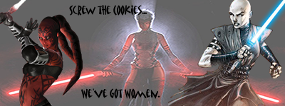
Recruitment siggy for the KotOR club, Darth Talon's (left) saber was an ass:
sithwiminz.png


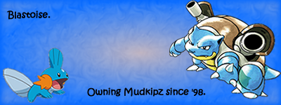
My current sig (and only one I'm completely satisfied with):
pokemans_sig.png


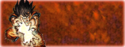
I've been working on a DBZ sig for the past hour, I've finally got it...decent, I guess. Goku just had his palms bared, but they were empty. I wanted to make it look like he was charging up an energy blast, and that proved to be a bitch.

Step 1 on the blast effect, done with bucket fill:
gokuUnfinished.png


Step 2, after I figured out I could change the brush textures, used air brush:
GokuSig2.png


Could be better, but I couldn't find the damn smudge tool and this seemed to work okay. The background just utterly fails. I can probably figure out something to do, but it's nearly 4 in the morning and my mind is asleep and my patience has worn a bit thin. I just wanted a flame effect to work with later on. May add text and use te thing if I ever get a decent background.

Critique if you want (except Shou, you aren't allowed to critique since your critiquing amounts to insults and you don't even make anything of your own), I fully realize I'm a n00b at this :wacky:
 
Well the stock is nice, but you need to work on the background more, try using images as backgrounds. Also you may not want to use more characters in one sig, no space for effects and text, as you can see in the SW sig, the text is just badly placed.

For first tries they're good, keep em comin :monster:

I couldn't find a background I liked for my Goku sig -__-; As for the SW sig...yeah, it does look a bit too cluttered.

Thanks though ^_^ I'm thinking of downloading photoshop since fireworks is pissing me off, what's the best one to get?
 
CS4 is the most efficient, I believe, but I'd recommend CS3. Also, when you're a beginner, you should start with icons/avatars first, because they are easier to make. I also suggest reading a lot of tutorials; they can be of great help.

Decent attempts, though. My first sig was far worse. XD
 
Awesome, thanks for the recommendation, I'll DL it later tonight ^_^

Ya know, I never even thought of making avatars...guess I could try that though. And to tutorials......meh, I'll probably have to, even though I'm lazy and really don't want to be arsed xD
 
The pokemon sig is the best, Blastoise rox your sox off.

You have good basis for backgrounds, maybe download some brushes off of deviantart and mess around with that to add some effect. Also download some C4D's, give good effect as well.

But good stuff mate.
 
Thanks for the compliment and tips ^_^

I did DL Photoshop CS3, but the site I get serials from is messing up so I'm waiting to install it until the site decides to behave >.>

I also made my current sig. Highly unprofessional, but based off a meme it doesn't really need to be :wacky:
 
If you download Photoshop CS3 from uTorrent then you can usually find some packages that come with working serial numbers, too, but it's really just the luck of the draw. The ones that allegedly do come with the numbers sometimes don't and the ones that actually do come never seem to work for me, or give me some kind of virus.

That's quite good for first attempts and, although I'm not much of an expert myself, I noticed that you made a border on the Goku sigs, which always just adds that extra 'zing' to the images. However, you might want to experiment with ways to make sure that he doesn't overlap the border, too. I find that adding a new layer and bringing it to the front, then bordering that layer, works well with that. Since it's at the front, nothing overlaps it and, since it's just blank, you're not messing up the creation. Unless, of course, you wanted to have him overlapping the border, in which case, dad on. xD
 
I was going to baleet this thread and start a new thread, but seeing as how it won't let me, I guess I'm stuck updating this. Anyhoo, just for the purpose of a recap, I'll chronicle my horrid progress at sigmaking.

First sig ever, horrid piece of crap, made with Macromedia Fireworks MX 2004:
bahamutsiggy.jpg


Second sig, made in Fireworks, also total crap:
zargabaathsig.jpg


Third sig, I do believe, also made with Fireworks. Not much better.
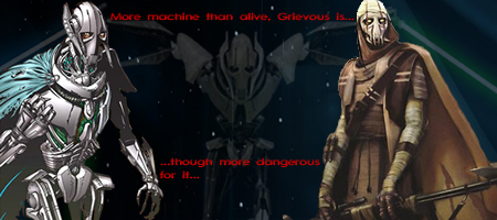
grievous_siggy.png


Fourth sig (or third, these two were around the same time), with Fireworks, for the KotOR club here, befoar I left it:
sithwiminz.png


Pokemon sig, made in Fireworks. Real simple and n00bish but I like it:
pokemans_sig.png


Incomplete DBZ sig with Fireworks, the background sucked and I intended to change it but never did, made the glow in the hands myself though:
GokuSig2.png


Then this, with Fireworks:
ziimsig2.png


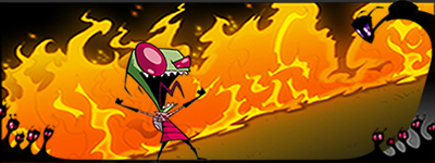
And very shortly after (the same day I think) I made this with Fireworks:
zimflames.png


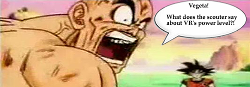
And then I made this for the lulz sometime later:
VRover9000.png


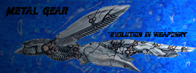
Then I made this in Photoshop CS3, which I am not proud of:
MetalGearRaysig.png


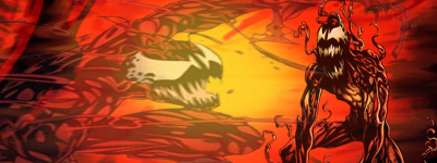
Then this in CS3, which is decent:
carnagesig.png


Then this recent one, which I was not happy with, I made in Fireworks because the CS3 trail ran out:
stormshadowSig2.png


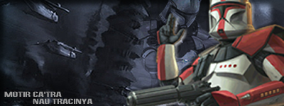
And finally, I just made this, used a combination of GIMP and Fireworks, I'm rather pleased with it:
ARCtroops1.png


All this has been in the course of about 6 months I think (6 to 9 at the most). So at least I'm slightly improving. And I'm getting much better at cleaning up edges around things with the eraser. My hand used to be real unsteady but now I've finally gotten used to it.
 
Aha! Thanks to your updates, I found your thread. xD

Like everybody said, it's not bad for a beginner. You should've seen mine. Horrible. >.> The ones you did for CS3 looks decent enough and slightly better than the older sigs, although I'm sure I don't need to tell you that it does need some more improving. ;)

If you can download cool brushes, I'm sure you'll have more fun toying around with the background effects and whatnot. C4D renders are also quite fun to mess with. Anyway, looking forward to some more of your work! Practice and you'll definitely get better.
 
Owai thank yew :neomon:

Yeah, I need to dl some brushes, I'll get around to it eventually. And wut be C4 renders? I tried a google for them but all I came across were normal renders like what you find on PlanetRenders and such.
 
They are looking really good VR, not that I know anything about it but well..... I really like your current sig & just wanted to say I like your stuff.

If that's what a beginner can do then you have the potential to be sig maker of epic greatness :neomon:
 
I tried a google for them but all I came across were normal renders like what you find on PlanetRenders and such.

Try DeviantART for C4Ds.

The last of your sigs is the best one. Just try to move your stock closer to the center and place your text by the focal point (near the stock, which is supposed to be the actual focal point). Also I recommend using gradients and flood-fill layers under different blending/coloring modes in order to make the colors match, if your program is capable (I think all are capable of blending/coloring modes).
 
Owai thank yew Bambi :elmo:

Okay, I'm browsing dA for C4Ds, they're actually backgrounds, I need to learn my terminology :wacky:

So then aside from those, center my pieces more and use blending and color modes? I think I can give that a shot.
 
Back
Top