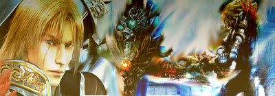
nOObish me. Art Thread

Dean Winchester

Keeping you alive by killing what's in the Dark...
Veteran
Joined
Oct 7, 2006
Messages
5,601
Location
The blazing paradise of the Caribbean
Gil
5
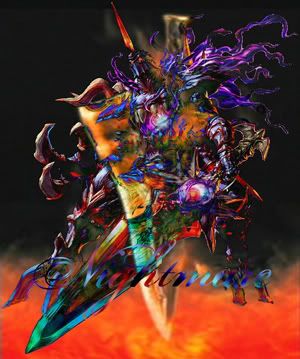
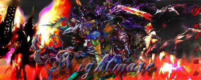
These are quite simple, honestly I just wanted something to look good without spending endless hours on it. (In fact I wanted something I could use in my sig an hour later after starting it.)

Here are they:
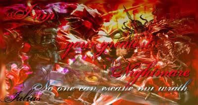
Nightmare-Signature.jpg


Nightmare-IV-2.jpg


What do you think?
 
I think they're pretty good.

I think you could have been a little more creative with the font though.
 
When transforming for size, the Shift button is your friend. ^_^ Resize pictures by holding down Shift while using the corner to change the size. The proportions will stay as the picture grows or shrinks.
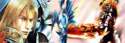
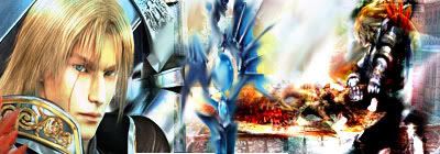
 
To be completely honest, I don't like either, the colors just hurt my eyes, you should try to make them softer... And the text placement in the first one is just blah... Better not to have any text, than that, or make them smaller and try different places.

Sorry, just trying to give you pointers on what to improve.
 
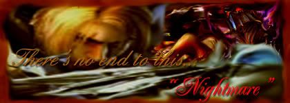
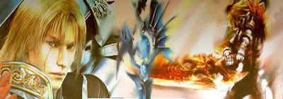
I made three versions of the sig that I will show up in this post. This time I have not used any text at all seeing that I can't find the correct one.

First Versions of Sig 1-
New-Signature-Project-Sig-1.jpg


New-Signature-Project--2.jpg


New-Signature-Project-3.jpg


Second Versions of Sig 1
New-Signature-Project-Sig-6.jpg


New-Signature-Project--5.jpg


New-Signature-Project-4.jpg


Now I can't decide which one should I use as my siggy :P

Edited: i fixed a small mistake on versions 2 and 5 :P
 
Last edited:
The third one of the first set is the best that you've made. All your first ones are not the worst I've seen but the elements you have on them don't blend well together and look very messy as a result. Try to have them blend in a bit more and sometimes having less at first is better until you learn to use PS effectively enough to incorporate more into them.
 
Back
Top