Photoshop Noob.

Daenerys

The Last Dragon
Veteran
Joined
Nov 26, 2006
Messages
11,178
Age
32
Location
Suburban hell.
Gil
1
So i downloaded photoshop a week ago...and i've turned into a sig making machine. srsly. but i have no clue how to work it...or what any of the technical terms mean...so ill post my better ones ^_^

this is the very first sig i was happy with

AGsigniture.jpg


i made this signiture at request of a friend

SigforShan.jpg


i made this for SE7

AvatarforAmanda.jpg


I made these for me ^_^

AGsingiture2.jpg


TickledPink.jpg


Edeasigniture.jpg


Thesimpsonsmovie.jpg


superfunhapytime.jpg


Angelscopy.jpg


CloudxAerith.jpg


NinaWilliams.jpg


Taki.jpg


Aerithroses.jpg


Clerithsig.jpg


And i made this for a SOTW contest at another forum

SOTWEntry2.jpg


these all all requests ive done too

Amandaavatar.gif


Sandsiblings.jpg


serersig3.jpg


Helenasig-1.jpg


Rydiasig.jpg


Dragonmagesig-1.jpg


Lisasig.jpg


And this one - i made 3 of the images. leki made 2 and Kain and warbourne made 1 each. i put it on slider.

Shanssig-1.gif


So thats all the work i've done so far ^_^ i really like photoshop and hope to get better at it :) so if anyone knows the links of any really Good tutorials or brush sites please tell me :lol:
 
Last edited by a moderator:
and you say your a noob... yet you've made so much XD
Noob means your "new" at something not crap at it :p
 
I've been observing your work for some time now Mark.... There are different brushes, y'know. Not just that one set you keep using. >.>

Bust out a crapload of brushes, use different ones, and have some fun. And remember, if you don't like it... Chances are, no one else will like it. And the more time you put into making something, the better it will be.
 
I'll just a throw a few tips in here :D

Your sigs don't have to be so 'big'. I know it's nice to have a bigger canvas to work on, and I did the same thing when I started out, but sometimes that can lead to problems with filling all the empty space.


Also, something I'd work on before even making the sig, is cutting out your stock. If you do want to completely remove the background from your desired stock, I'd start practicing with the 'Lasso' and 'Polygonal Lasso' tool, and when you feel up to it the 'Pen' tool. Stay away from the 'Magic Wand' xDD
 
Yes the magic wand is Evil. it keeps wanting to cut out pieces i want to stay in D:

i also needs some new brushes, i found one site where i thought id found the jackpot but all the brushes are rubbish D:

i Worked smaller with the Xenosaga one i made for Helena_Lou and...it nearly drove me insane XD but ill keep that in mind ^_^

There are tons of brushes on good old DeviantArt. I'd say grunge brushes work better than fractals for brushed backgrounds, so you might want to take a look at some sets.
 
i made this at...7am after no sleep :P

whydidyoudie.jpg


I think my major concern right now is my utter lack of brushes that are remotely decent - i only have a heart set and a Fractal set that i actually like. whilst all of the others are crap =/ so if anyone has any brush site links please please share them XD
 
You're not bad for just starting out man. Haha, better than I was anyways. But some tips.

1) You're overdoing the color. Its not pleasing to the eye. Think of it like clothes. Brighter and lots of color isnt always better. Try to see what looks together and feels right.

2) AV already said it, but its better to work with smaller sigs. You wont feel pressured into filling up empty space and people wont get frustrasted when you fill out a request and a forum prohibits them from using it cause of size issues. Plus, small is the hip nowadays.

3) Borders. When you just post up a sig without a border, it feels...wrong. It needs a frame so it doesn't feel like the picture is about to leak out of its structure. Easiest border is the stroke border. Pick the Select Tool(box maker) and right click inside the sig. Click "Select All". Right click again once that is done and go to stroke. I usually go with 1p Inside. Now you have a simple frame.

4) Whenever possible, use renders. Trust me, it makes your job much easier. All the cutting is already done for you and usually done well. I use planetrenders a lot if Im looking for images.

5) Fonts. Most people cant do text well. But it really can make the difference between a good sig and a bad sig so you better try your best. DaFont is a good place to DL fonts.

And thats all I can think of off the top of my head. I hope you keep it up man. I expect to see more from you! ^__^
 
:monster: warbourne gave me a ton of advice and i think it worked out well in these sigs -

Jean is Love

jeanislove.jpg


Sarah Jessica Parker

SJP2.jpg


Penelo

PENELO.jpg


Aerith

Aerithsiggy.jpg


Clerith

Clerithwhy.jpg


two requests

amandasig-1.jpg


sephyislove.jpg


and i got bored so i made a banner for shens club ^_^

Thedragonsinferno.jpg
 
I think the last one is the best from you so far. Lower the opacities of the background a bit, so that everything focuses on the stock, 'cause it seems that it doesn't stand as much as it should.
Either that or blur the background.
 
Don't call yourself a noob, man. You're better in making sigs than me. I don't even know how to uses the brushes properly. The SJP sig rocks!

Warbourne said:
I think the last one is the best from you so far. Lower the opacities of the background a bit, so that everything focuses on the stock, 'cause it seems that it doesn't stand as much as it should.
Either that or blur the background.
<!-- google_ad_section_end -->

True.
 
Don't call yourself a noob, man. You're better in making sigs than me. I don't even know how to uses the brushes properly. The SJP sig rocks!

XD compared to like...every other sig maker on this site i am a noob. but thanks for the compliment about the SJP sig, i wanted to make something simple but effective. so i used two brushes - smaller hearts and then the biggers hearts, and made them overlay each other - i thought it looked quite nice ^_^
 
The first and last 2 are way overcontrasted. Lighting is a bit odd on SJP and Penelo. I'd suggest trying to make the render the center of attention, rather than the text.
 
and you say your a noob... yet you've made so much XD
Noob means your "new" at something not crap at it :p
close..
a NEWB is a newbie. witch is new to something. and is acctually trying to bet getter.

A noob. or n00b. is an arsehole withch clearly doea NOT understand what s/he is talking about, but still makes him/herself sound like a god.
--------------------
you are quite talented.
you have one the small time you had PS. closed up to me. and I have had PS since v5.0.

keep up the good work
 
Lighting is a bit odd on SJP and Penelo. I'd suggest trying to make the render the center of attention, rather than the text.

I know the lighting is a bit weird =/ it was the first time i decided to mess around with the lighting effects, and Warbs suggested a flashlight effect on their faces.

Ill keep your advice in mind ^_^
 
Hmm, that's true...
Should've said this earlier, but maybe dim the lights a bit on the SJP one.
There's a bunch of bars/sliders in that window when you click lighting effects (or at least there should, I have no idea what CS2 looks like o,.,O) and just keep sliding until you get a dimmed look on it.

Furthermore, keep experimenting with the different combinations.
 
Loooong time since i messed around with photoshop...

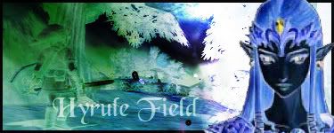
SorceressEdea7 asked me to make a simple avatar for her, which lead me to create this....

Amandaavatar-1.jpg


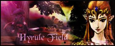
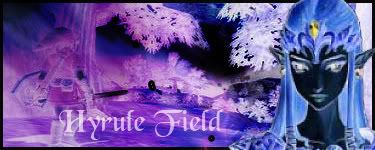
And then i made 3 different versions of the same sig, i think i like the 2nd one best.

Hyrule1.jpg


hyrule2.jpg


hyrule3.jpg


IMO, i think i've gotten a lot better at making these things since i first started xD
 
The avatar was your best yet and the middle one of the three sigs was your best signature, to me xD

I felt the same, actually - I took a break for a while [hahah, it ran out =(] and when I re-acquired it, I was much more confident with it.
 
I didn't use a single brush with this next sig :| I don't know if i like it or not...
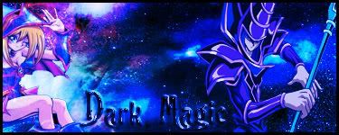
Phoenixsig.jpg


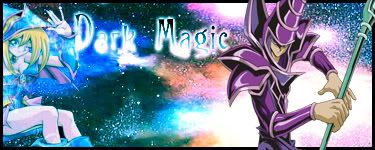
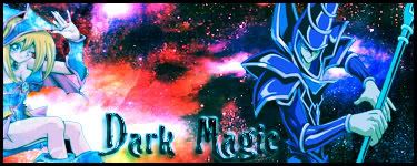
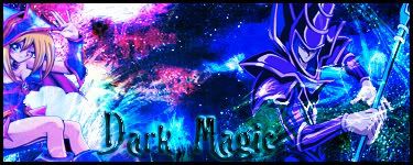
and i made 4 versions of this sig :D the first and second version suck but i like the 3rd and 4th one ^_^

darkmagicattack.jpg

darkmagicattack2.jpg

Darkmagicattack2.jpg

darkmagicattack2.jpg

darkmagicattack3.jpg


darkmagicattack4.jpg
 
Last edited by a moderator:
I think there's too much contrast there. Have you followed any tuts? I did when I started. They help one to learn new techniques in order for one to develop their own style. It is rather necessary for those newer to Photoshop. =]
 
Back
Top