Navigation
Install the app
How to install the app on iOS
Follow along with the video below to see how to install our site as a web app on your home screen.
Note: This feature may not be available in some browsers.
More options
You are using an out of date browser. It may not display this or other websites correctly.
You should upgrade or use an alternative browser.
You should upgrade or use an alternative browser.
Radon's Portfolio
- Thread starter Radon
- Start date
- Tagged users None
 We try and keep all of our GFX threads in the Graphcis Reverie, instead of the Art section, just for future reference.
 ")
I adore these four.
They're all very good overall.
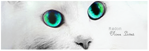
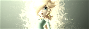
The first one with the cat looks nice and simple. I love how it's all white, save for the bluey-green eyes.
Absolutely gorgeous!
I'd recommend making the text bigger and using a different font. The placement for the text is great though!
-------------------------------------------------------------------------
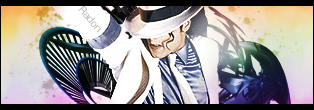
You're Michael Jackson signature is my favourite of the lot. Lighting is perfect and the colours look brilliant! It has a nice soft feel to it and the paint splatter brushes look great!
As does the half border.
-------------------------------------------------------------------------
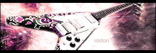
I like the image of the guitar used and the angle it's on!
The background looks nice, though I think it looks a bit too sketchy.
Great lighting and the text is situated well and the font is decent. =)
Nice half border again!
-------------------------------------------------------------------------
Simple and sweet. =)
I like the lighting around the girl and the effects surrounding her too.
The only thing I think could be improved is the text again. Just a tad bigger and a bit brighter. =)
-------------------------------------------------------------------------
Keep up the awesome work!

- Joined
- Jun 20, 2006
- Messages
- 2,517
- Age
- 32
- Location
- West New York, NJ
- Gil
- 3
- FFXIV
- Itami Raizou
- FFXIV Server
- Lamia
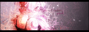
I like these two the most
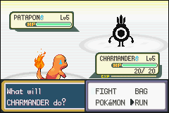
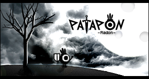
 for the patapon sig you used the text very well and placed it in the right place, These black clouds are perfect.
The Guitar one is good but not perfect, I'm not sure about the colors on the right side but overall it's good.
They're all amazing, but these two are my favourites. I love the simplicity of the first one and the eyes standing out of the white. The font is also spot on in that sig. And for the 2nd I love the way it's different in terms of the font being the focal point, which is a great change, and considering I know how hard it is to work with text you've done an amazing job. Keep up the work dude, looking forward to more.
")