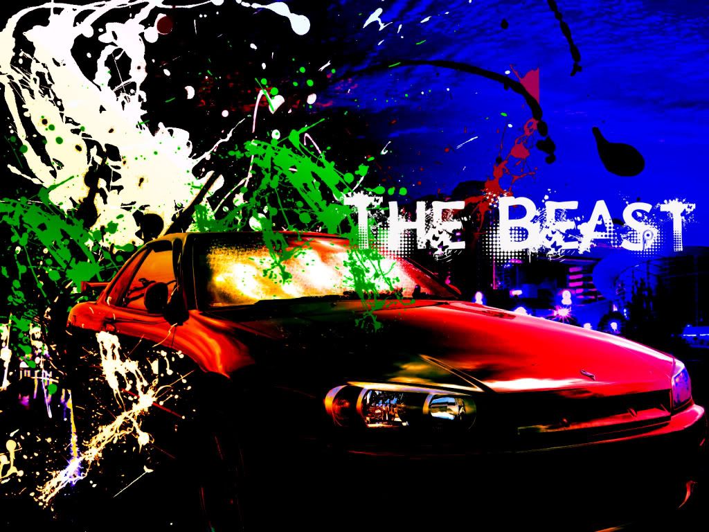
Well I figured I should post some of my work with Photoshop, Here are all the Sigs I've made in the order I made them in. So here we go:
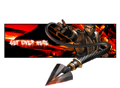
1: My very first Sig Everrrrr! Lol back than I didn't know C4D's existed and I just assumed all those crazy lights were made within Photoshop.

and an Avatar to match:

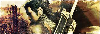
2: With this one I decided to do a twilight zone themed Sig, by this time I knew C4D's existed, I just didn't know how to use them

Avatar:

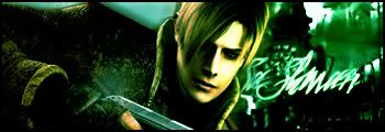
3: With this one, I thought I needed something more colorful so I went for a good ol' Morello Sig I still didn't know how to use C4D's (I had to use the clone stamp tool to extend the stock thats why it looks a lil dodgey)
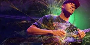
and an avatar, all I did was use a bit of the sig coz I was lazy:

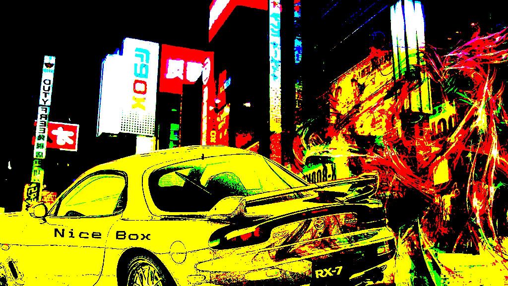
4:Here is my current Sig (and my favorite thus far), I finally figured out how to use those damn C4D's (note: I would like to give props to Dark Cloud's tutorial http://www.finalfantasyforums.net/tutorials/signature-tutorial-20582.html, it really helped me out a lot)
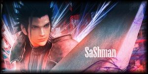
and my current Avatar:

5: Here is a Sig I made with help from Casanova's tutorial http://www.finalfantasyforums.net/tutorials/background-tutorial-22585.html
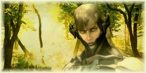
6: Here's one I made today:

7: And another one I made today:
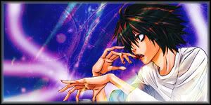
8:

9:

10:

11:

12:

Well there ya go, any constructive criticism or advice would be very much appreciated
1: My very first Sig Everrrrr! Lol back than I didn't know C4D's existed and I just assumed all those crazy lights were made within Photoshop.

and an Avatar to match:
2: With this one I decided to do a twilight zone themed Sig, by this time I knew C4D's existed, I just didn't know how to use them


Avatar:
3: With this one, I thought I needed something more colorful so I went for a good ol' Morello Sig I still didn't know how to use C4D's
 (I had to use the clone stamp tool to extend the stock thats why it looks a lil dodgey)
and an avatar, all I did was use a bit of the sig coz I was lazy:
4:Here is my current Sig (and my favorite thus far), I finally figured out how to use those damn C4D's (note: I would like to give props to Dark Cloud's tutorial http://www.finalfantasyforums.net/tutorials/signature-tutorial-20582.html, it really helped me out a lot)

and my current Avatar:

5: Here is a Sig I made with help from Casanova's tutorial http://www.finalfantasyforums.net/tutorials/background-tutorial-22585.html

6: Here's one I made today:

7: And another one I made today:

8:

9:

10:

11:

12:

Well there ya go, any constructive criticism or advice would be very much appreciated

Last edited:


