Navigation
Install the app
How to install the app on iOS
Follow along with the video below to see how to install our site as a web app on your home screen.
Note: This feature may not be available in some browsers.
More options
You are using an out of date browser. It may not display this or other websites correctly.
You should upgrade or use an alternative browser.
You should upgrade or use an alternative browser.
SOTW 187 Voting
- Thread starter Six
- Start date
- Tagged users None
- Status
- Not open for further replies.
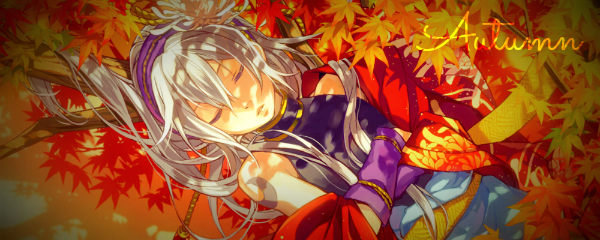
Both are great entries this week! I sat down and couldn't come up with anything to fit the theme o.o
I think my vote is gonna go to the first one though. The vignette effect is actually really interesting and I like how the text is excluded from that. Looks cool!
I think my vote is gonna go to the first one though. The vignette effect is actually really interesting and I like how the text is excluded from that. Looks cool!
.....and we have a winner! Congratulations on your first win in SOTW JigoKuu!
Your entry will be featured in our DeviantArt gallery as per usual.
Donations will be handed out shortly.
1. JigoKuu
2. Dyranda
Your entry will be featured in our DeviantArt gallery as per usual.
Donations will be handed out shortly.
1. JigoKuu
2. Dyranda
- Status
- Not open for further replies.

