Navigation
Install the app
How to install the app on iOS
Follow along with the video below to see how to install our site as a web app on your home screen.
Note: This feature may not be available in some browsers.
More options
You are using an out of date browser. It may not display this or other websites correctly.
You should upgrade or use an alternative browser.
You should upgrade or use an alternative browser.
SOTW 47 Voting
- Thread starter L
- Start date
- Tagged users None
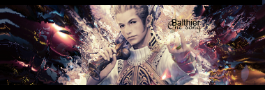


My vote goes for #1. I tend to find the busier graphics to be the most attractive. It looks like it was time-consuming to create.
1 seems more like more work was put in it then the other ones. so yeah, i vote 1 as well
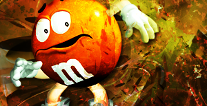
Definitely #4. The subject matter owns the others. M&M man thing = ownage. The effects are pretty cool, too.
I was torn between 2 and 3. In the end, 3 won out. I really like the colouring and lighting on it. The angle of the stock is quite nice too.
Great work on number 2, nice and simple. Bit of a dodgy size though. =/
Great work on number 2, nice and simple. Bit of a dodgy size though. =/
I'm between 1 and 3.
I like the simple style used in 3. The flow is also very good. 1 has nice text and looks as though there was a lot of effort put into the background and the effects.
Maybe I'll make a decision later.
I can tell who did every piece with the exception of 4.
I like the simple style used in 3. The flow is also very good. 1 has nice text and looks as though there was a lot of effort put into the background and the effects.
Maybe I'll make a decision later.
I can tell who did every piece with the exception of 4.
Last edited:
I'm going for #1 because I love the light background behind Balthier which contrasts to the dark background elsewhere, and as Claymore has pointed out it looks as if a lot of effort has been put into the background.
Kudos to #1 :wink:
Kudos to #1 :wink:
- Joined
- Dec 14, 2006
- Messages
- 11,628
- Location
- California
- Gil
- 0


- FFXIV
- Mitsuki Calei
- FFXIV Server
- Lamia
- Free Company
- Gaia
It was between 1, 3, and 5 for me.
1 was really good, in a way that it really shows great effects in the background. The text is also well-placed and I quite like it. The only thing that doesn't really appeal to me is the darker background on the left and right side and would have much preferred it if the artist just stuck with the color theme in the center as I really loved that part since it blended really well with the render. Other than that, this one was a really decent entry.
3 is also beautiful in a very simplistic way. I like the subtle effect and how there's really not too much going on in the background. The way Yuffie was placed is also quite interesting and I like it a lot. But somehow, I feel that the signature isn't complete for some reason. =/ Like maybe one more very subtle effect in the background would've sufficed as it seems too empty for me somewhat.
5 was kinda different from the rest and I really love the style. I like that rounded border thingy (don't know what to call it) in the background and the colors are awesome! Not too much colors, which I like. The lighting effects are also pretty good and very nice usage of C4Ds in the background. Didn't care too much for the render though, but overall it's very good.
So in the end, I decided to go with 5.
1 was really good, in a way that it really shows great effects in the background. The text is also well-placed and I quite like it. The only thing that doesn't really appeal to me is the darker background on the left and right side and would have much preferred it if the artist just stuck with the color theme in the center as I really loved that part since it blended really well with the render. Other than that, this one was a really decent entry.
3 is also beautiful in a very simplistic way. I like the subtle effect and how there's really not too much going on in the background. The way Yuffie was placed is also quite interesting and I like it a lot. But somehow, I feel that the signature isn't complete for some reason. =/ Like maybe one more very subtle effect in the background would've sufficed as it seems too empty for me somewhat.
5 was kinda different from the rest and I really love the style. I like that rounded border thingy (don't know what to call it
) in the background and the colors are awesome! Not too much colors, which I like. The lighting effects are also pretty good and very nice usage of C4Ds in the background. Didn't care too much for the render though, but overall it's very good. So in the end, I decided to go with 5.
OK, my vote has to go to #1. It looks like a lot of effort has gone into it, and Balthier seems to fit that the background of the sig. Also, it seems the perfect size for a signature.

I rather like 3, i was totally stuck for 1 and 3.
But i like 3 the most because it has very nice lighting and colour to it and just pwns
But i like 3 the most because it has very nice lighting and colour to it and just pwns
I'm deciding on 3. I like simplicity more than action. Hence why my own graphic style is simple.
Also voting for 4. The M&M choice was unusual, but the artist made it work out great! I just love it.
H
HigherStorm
im voting for #5 i need to start going with the flow more
I like 1.
The use of colours makes the image stand out and look more appealling. The overall effect is great and it seems to demand attention, this and I like Balthier.
The use of colours makes the image stand out and look more appealling. The overall effect is great and it seems to demand attention, this and I like Balthier.
Eidolon
Guru
2 GMV. Quite simply it's the most pleasing on the eye.
3 is nice, although I dislike the colouring.
#1 omg it looks like a ncie background, but then in the middle someone has just vomited everywhere. Balthier is far too light in comparison with rest of sig.
3 is nice, although I dislike the colouring.
#1 omg it looks like a ncie background, but then in the middle someone has just vomited everywhere. Balthier is far too light in comparison with rest of sig.
- Joined
- Jun 20, 2006
- Messages
- 2,517
- Age
- 32
- Location
- West New York, NJ
- Gil
- 3
- FFXIV
- Itami Raizou
- FFXIV Server
- Lamia
I'm going for 1 it has good effects, and colors even though I don't like colors much but still it's really good =D