SOTW 64 Voting Thread!

SOTW 64


  • Total voters
    25
  • Poll closed .

Daenerys

The Last Dragon
Veteran
Joined
Nov 26, 2006
Messages
11,178
Age
32
Location
Suburban hell.
Gil
1
I'm so pleased at the amount of entries I received this week ^^ The theme was Halloween! Just remember, you must post for your vote to count =]

1)
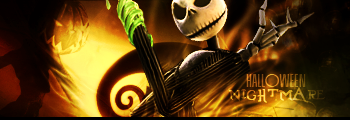
HalloweenNightmare1.png


2)
SoTW64.jpg


3)
SOTW64entry.png


4)
Untitled-1copy-6.png


5)
witch4.png


6)
SoraSign.jpg


7)
JackSkellington.jpg


8)
Halloween-SigAnimated2.gif
 
I was stuck between one and two, but in the end, I must say two. =]
 
This was a hard choice but i gotta go with number 2

Rules that apply to every SOTW

1.) Do not vote for your own entry. You will be immediately disqualified if you do so.

Sorry, you broke a rule of SOTW and I now have to disqualify you.
 
Let's see some reasons as to why you like them guys.

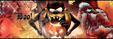
Chosen Number 3 - Taz looks creepily dark in this, and the way the pumpkin glows is quite clever!
 
Voting for #3

All the sigs are pretty nice, but #3 caught my attention as Taz would make and excellent work in Halloween :P

I also like the background and the Pumpkin light effects.
 
It was between 5 and 8 for me. 5 was very clean, colorful, and softly done. I love the various elements implemented to it, and the lighting is quite fantastic. The text is very cute as well and overall, it's just a fantastic piece.

8 is also excellently done. I can tell how much effort the artist put into the work and the creativity is a definitely a plus. The glowing light inside the pumpkin is just very neatly done as well as the tiny sparkles shimmering here and there. I love the animation to it, I really do. The text is also beautiful!

In the end, this is pretty much a toss in the coin for me as I love both piece. But due to the subtle animation done for 8, I'm going with that one. I know animation can be a pain, and I like the overall look to it. It also fits the Halloween theme more as well.
 
Man, tough choices this week! I like 1, 4, 5, and 7. But I have to go with number five. I like the way it looks. I like the softness of it, despite the fact that it's a halloween signature. 1 and 7 used the same render, so that kind of took their attractiveness down a bit, and 4 a little harsh on the eyes. So, my choice:

#5

I vcan't believe someone didn't do a Michael Myers sig!
 
I went with 8 because I thought the pumpkin was a great idea to use as a render. The orange and dark colors gives it a spooky feel to it and the glowing eyes are a plus. Text was blended in nicely to complete it.
 
I voted 5)
great combination of colors.
The last one is good especially with the font and the glowing animation. but still number 5 is very good.
 
8 cause it looks nice and clean but hard to make.
 
Eight by a country mile.

It has a very good "Halloween" feel, and the subtle animation is impressive. Whoever made this put a lot of work into it, and it shows. Most of the others were good, but it's the little details that give Eight the edge.
 
Tough choice between 1 and 5 because the effects on both are all stunning. D=

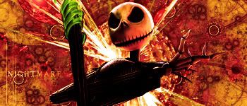
1 is really good in that the lighting is really well done on it. The secondary render worked really well too.

In the end I'll say 5 just because of the fact there were so many different hues involved that also worked so well with each other. Rather candy-ish too, so so appropriate. :)

But both were fi-ine.
 
Those are really good ^_^ It was a tough choice between 1 and 5.

1 has great colours and text
Number 5 seems to stand out the most. The creativity used for the text and the sig over-all is very profesional. Great job.
 
Back
Top