What else?

Davey Gaga

Under you like a G.U.Y.
Veteran
Joined
Jun 18, 2006
Messages
7,134
Age
33
Location
Glasgow City Centre, Scotland.
Gil
0
ApacheRaidAlbumCovercopy.jpg

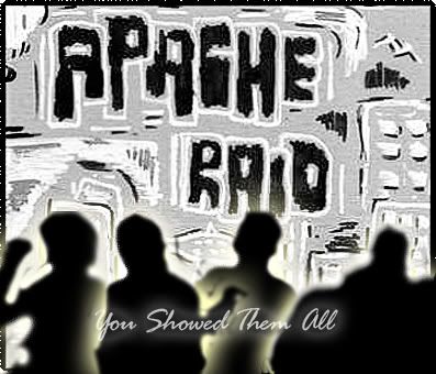
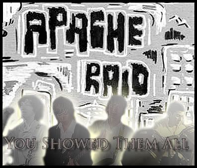
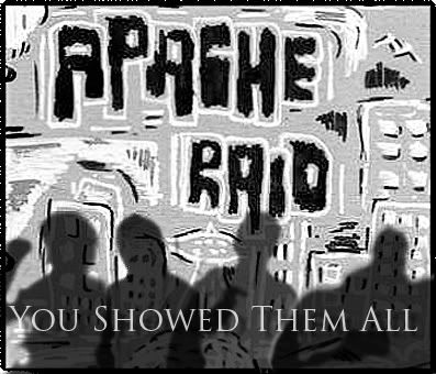
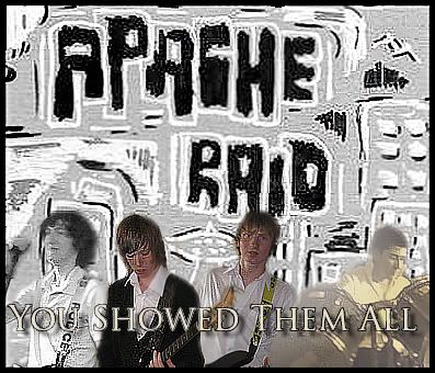
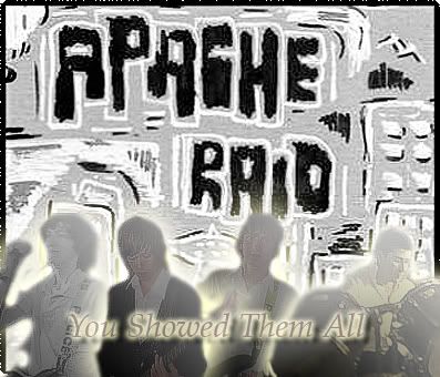
As some of you may know, I've recently joined a band [that's me on the drums on the right hand side of the cover]. I decided to make this so that we have some kind of logo to use for the time being. I want to ask your advice on how I can improve this first ... draught? Seriously, any tips or suggestions are welcome - but please provide directions to your advice, seeing as I'm not totally fluent yet.

The background was actually hand drawn by the guy second from the left in the black jumper, so I decided to use this and I'd very much like to keep it. I intend to use the cut the letters from "Apache Raid" and edit them to say "You Showed Them All," so that the fonts are consistent.

All suggestions welcome and appreciated.
 
First off, it's too pixelly... Next, "You Showed Them All" doesn't fit with the rest of the cover. It seems a bit off, if y'know what I mean.

Okay, I actually think it would look better if you took off "You Showed Them All" and also the images of you guys. Mind you, I'd like to know what it'd look like if you were silhouettes.

To do that:
-Left click on the layer in the layer window
-Select "blending options"
-Select "colour overlay"
-Set that to black, normal and 100%
 
First off, it's too pixelly... Next, "You Showed Them All" doesn't fit with the rest of the cover. It seems a bit off, if y'know what I mean.
I do, hence why I want to use the existing letters to make You Showed Them All in the same style. Alternatively, I could just ask Nick to do an entire alphabet in such a style, so it's always there.

Okay, I actually think it would look better if you took off "You Showed Them All" and also the images of you guys. Mind you, I'd like to know what it'd look like if you were silhouettes.
I'd rather not do that, otherwise, all I'm left with is the background - which is what I started off with. The entire point was to create something snazzy with that design as the background.

EDIT:
Right, I've been messing around and I've created a number of edits and they are as follows;

ApacheRaidAlbumCoveriicopy.jpg


ApacheRaidAlbumCoveriii.jpg


ApacheRaidAlbumCoveriv.jpg


ApacheRaidAlbumCovercopyV.jpg

 
I prefer the first, but take off the outer glow. Also, is there any way you can make that background less pixelly?
 
The first one would be good if the bg wasn't so blurred, and you took away the outer glow. Can't you re-create it using a less blurry version of the picture?

Also, use the text you used on the 3rd. But lower it so it's near the bottom. =]
 
The first cover you made was awesome but...

what does the sentence "you showed them all" have to do with the cover?

try another one!
 
Back
Top