An attempt was made

Morrigan

Veteran
Joined
Oct 6, 2006
Messages
2,005
Gil
144
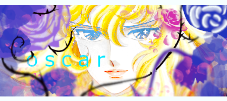
I got inspired by talking to a few other people yesterday and after like 9-10 years I made an attempt to create something of the gfx kind.

Behold my creation:
v1
oscarv1.png


v2
oscarv2.png


I am re-discovering GIMP and features I'd forgotten about, I even made my own brushes.

My conclusion: I have mixed feelings about this. There's something there that I want to express but I can't quite tap into it. The idea is there, the execution not so much. If you have any suggestions for the text (I like the color) to pop up more please do share.
 
Last edited:
Oh nice, you actually tried it! :lew: I'm not very savvy with GIMP but I think it looks really nice. I like the white border on top & bottom too, it works with this signature! I think V2 is nice, the rose color watches more with the colors, but that's just my humble opinion. :-)

If you have any suggestions for the text (I like the color) to pop up more please do share.
Man, I'm so bad at text that I have to really take samples from other people to get an idea of where to start with text. It's definitely not my strong suit, but there's so many things you could do to make your text pop, like dropping a color shadow or duplicating the text and angeling it underneath the original or something! Good luck, I hope you find some inspiration to keep going :lew:
 
Oooh, great to see you back at it!

I also think v2 looks better as it doesn't clash as much with the colour palette overall. I'd personally be careful with harsh lines like you see at the top right with the indigo coloured effect.

Ah text, my personal favourite....

raccoon-weird.gif


Caps lock is your friend. It makes the text look more cohesive, you can always add some decorative dots above and below the text to box it in a little more so that it's not floating. Alternatively, you could use a cursive font, set it to be extremely tiny and unreadable and make it a decorative text as a backdrop for the main. :D
 
I got inspired by talking to a few other people yesterday and after like 9-10 years I made an attempt to create something of the gfx kind.

Behold my creation:
v1
View attachment 11749

v2
View attachment 11750

I am re-discovering GIMP and features I'd forgotten about, I even made my own brushes.

My conclusion: I have mixed feelings about this. There's something there that I want to express but I can't quite tap into it. The idea is there, the execution not so much. If you have any suggestions for the text (I like the color) to pop up more please do share.
If you're looking for feedback from someone who tried this stuff a few times years ago and (admittedly) was complete shit at it...

Layering seems a bit all over the place; not sure why the text is behind those black lines. Where is the focal point of this piece? I'm assuming the face is the main subject, and yet I feel like I'm peering through some random flowers that are annoying me. I just want to reach through the screen and wipe them out of the way! The colours feel a bit chaotic too - Bright neon blue on bright yellows and whites is difficult both from an accessibility and a design standpoint. Contrast is your friend. Blue is a nice colour but maybe shadowing or some kind of translucent textbox/wrap could help make it stand out a bit more. Desaturating the background could work too I suppose. It could also be that bright blue text just doesn't work super well with this piece and that's ok as well.

Hope this doesn't sound too negative! Graphics take time and all the power to you for even having a go. :)
 
Thanks for sharing your work here, it's pretty cool seeing fresh new GFX styles after so long!

For text, personally I would say the first thing to do is to really consider the typeface you are using. Some fonts look stunning set all in uppercase, some look better in lower or sentence case, it really depends on on the individual characters. For example the typeface you are using there uses the double barrel 'a', this might look better with a more geometric style to fit with the 'o' and 'c'. Typefaces like Noah for example offer both glyph styles for characters like 'a', 'e', 'g' and 'y' and would give you greater flexibility when typesetting.

When starting out, it's best to leave your text clean, focusing more on your selection of typeface, how you set your characters and where you position it in your composition. Looking at focal points and how your text interacts with your image to communicate your message is a great jumping off point. It can be tempting to add loads of detail around your text to 'make it pop' but more times than not it can clutter and drown out what your graphic is trying to achieve.

With this particular piece I think what's making it difficult for your text is the low contrast between both that intense bright blue and yellow. The widely spaced characters are also making it difficult for the typography to hold any sort of presence here. I understand that you enjoy the colour of it, but higher contrast is what makes elements really stand out without having to resort to all sorts of effects which will only muddy your work. In this case you can either change the colour of text and tighten it up (playing around with some solid sans serif fonts), tighten up your text and change the colour intensity/mode of your image, or see if a graphic element such as a rectangle placed behind the text gives you any opportunities to play around with.

So yeah, keep it simple, keep it clean and give it room to breathe really. Minimal typography is always the most pleasing and elegant solution!
 
Wow so many interesting and different replies. First of all thank you all for your individual input.
Oh nice, you actually tried it! :lew: I'm not very savvy with GIMP but I think it looks really nice. I like the white border on top & bottom too, it works with this signature! I think V2 is nice, the rose color watches more with the colors, but that's just my humble opinion. :-)


Man, I'm so bad at text that I have to really take samples from other people to get an idea of where to start with text. It's definitely not my strong suit, but there's so many things you could do to make your text pop, like dropping a color shadow or duplicating the text and angeling it underneath the original or something! Good luck, I hope you find some inspiration to keep going :lew:
In general people seem to be liking V2 the most. For some reason I like v1 maybe because the flower pops out so much. I actually considered your idea, the only thing is I don't remember/don't know how to do it.:LOL:
Never really bothered to learn the art of the text. Thank you for the feedback and your kind and encouraging words.

Oooh, great to see you back at it!

I also think v2 looks better as it doesn't clash as much with the colour palette overall. I'd personally be careful with harsh lines like you see at the top right with the indigo coloured effect.

Ah text, my personal favourite....

View attachment 11752

Caps lock is your friend. It makes the text look more cohesive, you can always add some decorative dots above and below the text to box it in a little more so that it's not floating. Alternatively, you could use a cursive font, set it to be extremely tiny and unreadable and make it a decorative text as a backdrop for the main. :D
I see what you mean now, regarding the harsh lines. When you spend so much time looking at something you become blind to some of its fault. So my eye got used to it and couldn't really notice it's there until you mentioned it or probably until I saw it again after some time away from it. You think bluring it a bit is a good choice? Or should I try something like smudge or an entirely different thing all together?

I didn't really experiment much with the text or the fonts. I am afraid if I add decorations to it it'll become too much as my graphic is already quite loaded. But I'll try some different fonts and see if I find something more suitable.

If you're looking for feedback from someone who tried this stuff a few times years ago and (admittedly) was complete shit at it...

Layering seems a bit all over the place; not sure why the text is behind those black lines. Where is the focal point of this piece? I'm assuming the face is the main subject, and yet I feel like I'm peering through some random flowers that are annoying me. I just want to reach through the screen and wipe them out of the way! The colours feel a bit chaotic too - Bright neon blue on bright yellows and whites is difficult both from an accessibility and a design standpoint. Contrast is your friend. Blue is a nice colour but maybe shadowing or some kind of translucent textbox/wrap could help make it stand out a bit more. Desaturating the background could work too I suppose. It could also be that bright blue text just doesn't work super well with this piece and that's ok as well.

Hope this doesn't sound too negative! Graphics take time and all the power to you for even having a go. :)
No worries. I think we just have a different approach. What i was going for but kind of failed was the focal point being kind of the face but it would be behind other stuff, the things you see on the front that's why they're blured. I can't quite explain it well what my intention was but think of a shot where you see a face from a somewhat obscured angle. If I find an example from a movie I'll post it. That might explain it better than I ever could.

I really like colorful stuff. It's more difficult to work with it I feel and yeah blue/purple is a complementary color to yellow so everything call for quite a bit of attention. At the moment I'm not sure how to balance all this while keeping my intention (as in I'd hate desaturating it, but I like your contrast idea) and currently I'm am executionally impaired:p
Thank you for your input!

Thanks for sharing your work here, it's pretty cool seeing fresh new GFX styles after so long!

For text, personally I would say the first thing to do is to really consider the typeface you are using. Some fonts look stunning set all in uppercase, some look better in lower or sentence case, it really depends on on the individual characters. For example the typeface you are using there uses the double barrel 'a', this might look better with a more geometric style to fit with the 'o' and 'c'. Typefaces like Noah for example offer both glyph styles for characters like 'a', 'e', 'g' and 'y' and would give you greater flexibility when typesetting.

When starting out, it's best to leave your text clean, focusing more on your selection of typeface, how you set your characters and where you position it in your composition. Looking at focal points and how your text interacts with your image to communicate your message is a great jumping off point. It can be tempting to add loads of detail around your text to 'make it pop' but more times than not it can clutter and drown out what your graphic is trying to achieve.

With this particular piece I think what's making it difficult for your text is the low contrast between both that intense bright blue and yellow. The widely spaced characters are also making it difficult for the typography to hold any sort of presence here. I understand that you enjoy the colour of it, but higher contrast is what makes elements really stand out without having to resort to all sorts of effects which will only muddy your work. In this case you can either change the colour of text and tighten it up (playing around with some solid sans serif fonts), tighten up your text and change the colour intensity/mode of your image, or see if a graphic element such as a rectangle placed behind the text gives you any opportunities to play around with.

So yeah, keep it simple, keep it clean and give it room to breathe really. Minimal typography is always the most pleasing and elegant solution!
I used to do GFX a long time ago but I was also kind of out there back then as well. I'm simply trying to find a style that works for me that is at the same more modern.

Wow you have a very detailed insight into fonts. I don't think I've ever seen such a detailed post on this topic (graphics wise). I think I agree with you about keeping the text simple, that's what I went for.

Thank you for your suggestion! I like the idea you suggested about changing the contrast! It was quite practical and I appreciate that!

I'll take some of your suggestions and see what I can produce after the changes. Afterwards I won't spend more time on this piece as I think it's more important to familiarize myself with more basics and put them into practice over and over again (if I stick with it more than this week that is:p)by making more stuff. An maybe someday I'll come back to the core idea and try to remake it with better skills!
 
You think bluring it a bit is a good choice? Or should I try something like smudge or an entirely different thing all together?

I think leaving it out (depending on the background colours) might be the better option colour wise! I'd just keep messing around with things to get back into the groove if I were you, honestly! :D
 
I think leaving it out (depending on the background colours) might be the better option colour wise! I'd just keep messing around with things to get back into the groove if I were you, honestly! :D
That's what I'm kind of doing :LOL:

I tried to apply some of the ideas I found easier to apply from the above posts. The changes aren't that drastic but I think i'll keep the other posts in mind in the future while doing something different.

oscarv3.png

Tried to incorporate some of your advice and Miko's. I think it's time for me to move on from this and when I get better skills maybe redo it from the beginning.
------------------------------------------------------------------------------------------------------------------------------------------------------------------------------------------------------------------------------------------------------------

This was the middle point to get to the other versions I believe. It's mostly like a step and not the final product.

morcol.png


Then I moved to this which looks kind of dreamy to me but at the same time sort of washed out. I wanted to do something specific but as you'll see afterwards my attempt was not as successful.

morcol2.png


This is supposed to be finished. I tried to up the contrast and colors and added a few more things. That wasn't supposed to be a thunderbolt but something else...but we'll pretend a thunderbolt was my intention all along. The text ison the bottom left and I was trying to go for a signature on a painting sort of feeling. The brightness of this makes it look like it's daylight but I was always going for nighttime. That's why I attempted to darken everything in attempt number 3.

morrigann_light.png


This is by far my favorite. It at least got one of my intentions right. :p

Those reddish/beige thingys (depending on which version you're looking at) are meant to be clouds but I didn't quite get the result I had in mind.

morrigann.png


~Thank you for taking the time to comment (if you end up commenting).
 
  • Like
Reactions: Six
This was the middle point to get to the other versions I believe. It's mostly like a step and not the final product.

morcol.png

I really enjoy this. I like the direction this signature could be going, personally, and the current colour scheme work well with the render.


This one, even though the colours pop more, for me, seem to be where it kinda lost it's "theme". What's the dark purple effect near her hand? The white does look like a thunderbolt xD But the purple splotch seems a little random to me, and if not random, definitely too harsh.


I think by trying to darken the whole piece after you already had a more dreamy look it perhaps oversaturated the piece now. I think text would look lovely on the right side of the piece, instead of tucked into a corner (but then I was never a fan of text in corners). I also think the border is a little too hectic for my personal tastes.

Again just some feedback which is always going to have some personal preference tied to it. As long as you like your work that's really all that matters, but perhaps the insight can help you notice things that might've not stood out to you previously.

Stoked to see you back at it, though!
 
I really enjoy this. I like the direction this signature could be going, personally, and the current colour scheme work well with the render.


This one, even though the colours pop more, for me, seem to be where it kinda lost it's "theme". What's the dark purple effect near her hand? The white does look like a thunderbolt xD But the purple splotch seems a little random to me, and if not random, definitely too harsh.


I think by trying to darken the whole piece after you already had a more dreamy look it perhaps oversaturated the piece now. I think text would look lovely on the right side of the piece, instead of tucked into a corner (but then I was never a fan of text in corners). I also think the border is a little too hectic for my personal tastes.

Again just some feedback which is always going to have some personal preference tied to it. As long as you like your work that's really all that matters, but perhaps the insight can help you notice things that might've not stood out to you previously.

Stoked to see you back at it, though!
The splotch on her hand is a bat...:sad2: I tried a few other bat poses but they felt kind of distracting. maybe I should retry them...

I personally likethe border on the second piece out of all four. Due to me messing around with the colors and saturations, the border also ended up getting affected. When I find some time I'll try your text idea.
 
  • Haha
Reactions: Six
Oh, I see the bat now! 😂

The text is completely up to you! I just personally think it always pulls away from a piece in corners.

I think especially with the more “dreamy” version a capitalised space between each letter “M O R R I G A N” would look really good. A font like… Bebas.
 
Oh, I see the bat now! 😂

The text is completely up to you! I just personally think it always pulls away from a piece in corners.

I think especially with the more “dreamy” version a capitalised space between each letter “M O R R I G A N” would look really good. A font like… Bebas.
I can kind of imagine it faintly. I'll try it tomorrow that I'll find some free time (hopefully).
 
Rather ambitious idea I had in mind. Lately I've been feeling inspired from games that I've played in the past. So I wanted to create something revolving around Fatal Frame (or Project Zero as I know it). The concept I had in mind was use the render of the heroine with the camera in her hand and have photos of ghosts around. That was the idea.

project_zero3_ghosttext.png


The border thing you see is just an attempt at an exposed photograph that has deteriorated or something (don't really know the terminology as english isn't my native language).

This time I like the text a lot better than the other times. I tried a different approach but it was :poop: so I'll stick with this.
 

Attachments

  • project_zero3_ghosttext.png
    project_zero3_ghosttext.png
    153 KB · Views: 117
Last edited:
  • Like
Reactions: Six
Sorry it's a bit late! I saw you on the other day and realized that I had intended to post about this!

I like this one! The border is a bit distracting since some of it isn't as crisp in other areas, but the distressed grunge look works. Would like to see the camera though, I think it would have pulled it all together :lew: I think the colors inside are really cool though!

Pretty much any grunge texture works with this kind of look your going for, so maybe look for some resources to use as an overlay or something (if that's an option for the program you use!)

Hope you haven't given up making stuff :lew: You need to update your signature space so you don't have those ugly watermarks on it anymore! :O
 

Ohh, interesting. I'm not gonna be talking about "style" because clearly we all have our own.

I love the blur behind the text that you added, fits the aesthetic. I like the whole vibe of the signature and even though I understand the border myself I do find it a bit hectic, kinda like Miko said. I'm missing a little bit of an overall focal point, but that's sometimes intentional with signatures like these.

Very nice, though. I like when artists experiment with things that aren't their "usual" style. :D
 
Sorry it's a bit late! I saw you on the other day and realized that I had intended to post about this!

I like this one! The border is a bit distracting since some of it isn't as crisp in other areas, but the distressed grunge look works. Would like to see the camera though, I think it would have pulled it all together :lew: I think the colors inside are really cool though!

Pretty much any grunge texture works with this kind of look your going for, so maybe look for some resources to use as an overlay or something (if that's an option for the program you use!)

Hope you haven't given up making stuff :lew: You need to update your signature space so you don't have those ugly watermarks on it anymore! :O
I also wanted the camera to be more visible, it's just that the stock itself doesn't have the whole camera in and couldn't find a better one.

I have simply been busy to be honest. And I've been playing a lot of games.
When I started posting here, I frankly was working only one job and now I'm working two and some days I travel like 3-4 hours. But thanks for reminding me!
II'll give a more detailed reply during the week, as I just wanted to clarify some things with the current post.
 
Back
Top