Navigation
Install the app
How to install the app on iOS
Follow along with the video below to see how to install our site as a web app on your home screen.
Note: This feature may not be available in some browsers.
More options
You are using an out of date browser. It may not display this or other websites correctly.
You should upgrade or use an alternative browser.
You should upgrade or use an alternative browser.
Constructive Critisism;Please.
- Thread starter 50525
- Start date
- Tagged users None


This one is pretty good. I like how you kept the background colours consistent with the render. The text looks really good too. My only criticism with it is that the left side looks kind of plain, like it is missing something. But otherwise good work.

I really like the background in this one. I like how the colours define the buildings in the background. But the render looks a tad out of place. The colours in the render are a bit dull and the edges of the render are too sharp IMO.

This one looks really good, but one tiny thing that bothers me about it is that there seems to be a distinct line on the girls head where the sparkly effect cuts off, I think it would look better if the sparkles were more spread out. But aside from that; the text looks good and the Sig sits together nicely.

I really, really like this one. I can't see anything wrong with it, good work.

I really like this one too, I like how you didn't include a character or anything. I really like the orange colours you have used it works really well. The only thing I'd suggest is to make the text more defined. Text doesn't always have to be clear IMO. But for this particular Sig, I think it would look a lot better if the text was clearer.

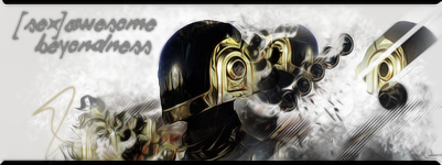
I really like the middle and the right side of this Sig. But something about the left side looks a little off, I think the edges of the large dark part which is sticking out to the left side should be sharper.
As a whole, this is some really great work.
Keep em coming.

You've done and excellent job on all of these I must say. =D
Very good though I think the focal point is a bit out.
The character is too far to the right, leaving too much empty floating space on the left.
I like the effects you've used around the guy and the text placement is very well done as is the use of font.
Lighting is great and I actually think a white border would have made it stand out more!
With this one it seems as though he's just flaoting there and not really blended well at all to be honest.
The background is a bit too dark and there is not much lighting on Venom to make him stand out more as the main focal point
The text is placed well and the font is well done though. =)
I love this one!
The colours are gorgeous and the sparkly dust effects surrounding the couple look awesome!
The lighting is well done and the text is placed well and the font is beautiful.
A little bit hard to read at first glance but otherwise great. =)
Another awesome piece!
It gives off a closed in claustrophobic type feeling, as though the walls are closing in around him.
The image is awesome and the lighting is excellent!
The C4D used works really well as does the half border.
I like the effect you went for here.
The lighting and blending is all really well done and the colours work well together.
Though I think that the text should have been a tad more readable even if it is meant to be broken up. =)
I really like this one.
The effects are great and I love the blending. The colours work together magnificently and the text is very well done and so is the font that was used.
I still think that something needs to be added though. Maybe if you focused more light on the text itself it would give the signature a focal point and not appear so empty. =)
Keep up the great work and post more soon!
I love the colours in that sig, they're epic! The right hand side looks amazing, and the font works really well the colour scheme and focal point of the sig, I'm still debating whether the left hand side looks empty or just right. It looks as if something should be added on the left, but then you lose that nice browny colour if you do, so I think it's just dependant on what you're looking for.

That's great, it really looks like a fantastically well done anime sig, and the effects really bring the render out and you get to feel the magic of the moment, I love the font as well, it suits the sig.
Keep up the good work
")

This ones nice, the lighting is well placed and the effects are sharp but not oversharp. Text placement could use some work but overall its really well done. Interesting size aswell.

This ones fukin cool. I love the border so much. The effects uv used, the c4d are brilliant and the lighting is superbly placed. Awesome work on this one.

Hmm this one doesnt stand up to the previous. Its quite plain tbh, theres no depth to it and theres nothing that catches my eye

This one reallly like aswell, its superbly done. I would advise toning down a little on the smudging though, his right side is a little to smudged i think. The text is well places and i like the BG, well done ^^

I like the glossy look to this one and the light emitting from its hand. I think the overall lighting could use a bit more work though and i think the sig would look better if it was a little longer but this is seriously a really good tag.
Yopur work is really good, keep posting man.
[/quote]