HS' GFX

Are you using topaz? I think you're overusing it. Topaz is nice in the background but I think you need a little sharpening of the focal points to make them stand out more. If you're not using topaz, sharpening might be a good idea anyway.

Your tags are okay, nice use of effects and blending in them. Lighting is alright, but it is a bit overpowering and overcontrasted in some tags. Try toning it down if you can.
 
Thanks. :) Yeah, I know. I usually notice it way too late.
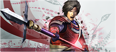
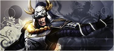
Sanada-2.png


Honda.png


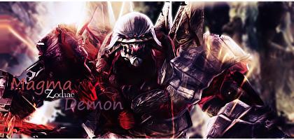
Astaroth.png


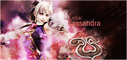
Cassandra-2.png


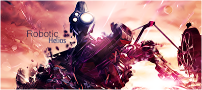
Helios2.png


Magoichi-1.png


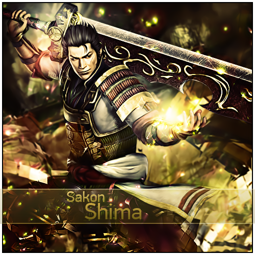
Sakon-1.png


Fuma.png


Keiji.png


Bannah.png


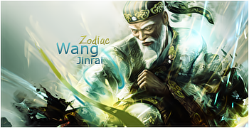
Wang.png


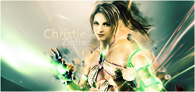
Christie.png


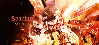
spacy.png


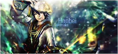
Hannie.png


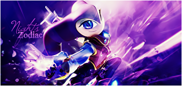
Nights.png
 
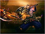
I really like your stuff! Your lighting is really excellent and the effects you use are superb! My favourites are the first one and the Sakon Shima piece.
I think on the Hanbei one though, the background is blurred a bit too much. Maybe you could tone down the blurring a little bit?
Other than that, they are all fantastic. They really inspired me. :) KIU
 
Christie.png


Like, ONOM. I LOVE your current style. Love the glow and the render and its positioning. Effects and the BG are awesome, and the text is perfect.

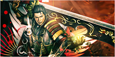
Sakon-1.png


Border :awesome:

Lighting and the textbar are gorgeous, the glow is perfect. Only thing that irritates me is that there were too much sparkles :)

Keep it up HS! :monster:
 
Are you... Dutch? :gasp:

Bannah.png


'Cause that sure as hell is dutch text. :wacky:

Nights.png


I love the current style you have, so glossy and clean. Absolutely loving this purple one. Your last update was by far your best, adore the LP as well.

Keep it up!
 

I really liked these three the most out of your recent update!

You're style is so clean and detailed!

The images always look sharp and are blending in with their surroundings brilliantly!

Fantastic use of detail and colour combinations.

The lighting is always in the right spots, lighting up the focal brilliantly!

You're backgrounds are always interesting to look at too! They're so busy and yet you still manage to make us focus on whatever is meant to be the focal.

Keep up the fantastic work and you really should enter SOTW's! I don't think I've seen you enter any yet.
 
*Max Revive on thread*

Thanks for the comments.^^
@Colors: Yeah, I'm dutch. =) Nogal zeldzaam op een forum, niet?^^ En die banner was meer voor een forum waar ik designer ben.


Click to enlarge.^

Sakon-2.png


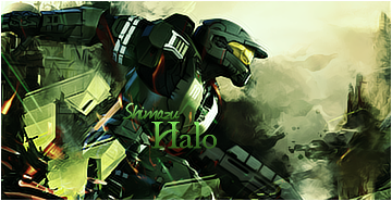
halo.png
 
Please....I am begging you to put up a tutorial for some of these. The colors are extremely well added and all you work is A+ material. They all look so vibrant and well put together. The focals are all well established and the backgrounds are all awesome.
 

This one looks awesome!

I love the colours and how well they mingle together!

Great lighting and I love how it has a glossy sort of look to it in certain places.

The focal is well established and sharpened a bit more in order to make it stand out it seems.

The background looks good blurred in certain places and I really like those swirls and dots over on the left!

Fantastic blending of it all and nice border!


Another great signature.

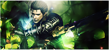
The greens are very appealing and the effects are all blended in around the focal brilliantly!

Awesome texture in the background over on the right and the text looks pretty neat.

I like the fonts you've used and it's good that you used a green that didn't blend in too much with the other shades.

Very nice piece of work!
 
Nice work dude Damn.


Astaroth.png


This one is BEAST! seriously awsome xD.


Wang.png


is this the character from the Tekken game?
becuz this old man remembers me of someone from tekken.
i love the effects Blue/Gold thunders.

spacy.png


This one looks really nice on colours and at the same time it looks Cute but also beast x]


Nights.png


This one is Cute and the purple colour is also lovely.
Can u tell me the name of this character?.

With al the purple it looks like some kind of Aura.
i love this one.

Nice work. Conf.
 
Back
Top