Miko's Graphics

Miko

Staff member
Global Moderator
Social Media Team
Veteran
Joined
May 17, 2019
Messages
1,800
Location
Bulba Garden
Gil
3,209
Coloured Thread
Chocobo Egg
Shiva Snowflake

Miko's Graphics


This thread is meant to act as both a portfolio and a means for constructive feedback. Your time here is appreciated!
Want something made? Check out the Pixel Dust GFX shop!
If your here looking at samples please note that my ability is not limited by my aesthetic.
Just because it isn't here doesn't mean I'm not able to do it, so please PM me for any questions you have so that you can see more stuff listed below!

More work to be updated!


Signatures For My Own Use


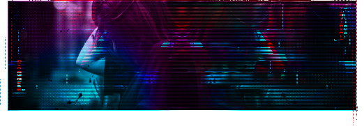
Glitchy Purple.png


Tifa Signature.gif


Glitchy No Name.png


Into the Fire Signature.png


Draw into the Fire Red.png


Saturated Signature.png


Aurora Signature.png


GLOW.png


Glitch Signature.png

^Watch Behind The Scenes Here^


Signatures For Others / Events


FFVII_Remake_GFX_Entry Center Fixed.png

^Made for this thread!^
Kain Signature.png

^Made for this thread!^

Zidane Tribal.png
^Made for this thread!^

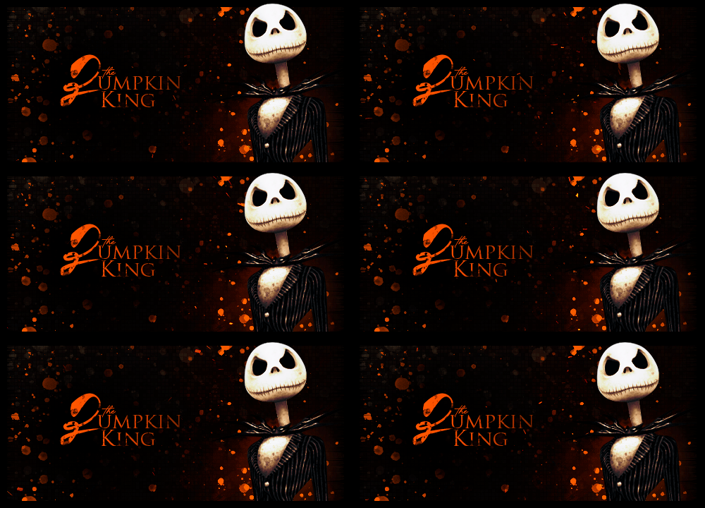
Pumpkin-King-Signature.gif

^Made for the Trick or Treat events!^

Hiss.png

^Made from the Pixel Dust GFX Shop^

Added & Removed Some Things ⤵️
 
Last edited:
Ooo, finally!

The Cloud Strife signature actually cracked me up. I'm also got reminded of how much I actually like the more narrow styled signatures. This is why it's great people post their work! It's inspiring, so thank you!

Keep us updated! :D
 
:D Hey, thanks!!

I'm also got reminded of how much I actually like the more narrow styled signatures.

It's funny you bring this up because I had been doing signatures short and long up until this point! I think that's why a lot of them are different sizes up there. I think the size I like is what I've got rocking right now. Also borders seem to be hit & miss here, which is pretty cool! I feel like my style is kinda up in the air a bit though - I need to lay low on the transparency game 😁

/dork
 
  • Haha
Reactions: Six
Love your unique style, Dagger!

This is my favorite one so far:

dI1VDza.png


Composition-wise, I like that you didn't center the face and provides a great balance with the overall effects.

The way you also did Britanie is rad is sooo cool! You've got a creative mind and it shows. Keep it up!
 
Added & removed some things from the OG post, mostly because I decided I didn't like my 'Cloud Frog' signature, but also because I hadn't made a formal update since 2019 apparently. :ohshit:

Definitely see my own style really coming out, and apparently I have a fear of eyes. Still working on improving my text usage, placement & font usage. It's always been kinda a mess tbh, but I see some improvements by taking samples from others & applying it. My current signature is a bit of a mess in the border craziness (even though it's supposed to be, but you know) and I'm not sure if I like it or not, but I spent too much time on it already & called it quits. May revisit later like I did with my 'Draw into the Fire' yellow/red signature, but for now it'll do. I've been wanting a white/red signature for a while and I felt inspired with the recent GFX talk on the forum :D

Thanks for looking! ♥
 
  • Like
Reactions: Six
Hi Miko,decided to take a look since this part of the forum isn't as active these days. It's really interesting to see your past. There is definitely a style you seem to be going for, albeit not always (like the Tifa, Jack and FF9 signatures). I think your current style is transitioning quite well to this point in time with the current trends. Not sure if you care much about that point though, I just found it interesting how dated (or old-school, depending on your point of view:tehe:) some old stuff I've seen looks compared to the trends now and I guess I felt the need to mention it.

I enjoy the color scheme you chose and despite it being white it doesn't seem empty or clinical, thanks to small details in red. It has enough business to it, but not too much as too eppear overly crowded, it's balanced in a way. As for the text, while I don't find it displeasing to the idea it does take me back a decade, but that is only if you want to stick hard to trends but definitely not necessary.

It would be nice to see something soon again from you.
 
You had me scroll all the way up! :wacky:

Your style is very, very different from my own which I always love to see. Your latest reminds me of a show my mom’s been watching…. The 100? I think.

At first I wasn’t sure about the text being in the bottom corner but I don’t see a fit for it anywhere else, so perhaps it evens out all the funky details around the border (very creative btw).

I do enjoy people who retain their own style versus being a carbon copy of the next artist. Lovely work!
 
Thank you both for your feedback 🥺🥰 I know my style isn't everyone's cup of tea but it's nice to know that it isn't unsavory at least! I know my current sig the text is very strange but like Six said it doesn't really look like it could go anywhere else and maybe it balances out somehow. I dunno! I've still got lots to learn on the text-front! I do like going outside of the box though, especially like with the Pumpkin King sig. That was for an event we ran a year or two ago & I know not everyone likes my own style, and I don't necessarily limit myself to just my style either. It's a lot larger than what I'm used to, and back in the day I always made my sigs run much smaller o:

I think your current style is transitioning quite well to this point in time with the current trends. Not sure if you care much about that point though, I just found it interesting how dated (or old-school, depending on your point of view:tehe:) some old stuff I've seen looks compared to the trends now and I guess I felt the need to mention it.
Haha I definitely know what you're saying! Looking back at sigs pre-2010 era is like looking at old myspace photos. Just a different time I guess! Photoshop, and photo-editing in general really, has come a long way over the years too. I definitely felt very dated when I first joined here because everyone had a lot fancier of signatures than what I had been used to in my own old foruming days :lew:


Thanks again! Really appreciate it ❤️
 
Haha I definitely know what you're saying! Looking back at sigs pre-2010 era is like looking at old myspace photos. Just a different time I guess! Photoshop, and photo-editing in general really, has come a long way over the years too. I definitely felt very dated when I first joined here because everyone had a lot fancier of signatures than what I had been used to in my own old foruming days :lew:
From my experience, it seemed every forum had it's own style of GFX and preference. And sometimes things that would be negative in a different forum would be welcome in another. really goes to show you how subjective some things can be.
 
  • Like
Reactions: Six
Back
Top