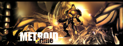
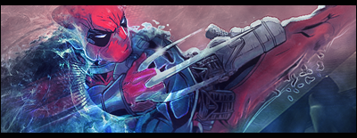
My GFX

Prepare for a long feedback review. :awesome:

estrella-1.png


Amazing signature. The vibrant colours and placement of the stock are amazingly done. I love the Tifa picture you used. I wasn't quite sure about the font though, however. It tucked in rather nicely but the E felt a little out of place.

I love the urban street feel you gave it, and how detailed the background is, while the focal is still clearly visible as well. Great job.

girl.png


This one seemed a bit too messy for me. It had a lot going on and the girl was camouflaged by all the colours, so I wasn't sure if it took away the focal or not. It's brighter, and she's noticeable, but it could've been a bit better in my opinion.

Awesome job on the gorgeous details however though.

spiderman-2.png


This signature has great use of colouring and depth. Dear god, xD I love how vibrant his hand is and it takes off towards the distance, as if you were looking at something and he suddenly pops up. Nice motion capture, and I'm loving the text.

Did you make the S with the pentool?

venom.png


First thing that caught my eye was the text. :awesome: It's absolutely gorgeous. xD The colours really fit the piece, and I love the use of negative space on the left for the text. It gives it a real professional look, and I like that.

LancerEvolutionX.png


I just wanted to point out how gorgeous the colours look in this piece, along with:


They look really great. The use of vibrantness and lack of text in the last one really look great. However, on tags you do place your text, you place them spot on.

vanille.png


I understand what you mean about not being used to girly tags... xD I tend to avoid them to be honest...

Text looks really clean and professional, and the lightning in the sig looks good to me as well. All I can say is that it's just a bit too pink for me. :rofl:

Awesome graphics, dude. Keep them coming!
 
Wow thanks for the great review. I appreciate the time you took to give the feedback. :D

- Number 1 is also one of my favorites. I just wish I didn't drown it with gradient maps and brought out the actual colors more. Rookie mistake >_>
-That second one was one of my earlier signatures. I was learning to use the smudge tool and also just discovered the pen tool! I also realized I could screenshot the image and keep that pattern BG from the canvas on photoshop. Basically I was trying a lot of new things and did a bit too much I guess lol
-Yup it's a pen tool S. I also learned a lot in this signature about depth. The fading t vibrant color as you mentioned and the slight blurring and sharpening were some nwe tricks I learned at the time.
-The colors were one of the only reasons I kept that car signature. I actually really disliked the pen lines they seemed out of place and the spatter in the back corner was just messy. >_>

Again, thanks for the review!
 
I hope it's not too much to ask, but could you put up some tutorials of some of your work? You pieces are very well made and some of your techniques are brilliant. The colors are brilliant and the text and blending are superb (y)
 
2cprkgx.png


Here's my latest. Once again going for the feminine effect :D
C&C Thanks!
 

I really love what you've done with this image of Yuna.

It has a professional painting type feel to it. The texture is appealing and I really do love the colours you've used.

They work well together.

Nice lighting over from the right and the text is nicely done. I rather like the fonts used. =)

Keep up the great work!
 
Your sigs are fantastic. I wish I could make sigs like you. You do a great job blending colors together to make the render look alive. It's a great talent to have. I guess sig making comes more natural to some than it does to others. You have talent! Every sig you make keeps getting better, which is what every artist strives for. Thanks for showing your sigs they are an inspiration to me.
 
2cprkgx.png


Here's my latest. Once again going for the feminine effect :D
C&C Thanks!

I really like this piece. Unique dimensions, I thought. I like the overall flow of the tag, and the placement is quite excellent. I love the lighting in the bottom right corner too, although it looks slightly weird around Yuna's right arm, cutting it off a little too much, although that would be my only criticism. Overall, an excellent piece. I particularly like the text too, it fills up the left hand side nicely ^^
 
I love the lighting in the bottom right corner too, although it looks slightly weird around Yuna's right arm, cutting it off a little too much, although that would be my only criticism.

Yeah I noticed that too actually. And I have an excuse(kind of). When I started making the signature at the beginning, I was going for a 'cutout' & 'displacement' style, but soon after I started messing around more I kind of gave up that idea and didn't really clean up after. Those little cutouts were made from a brush outline filled with some of the other background. Thanks for pointing that out though! :D
 
2cprkgx.png


I really like this tag.

The effects are unique and flow very well and your eye is drawn across the canvas from right to left thanks to said effects and the nice light source to the right.

Nice use of colour as well. You used several and I thought they worked very well.

Unfortunately, IMO, the text kills it. When my eye moves across, the text seems like an obstacle to the path my eye is following. I don't think the fonts used or the sizes used click as nicely as the other aspects of the tag. I think maybe the signature would like much better if it was textless.

A really nice tag none the less. (y)
 
2cprkgx.png


Here's my latest. Once again going for the feminine effect :D
C&C Thanks!
I love the colors used on this! It's beautiful! The placement of the text is perfect even the quote is a great pick. I love how it looks like shards of glass are around her. Great job!!
 
2cprkgx.png


Agreeing with the above posts - the colours are gorgeous and very calming. I love how you captured her between the mountains and the greenery.

Yuna's colours and the ones surrounding her really work gorgeously together.

Even though to me, at first, she seemed like a giant tucked between the mountains, :lew: I actually grew fond of this piece looking at it for a longer while.

I wasn't sure about the text.

It seemed too large on a first view, but it didn't distract me... So I came to the conclusion I like it. xD I thought the fonts actually complimented each other rather well, and the text actually looks like another set of mountains. I can't quite explain what I mean, but just the looks of it. The Papyrus (I think it is that) upper text looks really appealing.

Lovely :-)hmmm:) piece. ^^
 
Thanks a lot for the comments guys! Here's a couple new ones I've made to keep you all updated.

iznqfiy.png


t8MJtYv.png


PacKeSk.png


Enjoy!
 
Last edited:
Thanks Kandy I'm glad you liked it :D

Here's a new one I made. A little more text and concept based here, not much fancy designing going on.

s4n98j.png
 
11ry9sg.png


thats epic. Love the lighting and text especially.
Defintely my favourite out your latest updates for sure :ryan:
Could i be annoying and ask what font you used for the 'choke a bitch' text?
 
11ry9sg.png


That one impregnated me because of how sexy Sam looks.:britt: The placement of the font and what it says is hella awesome.

Great job <333:pandalove:
 
I'm glad you all are liking that one I worked hard on it :D

And sorry Laguna, but I'm not sure what font that is. I have a bad habit of not saving my PSDs :(

This one here I made for a request on my forum :)

iv8roh.png
 

I really like this one.

It's dark but that's the theme of the signature so it suits.

It has a nice smooth look about it and the text is just gorgeous. <3

I love it when people are able to get text working together well!

Great colours too. It has a nice cool feeling and the half border looks great too!

Keep up the awesome work!
 
Thanks Kandy I really liked that one as well. Most people I showed it to didn't like it though because as you said it was dark and they felt it was pointless. I guess some people don't care for concept. :(

Anyways I haven't made anything in a lonnnng time so I decided I'd post a new piece I made just now. :D However, it's a bit messier than my usual.. but it's something so it's okay!

r9kdpj.png


C&C Thanks.
 
Back
Top