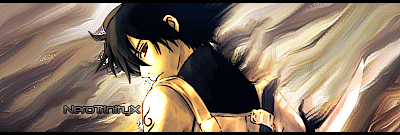
NeroTrinityX
NANI?!
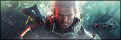
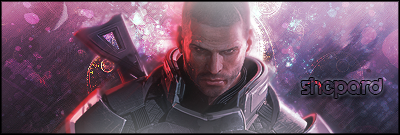
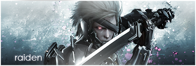
I like the first one better, but your opinions count!
Follow along with the video below to see how to install our site as a web app on your home screen.
Note: This feature may not be available in some browsers.


 I think if you apply the Inner Shadow, and line it so that it's running the same direction as the shading on the render, then it would look a bit neater.
 ")


Thanks for the input, and it's just me. I like working with a smaller canvas.


")


Thanks y'all your words are well appreciated
^ The first sig I ever made with strictly filters and effects
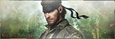
^^Won best Graphic on the Yeousch Forums very proud of it!
^other forum art sig request
Keep it up!