♣ • .:Castles Made of Sand:. • ♣

Dammit, Ryan!! :gasp:
Stop being so awesome!! ;~;

They're all so amazing really, I can't stop looking through them over and over, the colors you use the textures and specially the text, you're so good with text!~
Your lighting, the borders and the way you fill up the entire canvas with awesomeness, I can't say anything else!!

You're amazing!
 
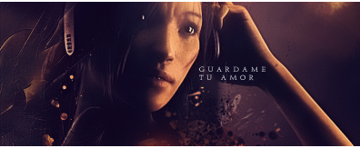
GuardameTuAmor.png


I love your current style. I never thought anyone would be able to pull off a mesh of orange and purple so beautifully so many times. <3 You must teach me. -__-
What I like about this is the softness. It's almost ethereal. You've got the stock placement just right. The formality of the text fits. I quite like the half border, but I've been thinking that even without it, it would still look good. Over-all: <333

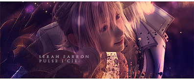
SoTWClaudeKelly.png


I knew this was yours. :awesome: I have to hand it you. Not many people can add so many effects around and still keep the attention to the focal. This has a nice atmosphere about it. Almost emotional. It's unique, it's appealing.


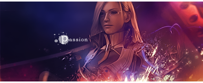
ValkyrieProfile.png


You're very good at adding effects. It's what I love about this tag. It seems like it's really glowing. It's crisp and imaginative. I think the left part doesn't go with the tag that much though. I think it's the brushing on the very left--either add more or erase it? But everything else flows gracefully. Really brilliant, this is. <3

Now go vote on the A and SOTWs. <3

Seriously though, I love your style and how you create. Keep 'em coming.
 
Um...can I just say that you're a million and a half times better than me!? These works are amazing!

Version4.png


This one has always been a favorite of mine. Mainly, I like the split parts of Sweeney Todd next to him. I'm not sure how to do something like that...>_>

thZackFairFFFcopy.png


Same thing applies here. I've not seen too much of these splits, and it's quite amazing. Along with the rich, but not overbearing, color you used, as well.

Kind of makes me feel unfit to be a Clan Leader, tbqh. XD
 
Aqua.png


SigRikuCallout.png


These 2 stand out the most to me. I don't know why these particular 2 do, when you have so many more beautiful than these.

I really like how some of your things seem so simple and yet so complicated at the same time.

I love your choice of color combination's in all of your sigs, also your effects.

<3 I love your work!!
 

First time I saw these attached onto your signature, I stared at it for like a minute. :gasp:

There's nothing bad I can say about these at all. You've owned this style, Ryan. It sort of has an 'out-of-this-world' feel to it that I remember I first saw in your Dissidia Zidane tag way back. You've perfected it. I love the fonts in both, I think the simplicity works because the tag is already filled with effects. The white half border, as you know, is something I'm fond of. I'm in awe of the effects: rippling, glowing, brushing or whatever else you did with it that I can't even tell. :wacky:

Your very best work so far! <3 I'd love to see more of this.
 
Coco pretty much summed it up perfectly tbh. THe colours are amazing, i was staring at this set for aages. My favourite of the 2 would be the bottom one, i love the text and uv made amazing use of the space. Loving how shes breaking away in the first tag, thats a cool effect. Wasnt to sure about the text in the first one but it doesnt mar the tag in any way. Noy your usualy canvas size either its nice to see something different. Awesome work.
 

Simply fantastic work on these two!

You're so good at blending and making the image look as though it was a part of the background originally!

Lovely lighting and effects and the smooth clean look of the signatures are just fantastic!

I especially love the text in the first one! The 'P' looks awesome with that detail around it!

Gorgeous borders as well.

Keep up the fantastic work Ryan!
 
Nice sigs you got there :awesome: I LOVE the texture of it; the water splashing effects is ver cool. Renders are nicely placed and colours used are perfect. Small texts rly suit the pieces. Well done Ryan, keep it up :monster: !
 

Such lovely work on this one.

The colours are very appealing. I love warm colours!

The effects are gorgeous and blended in brilliantly around the character.

The lighting is brilliantly done and is focused well and I love the smudgy look of the background over on the right.

Gorgeous text and border to round it off nicely. =)


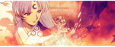
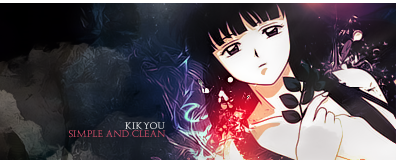
OMG this one is freakin' brilliant!

I love how dark it is and then how the colours and lighting are focused on Kikyou! The effects and colours are so pretty! I love that flare of red near her shoulder!

The blending is amazingly done and I like how the background on the left isn't entirely black. It still has some detail of what's lurking behind the darkness.

Amazing work on this one Ryan!
 
Sesshomaru.png

Kikyou.png


Sigs for Mandi :monster:

You just keep getting better and better.

I thought you were fantastic with real people as stocks, but you're terrific with anime, as well.

For the first tag, I think is just perfect. Always a fan of this color scheme. :wacky: Sharp, pleasant effects and as always, blending is never a problem for you. <3 Good text and border finishes it off perfectly.

The second one, I like more. Mostly because it's a little different from the color scheme you usually focus on though, I love the other as well, don't get me wrong. This just shows your versatility. All elements here balance off each other without taking the attention away from the subject.

Great stuff. <3
 
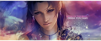
OerbaYunFang.png


Im loving your current style of tags. Everything is in clarity :gasp:
You know how colours compliment eachother and it shows in your tags. The blurred BG and clean look of the focal give the tag nice depth though i think some sharpening of the eyes would help. Or maybe just erase the topaz where the eyes are :hmmm:
Nice text, nice fonts, im quite partial to more formal fonts mself these days. Awesome tag, my favourite by you yet Mr Merc. :mrgreen:
 

....I am still wish---This is great, Ryan. Its simple and the stock quality is great. It always starts with a good image. ♥ The color blendings are great the texture is awesome O.O I wanna touch it....yer CD4 effects are always god, simple and effective, specially effective.
The text is well placed and styled I'd say and in the end simple half border to round it off nicely, well done as usual, Ryan. ♥
 
OerbaYunFang.png


This is really fantastic.
It looks very clean and well made and my favourite parts are the effects used and the colours. There are quite a lot of colours but they work very well together and don't overpower the sig. I don't know how you made the effects but the look great, especially the ones on the right and over her shoulder.
Simple yet effective text and it's finished off with an :awesome: border.

Good stuff ;))
 

This has to be one of the sexiest signatures I've ever seen. :gonk:

The colours are beautiful and blended together so amazingly well.

The lighting is soft on the signature and brings out the effects wonderfully.

I especially love that effect down the bottom of the signature. It's so pretty. <3

The background looks good blurred over on the right. It helps her to stand out more.

The overall signature is clean and sharp and looks fantastic!

I really like that texture in the background over on the left too. It's stunning. It's simple yet effective.

Lovely text and the colours are well chosen.

Also love the half border too. <3

Perfect signature in my opinion.

I want to make a request. :gonk:
 

Fantastic work on this one Ryan!

Gorgeous colours as always. Lovely and warm.

The soft glossy look of it all is very attractive and the blending is brilliant as usual. =D

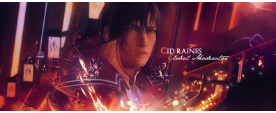
The effects shooting up from the bottom look awesome and I'm not quite sure what's meant to be in the background but it works in well with making the image pop out!

I love how it looks like bits are breaking away from him. It looks trippy/cool.

Very sexy fonts used. I love how you made the first letter on each line a different font and colour!

Awesome half border to round this off nicely.
 
Last edited:
CidRaines.png


Lovely sig. Lighting, BG and effects were ver nice, love the crystal texture.

IMO Cid shouldn't be covered by the lighting/effects, they should be behind him :)

Like Kandy said, :awesome: half border.

Keep it up Ryan!
 
Back
Top