Paddy's Stuff!!!

The Welsh Paddy

The Human Flamethrower
Veteran
Joined
Oct 22, 2006
Messages
953
Age
36
Location
North Wales
Gil
0
Cactuar
Yeah, couldn't think of a better title here...
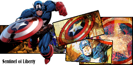
Captain_America_Sig.png


SonicandShadowSig.png
(Note that this sig is supposed to be best viewed with 3-D glasses. The ones with the different coloured lenses, not the ones you get in cinema these days.)

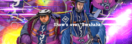
YunaX-2Sig.png


LogosandOrmiSig.png


I used to do so much graphical stuff, but I haven't been into it for a few years. That Captain America one I made was the first in a very long time. I think I do have a thread here somewhere with loads of my older stuff, so I'll link that here when I get 'round to digging it up. I may have some other old stuff that I've never posted, so I'll eventually get 'round to that too.

Anyhow, I'm working on some more stuff as we speak. :) I was quite happy with my Sonic and Shadow 3-D sig, so that's definitely something I'm going to explore further. So yeah, have at them. Be honest and tell me what you think. What works? What doesn't work? What could I improve on?
 
I quite like this one:
Captain_America_Sig.png


I like how it pops out and stuff but I think the black writing should have been white or something, though that could just be because you used to use it on a forum that wasn't as dark as this one.

I also like this:
SonicandShadowSig.png

It's cool that you made it so that it pops out with 3D glasses :O

I dunno about the white edges around the sonic logo though, maybe they're white because you need to see it with the glasses but it kinda looks like it wasn't cut our properly.
Otherwise it's awesome

keep up the awesome sig making :griin:
 
Cheers! :) The white edges were actually do to a lousy cut. I'm using a free online thing called Sumo Paint, which is pretty much a very limited version of Photoshop. I don't own a computer so I can't go downloading anything at the moment. But yeah, it's kinda awkward using it. Although, now that I've had a lot of practice with it, I probably could tidy that Sonic one up a lot. I'll get 'round to it. :D
 
SonicandShadowSig.png


a 3D sig, that new :O, it looks really nice, i adore the fact that you made it 2d, but I do agree with toni on the logo, too much white, but good job on it :O

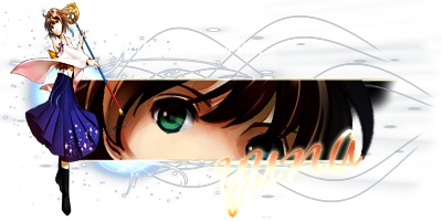
YunaX-2Sig.png


yuna :jess: I'm liking it but a few problems, firstly, the lighting near the second render (I think it yuna hugging tidus) is far too bright, turning the opacity down should help, the render on the left, I feel that their not a need for it, the focus point I feel should of have been the second image not the one right in the left, it feels like it just thrown in and kinda ruins it a bit, it don't help that there no lightning or blending for that render, I think taking that render out would make it much better. getting rid of that render will also allow you to move the text over, as I think the text is slightly too fat to the right, move it o the left and down a bit would help, as it overlaps the render, which disacts me from the focus point

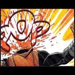
Captain_America_Sig.png


I love the comic style you went for, it suits the image really well on the image of the shild, the dirt effect seems too much, try turning it down slightly, also it more of a forum layout thing, but I can't read that black text, change it to a brighter color soo it can be seen on the forum :gasp:

LogosandOrmiSig.png


I'm gathering that this is one of your earlier pieces, there three main problems, but first the good, I love the background you did a great job, and the size is just right, your blending isn't there at all, graident maps or rubber round the edge of the render will help with this, there no lightning there either, this makes the signature look rather bland and lacking depth, try using the lighting filter to help with this, or mix the dodge and burn tool to make a lightning effect, finally you could use a brush with something like the screen, overlay or the huid light layer type to create lightning. finally the text, it in the wrong place, never overlap the text on the render in these kind of signatures, it can ruin a piece, move the text over to the left will be the best idea for this signature, try adding a 1px black stroke, that will help as well

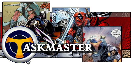
Taskmastersig.png


again, i'm loving the comic style that your going for here but the text on this one os far too big, maybe making the text smaller, it makes the text the focus when the images should be the focus, but apart from that, i'll say that is by far your best work soo far

keep up the awesome work :) I would say work on your lightning and blending to add depth into your work :) also on sigs like the yuna and the two guys one, try adding a border, a border always finishes off a piece very nicly :yay:
 
Captain_America_Sig.png


An interesting piece you got here. Like Toni(Squid), I also love the fuck out of Pop-Out tags. Though this one has a few parts of it that seem a tad bit..what's the word? Rough-around-the edges. Okay, not a word, but yeah. Still, I love this, and it's not bad considering you mentioned it's your first piece in a very long time. So, good job on that. :ryan:

LogosandOrmiSig.png


Gotta say, graphically-wise, this is your best piece. The colors are vibrant, and the text, surprisingly, is placed nicely. Multiple focals are really hard to pull off, and I think you succeeded in that department. One thing I would say is that the honey-comb brushes stand out too much, but since you said you took a break from graphics, I guess it's to be expected. In any case, a good piece. I look forward to seeing more from you in the very near future. :)
 
Here's a new sig I made.

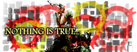
AC_Sig.png


Made it for an Assassin's Creed themed SOTW contest on another forum I frequent. Bit of a "slap-together" job, but I'm actually quite happy with it.
 
Annnd another bunch...

MickeyMouse.png


YunaSig.png


CookiesMilk.png
<--- That was mostly just following a couple of text tutorials.

shacething.png
<-- Collaboration with Shace!
 
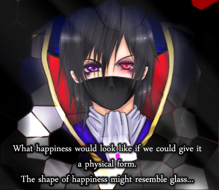
30DaysofNight.png


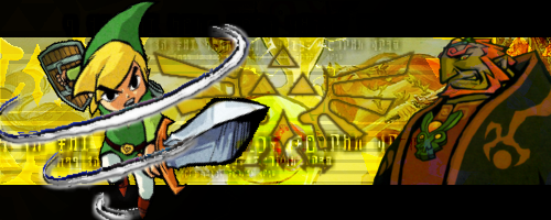
ZeldaSig.png


Well, I got some good feedback for these in the Callouts Voting, so that was very much appreciated. :) Just thought I might as well whack them in here. I'm kinda stuck as to where I should work on improving more... :hmmm: I keep trying out new things, but never feel like it's any better than my previous stuff. Moar feedback would be great!
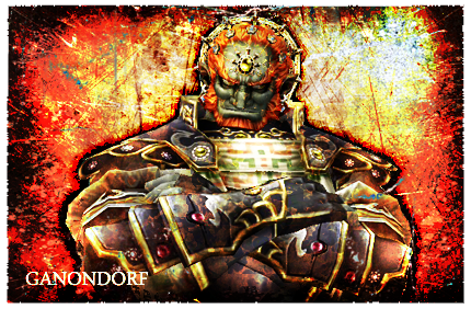
 
I loooove the toon link one :griin:
I couldn't say if it's perfect, or critique it properly, but the hurricane slash effect around Link and the colours etc are perfect imo.
Good work :sir:
 
Dude... My jaw dropped, for some apparent reason I can't help but keep staring at that Yuna sig, same with that Link sig.
 
Made that Yuna sig fer Steve-o. :D That's probably the one piece I'm most happy with actually. :hmmm: Only thing I'm pleased of with that Link sig was the colouring. :D That one was for a callout with Martel in which I got well and truly pasted haha. :wacky:
 
Right, quite a big update here... :hmmm:

So, some of my more recent pieces, but in no particular order!

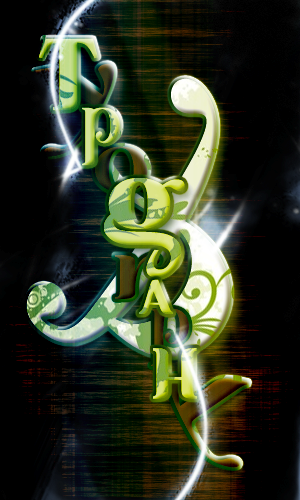
Typog.png


Other than that Cookies & Milk thing I did, this is my first real attempt at doing some typography.

Some sigs...

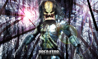
PredatorSig.png


SquallFFVIIISig.png


MovieQuoteSig.png


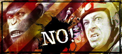
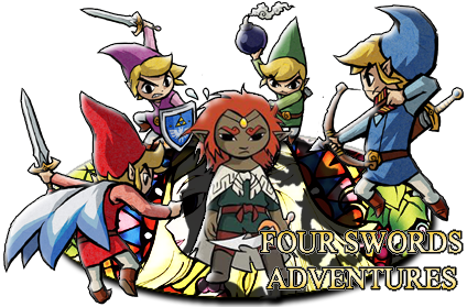
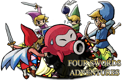
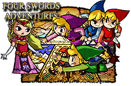
These lot were made for Greeny...

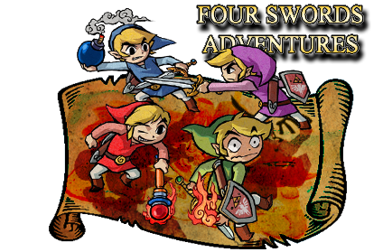
FourSwordsSig.png


FourSwordsSig1v2.png


FourSwordsSig2.png


FourSwordsSig3.png


Along with some matching avas...

FourSwordsAva1.png


FourSwordsAva2.png


FourSwordsAva3.png


FourSwordsAva4.png


And some more random sigs...

MarioSig.png


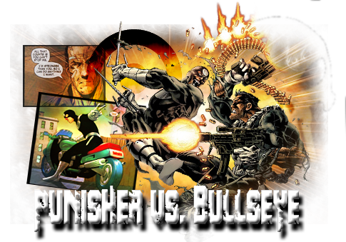
PunishervsBullseye.png


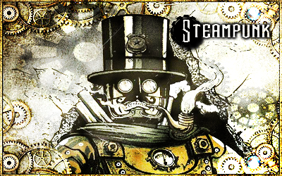
SteampunkSig.png


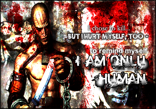
ZsaszSig_zps81ff6bce.png

Some feedback would be very much appreciated! :monster:
 
OMGawd! I love the Mario siggy! That is pretty sick man! (in a good way of course) I love how it just pops out at you.

I also love the "I am only human" siggy in the most recent update. It has a pretty freaky feel to it, which is awesome.

You're doing great stuff Welshy! :)
 
Well, it's been a while, but I have another big update!

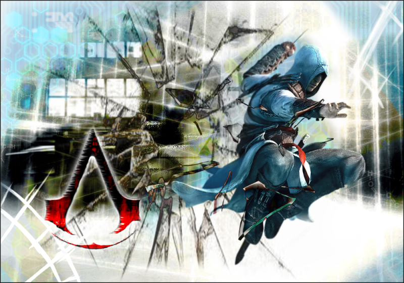
AssassinsCreed_zps1ef6a2da.png


Well, it would seem I'm quite well known for having my "pop-out" graphics. :wacky: Here I wanted to try something that's still along those lines, but still confined within a rectangular canvas. I made use of a shit load of textures set with different layer and blending options. Gaussian Blur was a tool I used a hell of a lot with this, which I find helps add more depth to it. Basically, I wanted to make this look like Altair is breaking out of the image. Please tell me whether I have accomplished that or not. :lew:


TheWelshPaddySig1_zpsf77871a7.png


TheWelshPaddyAva1_zpsb52a2499.png


A new set I made for myself.

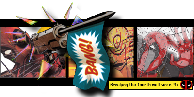
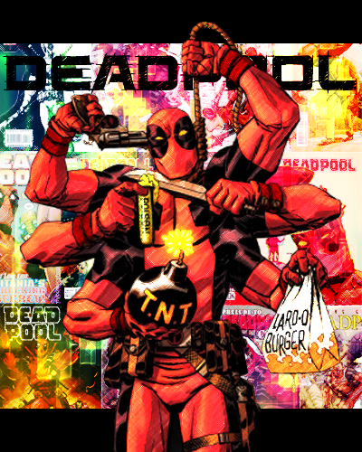
Deadpool_zpsd70a169a.png


Callout entry vs. Yu Narukami.

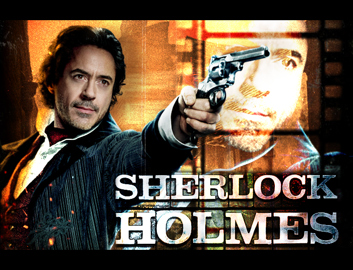
SherlockHolmes_zps2555e454.png

Clan challenge entry.


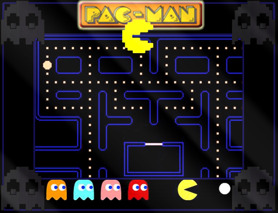
PacTitle_zps7f1eaa29.png


That Pacman thing is meant to be a Title Screen for some retro fan game some person is making with RPG Maker VX Ace. I wanted this to be something both good quality and also still look like you're looking at an Arcade machine.

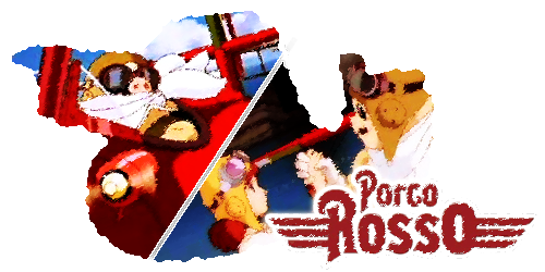
PorcoRossoSig_zps200099d0.png


For a Studio Ghibli themed Callout.

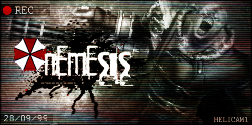
NemesisSig_zps50ee583e.png


Resident Evil sig for a Callout vs. Yu Narukami. HERE is the original image I used.

Redrum_zps8f859825.png


A horror themed Callout entry.

Some feedback and advice would be very much appreciated. :monster:
 

Attachments

  • AssassinsCreed_zps1ef6a2da.png
    AssassinsCreed_zps1ef6a2da.png
    770.1 KB · Views: 186
That Nemesis siggy is fucking hella awesome! It captures the scary feeling and such perfectly. I love the date on the bottom and "REC" logo on top. Those details really add to it for me. Everything else in your latest update is pretty cool as well! Great stuff Welshy :)
 
Back
Top