Sabriel's GFX Fusions

Status
Not open for further replies.
ok29vn.jpg


Nice colours but watch the render/stock. Try not to have ur background flowing over the person. It interupts the flow. I think merc said aswell a few post back about trying more bold fonts, id definately second that. The text although it isnt by any means impossible to read its still quite awkward on the eye. Pick something a bit more formal maybe and use a bolder colour. If it still looks hard to make out try darkening or lightening (depending on font colour) the area behind the text so that its easy to read. Your coming along well though, so goojd job ;))
 
I'm apologizing a head of time if you might find the following statements offensive, just saying that I'm only hear to critique and help you out as much as possible;

To be extremely honest, regardless of how long you've been messing around with Gimp or Photoshop, whether it be a few months to a year -- Your current movement through styles, and your techniques that you've been using to make your work needs a tremendous amount of work. I've looked at everything you've showcased in this thread, and there's a constant theme going on, and its evident that you're having some issues with -

* blending, color selection, layering, text placement, and resource selection:

Whenever you use a stock that's of an anime character, you usually have free reign to use most techniques. However, you also need to pay attention to what colors are 'within' the stock itself. What color is its skin, is it wearing more reds, blues, etc? A good piece of photoshop work is all in the right combination of colors. In your work, it looks as though you're throwing anything in there to mostly take up space. When you use anime-stocks, you can use brushes, vectors, and colorful resources to help build up the sig. However, if the anime-stock has more 'dimensions' to it, meaning if it has a lot of deep shadows or evident lighting in the drawing itself...then you can use 3-dimensional resources such as C4D's and photography.

When you use 'real life stocks' such as super models, actors, and so on - Know that it's a completely different ball field. Since those stocks are actually people, that means that they have more dimensions in them for you to work with. Meaning, that you need to grab stronger resources, instead of just focusing on brushes. You can google:free downloadable vectors to build a resource pack with those as well.

Then when it comes to typography, or just 'text' - The text placement that you've been using isn't working too well. I'm noticing that you're starting to rely on using the 'fancier' and 'girly' looking fonts. Don't be afraid to use the plainer fonts as well. It isn't always the elaborate font faces that make sexy tags. Its all about your choice in them, and how you use them. When you put in your text, make sure that every word is visible, if not just sharpen it up or use a stronger font face. Unless they're meant to be faded, having text that blends it with darker colors doesn't always work as well. That's evident in your 'Believe in Wonderland' piece above.

Also, I should mention resource/layer mixture.
When you start building your signatures, its always good to use things that look similar to each other to position in your tag, instead of just grabbing things that don't have much correlation to each other. The two signatures on Page 2 have that problem. The black heart in the pink one doesn't mix well with the pastel brushes, and makes it look awkward. Then the brush and C4D placements on the other don't mesh well because they were never meant to go together. Choose one type, and stick with it. It's always best when your work looks balanced, instead of messy and scattered.
 
2zsy1cz.jpg


avgzsi.jpg


ekko00.jpg


Long time since I've updated >_> Need to make something for Luffy and Ace :sad2: CnC please!
 

These two look great!

I love the little orbs in the background though I would suggest that they be placed around the focals a bit better so that they don't cover them up.

I would suggest sharpening the focals a bit more and maybe blurring the background around them a bit so that it focuses on them more and establishes the focal a lot better.

The lighting is well done and the text is simply gorgeous!

Lovely fonts and you've placed the text well.

I love the snowflake and sparkles in the bottom one and I think you represented the isolated theme very well. =)
 
Last edited:
I LOVE the James Morrison one Sab!

The text looks fab in all of these, the colours are nice and bright and blend nicely with the renders.

10/10 LOVE IT!
 
I like this one, I think the lighting and colors you used sit well with the entire image. =) The effects make the image look simple and appealing, the text, however, isn't placed or styled correctly I'd say. The color of the text sits fine but the placement doesn't seem to flow along with the picture. Maybe an overlay or making the text fade a bit more would help as for the placement, you need to find a way to make the 'click' together. Like puzzle pieces. I'm not too sure how to explain it any further x.x;;

:monster:
 
avgzsi.jpg


:gasp: Probably your best one yet! The softness is great. You're improving nicely on your text, and your signatures are getting a really clean feel. :D Great work on this one. The brushes you've used look really nice.

Amazing, keep it up, Sab!
 
Thanks for comments everyone!

@ Kandy: The orbs XD were aimed at lighting, and I tried to blend them into the background, it didn't work ):

@ Joey: thankies, was rly into him.

@ Kira: Srsly? I just meddled with the filters and such... LOL. Thankies again anyways! <3

~x~

New ones:

28sv48i.jpg


10h0vhh.jpg


For the other forums I go on now, CnC please! :monster:
 
10h0vhh.jpg


I must admit i kinda like what youv done with the text on this tag. Granted i think some of the letters positions could be better. I like the 'N' the most. I Think had you tried to incorporate the other letters into the environment a little better this would be a awesome tag. Nice work though. Good to see something a little different.
 

Hiya Renn im a gimp user too so i know what ur going through. what version are u using by the way? ur whole idea is awesome, unique and differerent. i like the later of the two. the letters could be more incorperated into the background. i see u tried to do that in the later one by softening/blurring. it works with the butterfly and the "n" in the sign but i feel the last "N" was too blured, making it nearly illegiable. that purple splatter, did u intend it or no? thats should be more blended and lightened. ok other than that good job.
 
@ Lew; I realised that, was making the letters as if they were on the edge of the building :) Thankies though <3

@ Kaka; I use Gimp 2.6.6 o_O The purple splatter? Maybe it's just I did it then I fogot about it thing :awesome:

~x~

Talk about a slump :ness: I'mma post all my recent GFX here:

IMPORTANT.png


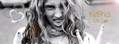
KESHA.png


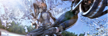
shiva.png


KESHA2.png


CnC please! :monster:
 
I could have sworn that I've posted here before! :wacky:

IMPORTANT.png


I like this one a lot. Nice subtle effects like the hearts and the butterfly. The lens flare is a nice add as well. It has a very soft touch to it.
 
Thanks Shadra! I could've sworn you did too :wacky: I was aiming for that feel as well, so :monster:

~x~

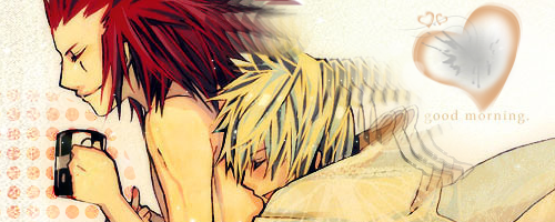
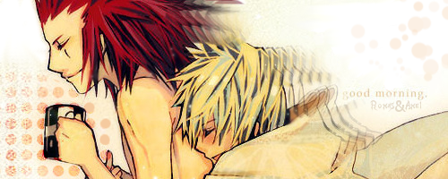
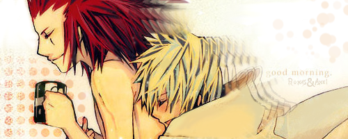
KINGDOM HEARTS: 358/2 DAYS SIG *squeals*: (Made 4 versions of it, YES, 4)

AxelandRoxas2.png


AxelandRoxas3.png


AxelandRoxas4.png


As usual, comments would be much loved!
 
Nice work on theeee game cover sab. I think the front looks pretty damn good. Very professional. The back however imo is thrown off by the font. Its a bit messy and takes away from the smooth finish. Maybe try a a more standard font next time. Other wise nice work.
 
OMG Serious slump >_>

~x~

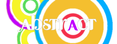
abstract.png


jecht.png


Yes. It is meant to look like that. Kung-fu style piece.

tryh.png


That, I'm stuck on. ;_;
 
Wow, Ali! They look absolutely amazing, and I can't believe I haven't commented on this thread yet! :gasp:

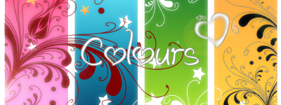
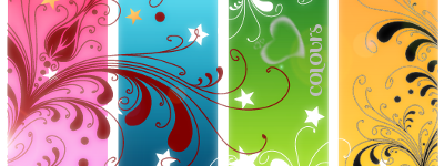
I really love the Silhouettes sig! I love the stylised lettering and how you've turned the o into a heart! It's cute! It's a beautiful use of blue as well. Your Colours sig is also very eye catching as well because I adore colourful things! The first one is the one I personally prefer. :jess:

And I don't think you're starting to lack at all! Keep going!
 
text2.png


OMG, I love this x3

Its color is so vibrant and the effects look great

The text looks great, and again, the effects make it look so much better

Everything comes together so nicely and its just awesome.
 
Status
Not open for further replies.
Back
Top