skxCreations

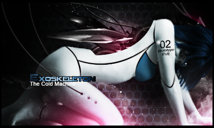
Exoskeleton

Pale Flesh
Veteran
Joined
Apr 5, 2009
Messages
3,389
Age
32
Location
Locked Away
Gil
9
~ New permanent graphic thread showing only latest projects ~
Latest update[5-23-12]
General Information
Name: Oli-SKX (Josh/Oliver)
Experience: Intermediate
Software: Adobe Photoshop CS5
Adobe Illustrator CS5
Deviantart: [link]

+Gallery List+
The Doll House - [link]
Liquid Gears -In Progress-

Latest Projects
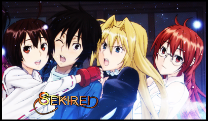

sekirei_zps3d72abec.png


Gollum_zpsc5624176.png


bioticbionicedited.png


cyborgenhanced2.png


LegendofDragoon.png


TOP.png


Steampunk.png


Sweenykiss.png


Celestica.png


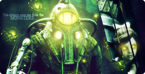
Exoskeletonenhanced.png


Avatars

Bella.png
KarenOavatar.png
woman-1.png

Alice-1.png
ulticorrectedavi.png

MermaidAvi.png
LithiumFloweravi.png

fuu-1.png


Signatures


yunosig2.png


shiro-1.png


lcborder2.png


AyaBrea2.png


Ultisig.png


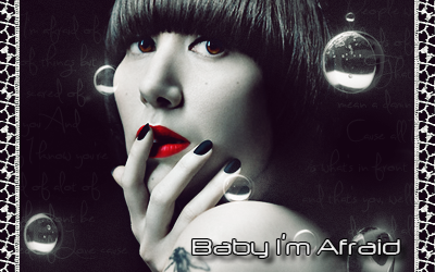
Dollface.png


Collaborations

With Lirael:
DemonSoulsCollab-4.png


wonderland.png


Favorites

aLISA.png

Florence.png

Ultisig.png
 
Last edited:
You've made a dramatic change to your styles, and your skill level have really also changed Dramatically.

You beat me at the "Undead, Zombies, Evil" callout we had. Ovedue congrats, but hey.

Good work Oliver. Your avatars also look yummy.
 
Looking over your sigs, avvies, and everything else, I've noticed you really love using fantasy concept art. :lew: Still, you're improving brah, so here here. :dave:
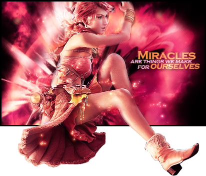
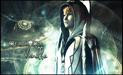
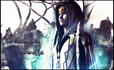
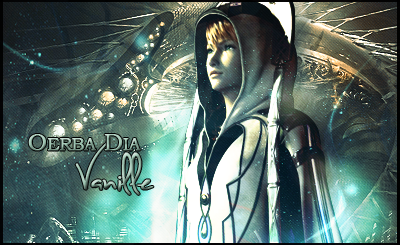
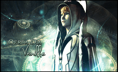
vanille123-2.png


My favorite piece from you, just because I am a big fan of the pop-out tags and this is a unique take on it. :O
 
Your works are so vibrant and nice to look at. I am so impressed by these:
Alisa2.png

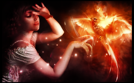
Soaringflames2.png

vanille123-2.png


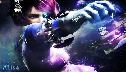
They are lovely, and so shiny. I love the lighting and vibrant colors. The effects on the right of the Alisa sig is cool and blending is great. I am also very impressed by the glows and colors in the phoenix sig.

Great works!
 
Avatars


MermaidAvi.png


Signatures

vanille123-2.png


Alisa2.png


Soaringflames2.png

I really love your style and the ones I've copied above are my favourites out of your update!

All your work is so rich in colour and beautiful. I really like that your signatures all have a different style and that you aren't afraid to try different things.

The last one with the Phoenix (I think it's a Phoenix) is just so vibrant! I love the lighting around the Phoenix and how smooth and glossy it looks.

Keep up the fantastic work!
 

These are my favorite signatures in yer gallery. The way Vanille sticks out of the signature is great; usually I wouldn't go for something like this but I think that it works really well for the effect you added in the middle. I like the text as well, it's simple and it draws perfect attention to it self without taking away form the main image.

The colors and the blending on that collab are fantastic! The image is well composed but it does seem a bit empty...like it's missing something. Maybe some text or a border; unsure about both, though.
 
You've made a dramatic change to your styles, and your skill level have really also changed Dramatically.

You beat me at the "Undead, Zombies, Evil" callout we had. Ovedue congrats, but hey.

Good work Oliver. Your avatars also look yummy.

Thanks! ^^ I'm glad you think I'm improving. It's helps motivate me to do more haha! This means alot from the GFX master Seijiman. rawrs~

Looking over your sigs, avvies, and everything else, I've noticed you really love using fantasy concept art. :lew: Still, you're improving brah, so here here. :dave:
Haha yus I prefer concept art from any game/movie over anything else so you've figured me out xD Thanks a lot for your input! :3

Your works are so vibrant and nice to look at. They are lovely, and so shiny. I love the lighting and vibrant colors. The effects on the right of the Alisa sig is cool and blending is great. I am also very impressed by the glows and colors in the phoenix sig.

Great works!

Haha thanks Cid! I appreciate your input! I love to experiment with colors and lighting and I'm glad someone noticed mine! ^^ I'm actually a big fan of your work!

I really love your style and the ones I've copied above are my favourites out of your update!

All your work is so rich in colour and beautiful. I really like that your signatures all have a different style and that you aren't afraid to try different things.

The last one with the Phoenix (I think it's a Phoenix) is just so vibrant! I love the lighting around the Phoenix and how smooth and glossy it looks.

Keep up the fantastic work!

Ah thank you so much Kandy :x3: I'm still trying to find my own "style" of making sigs and experimenting is one way for me to find it :P Getting the phoenix signature to look vibrant was anything but easy so I'm glad you like it ^0^.

These are my favorite signatures in yer gallery. The way Vanille sticks out of the signature is great; usually I wouldn't go for something like this but I think that it works really well for the effect you added in the middle. I like the text as well, it's simple and it draws perfect attention to it self without taking away form the main image.

The colors and the blending on that collab are fantastic! The image is well composed but it does seem a bit empty...like it's missing something. Maybe some text or a border; unsure about both, though.

Thank you so much for the input! ^^ That collab signature was really fun but it was Lirael's decision not to put text. I respect her action though because all I like to look at are the colors anyways :P


I had some time on my hands and completed some new signatures and avatars:
caiusavi.png

caius.png

KarenOavatar.png

LithiumFloweravi.png

kareno.png


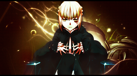
saber.png

I was working on this one but couldn't help but to think that something was missing :hmmm: text didn't work out in my case...
 
Haha thanks Cid! I appreciate your input! I love to experiment with colors and lighting and I'm glad someone noticed mine! ^^ I'm actually a big fan of your work!


caius.png

Hey thanks! I'm delighted that you like my works :x3:!

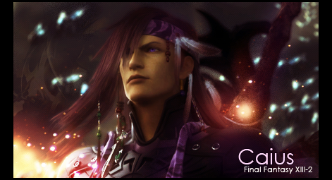
Anyway, that Caius sig, it's lovely! You have used spot-on, right combination of colors and the glows are amazing as always. I am not usually a fan of corner text recently, but it seems to work well here! The borders complement well with the size of the sig too.
 
caius.png


Zomg, this is fantastic! The colours work beautifully, the effects are simple yet brilliant with the render, which it itself well-chosen and placed. I just love the colours, the blending and the lighting effects. It's a gorgeous piece. :)

The text is a little simple but still works quite well! :)
 

This one seems to be a favourite among us all. XD

It really is a fantastic signature! I adore the lighting effects arond him and the colours!

The black border works awesomely with this piece and the text stands out nicely. <3 Nice simple text and good placement.

It's an awesome piece!

Keep up the fantastic work!
 
I've been working on a vanille one for a while. I dunno which background I want! Her render is the cleanest I've ever managed to cut so I'm proud of that ^^

van-2.png


van4.png


van2.png


van3.png


Ahhhh which is best? >.<

Other Stuff

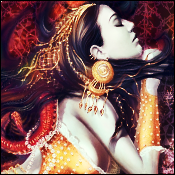
woman.png

Love the artist of this one ^o^ All I really did was give it color, the drawing style is so fascinating though ^^


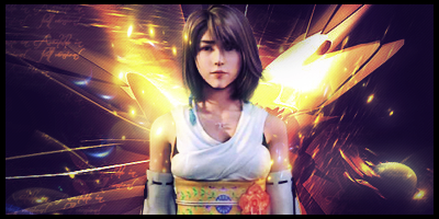
Secret Santa thing

yunasigsanta.png

yunaavi1.png
yunaavi2.png


Rewatching Hellgirl episodes
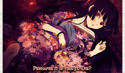
hellgirl2.png
 
van-2.png


van3.png


I prefer the background in these two! It's more balanced. The blending is superb and I really like the text too! :D The fancy font works well - it's rather Vanille! - and the simpler font balances against this. The colour and size of them is fairly good too. I'm not 100% sure about the placement, as I feel they could have been closer together. Oh, and well done with the render! It's nicely done! :)
 

Those two of Vanille are my favourite. =)

Love the backgrounds and the lighting around her. Very cute font used as well.

Great work on the render. I always sucked at that sort of thing. Very impatient. >.<

The avatar of the girl looks awesome too. Love the image you've used and the colour you've added to it. It looks rather mythical. =)
 
It's been a long while but I'm back with a batch of new sigs. I also think I'm getting a bit better at inserting my "style" in a signature. Decided to dust this place off and do some renovating. Out with the old and in with the new! I'd appreciate any feedback I can get from these. So here's what I've been up to so far:

Sets:

Ultisig-1.png
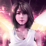
ulticorrectedavi.png


AliceGlass.png
Alice-1.png


Random Siggys:
GITS.png


Dollface.png


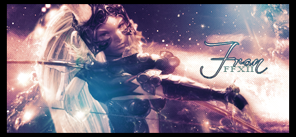
Fran.png
 
Ultisig-1.png
ulticorrectedavi.png


These are absolutely incredible! The blending is phenomenal; the character is lost in a sea of clouds! There's something very striking about it - the composition makes it appear as though he is floating the sky, watching some dramatic sequence unfold in front of him, perhaps a thunder storm or an aerial battle! The text is spot on, methinks. It maintains the colours and tone, doesn't dominate the piece, but it's clear! It actually looks very professional; I could imagine seeing this on a book cover!! :D Would you be able to create a tutorial? ^_^


AliceGlass.png
Alice-1.png

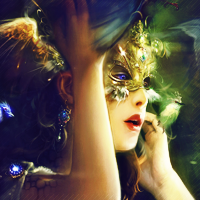
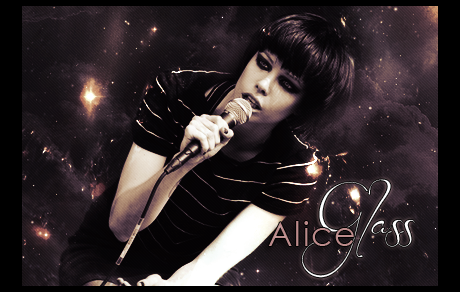
This one here is very pretty. The text stands out to me as it's different and classy, as the woman appears to be herself. The subtle, minimal blending here also works with the real life render; it can be really difficult to make a peice convincing when you merge real life renders into created backgrounds. Again, I would love to see a tutorial. Your work is incredibly stylish! :)


Random Siggys:


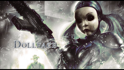
Dollface.png

This is just creepy. :ness: The blending is spot on, the effects are very pretty - did you craete the snow around her? How much of the background was created from brushes? The text is also super! :ryan: I'm keeping this short and sweet...the render is far too creepy! :ness:
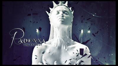
Fran.png

Absolutely stunning! The effects are soft, gentle and beautiful; the blending is fantastic and well balanced! More fantastic text! ^_^
 
@[Exoskeleton]

Ultisig-1.png

I like how this feels classy and scary at the same time. She's blended well into the color scheme. Though I would personally not erase part of her lower body too much. Nice lighting though.


AliceGlass.png

I absolutely love the text in this one! It fits the piece well. The scan lines add a nice touch to the piece =)
 
Would you be able to create a tutorial? ^_^
I probably wouldn't be able to seeing as I kind of suck at explaining those kinds of things. Maybe one day I could man up and try to make a tutorial for a sig like this one. ^_^ The Alice Glass sig could probably have a tutorial though so I'd think about that. The reason she blends so well is because that photo of her is not actually a render! :P

The blending is spot on, the effects are very pretty - did you craete the snow around her? How much of the background was created from brushes?
Thank you! ^_^ The effects for that one are actually a desaturated Cinema 4D image I found that replicates space. It makes a really nice snowy effect if you place it just right and erase parts you don't need with a soft edged brush. I rarely use brush effects on anything anymore. I could give it to you if ya want though just say the word. ^_^

Though I would personally not erase part of her lower body too much.
Oh no! How did you know about that? xD Guess that's something I couldn't hide too well. :P

Thank you so very much Lirael and Uncle Ulty for you comments! They've kind of helped me see what works and what doesn't work in the signatures I make. I appreciate your feedback so much! :x3: I've got a new small batch of signatures now. >.>

SnowWhite.png

Saw that Snow white movie where that Kristen girl smiles. Really loved this character though. This signature never really felt like it was the best I could do though no matter how many times I tweaked it.

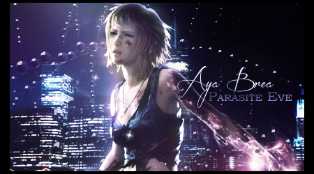
AyaBrea2.png

Parasite Eve signature. I was thinking this one maybe had too many effects but I couldn't stop myself! :hmmm:

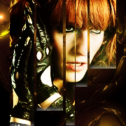
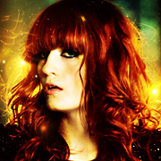
Florence.png

I'm kind of proud of this one. Experimented with technique a bit and manipulating colors. This one's pretty ace when it comes to what I've worked on in the past. The yellow lights and blending with her hair seemed to happen so effortlessly. I think the red hair helped with that, to that point where it sort of blends in and looks like in certain sections the C4d image I used. o__o

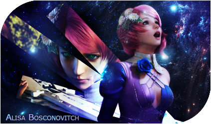
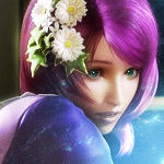
aLISA.png

Watched a tekken movie and got inspired by how cute Alisa Bosconovitch was! <3 Somehow in the middle of this I accidently closed the psd version of it so it's kind of incomplete. I lost the Psd so I kind of had to make to work with an already saved png file :sad3:

Avatars:
fl.png
FL2.png

alisa2-1.png
alisa3.png
 
Last edited:
SnowWhite.png


I think the placement in this signature is really nice. The colours don't clash, but I feel like it's a little out of place with such big difference in contrast. I'm personally not a big fan of the text, but it's definitely improved. :gasp: I'm talking about the subtext, the primary text looks fine. :ryan:


Florence.png


Very nice signature. Specially like the lighting and gloss the signature has. The text is awesome, and the little cut bar on the left :ohoho: Very nice. Placement is very nice. The colouuuuuuurs. :gonk:

aLISA.png


This tag is amazing, but the text does NOT suit it at all. Remove it, the tag is awesome without it! Placing text in the corner of a text pretty much suggests you had no spot to place it, so it's gonna be considered 'crammed in' do not do eet. The tag is gorgeous without it.


alisa2-1.png
alisa3.png


Love these, the colour and lighting is absolutely amazing. The second one looks like something Coco/Prinsesa would make. Very very nice.
 
Thanks a lot Kira! Your comments really help! I'll take them into consideration when working on future stuff. :yay:

I have some old stuff I might as well add to the bunch.

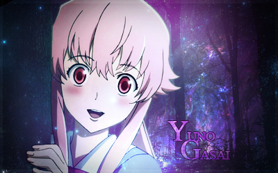
yunosig2.png

THis signature took a lot of work in terms of combining anime and realistic photos. Blending the forest in the background and making the wall she was grabbing onto a tree was the most difficult. The lighting was a bit too bright in this one imo.

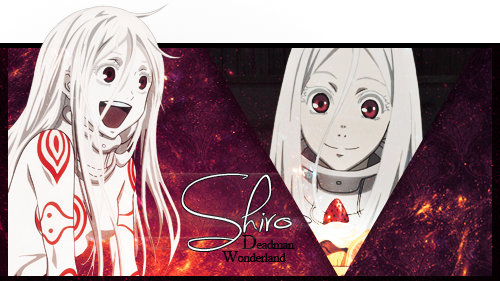
shiro-1.png

Shiro signature. I was mainly experimenting twith background textures. I really like the one used in this one ^.^

lcborder2.png

Experimented with making another pop out tag.

Edit: Forgot to add this one in xD
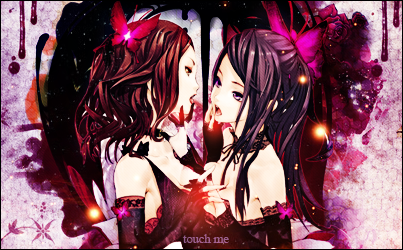
touchme.png
 
Last edited:
yunosig2.png
I actually really, really like this one. It almost give a hint of surrealism, since you really don't expect anime with real life images. A unique way of doing things. I do think it would look best without the stars texture. It just seems out of place somehow. I do like how the finished product looks, however. :)
 
Back
Top