SOTW 107 Voting Thread

SOTW 107


  • Total voters
    10
  • Poll closed .

Saga

ice ice baby
Veteran
Joined
Aug 16, 2007
Messages
3,123
Location
:inmypants:
Gil
0
This weeks Theme was Music!!

And there are the entries I recieved.

REMEMBER: You must post in order for your vote to count. ;))

1:
picture.php


2:
GerardWay.png


3:
sotw107.png


4:
2625hn7.jpg


5:
24b2lmq.jpg


6:
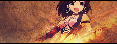
haruhisignature-2.png


7:
25psrco.jpg


8:
MusicThemeBlackBorder.png


9:
QuietEnergy2.png


10:
334jioh.png


11:
3859512412_c72207c229.jpg


12:
EminemSig.png


13:
SoTWClaudeKelly.png


14:
sotwviolin.png


If I've missed anyone, let me know
 
Wow, a lot of entries this week!

I had a few favourites.

4, 12 and 13 really stood out to me.

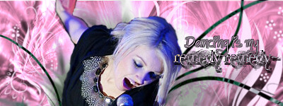
Though I'm a fan of pretty colours, and Lady Gaga looks simply yummy in this piece! :gasp:

Number 4 for me.

I love the glistening, sparkly look on her hair and the blue, pink and purple look absolutley gorgeous together!

Her lips look delicious by the way! :gasp:

The blending is superb and the lighting looks fantastic!

It looks so alive and in ya face!

The text looks like it's floating a little bit too much though. Maybe a variation of fonts would have looked good together, instead of the same font for the three lines of text.

I love the colours used in the text though. It looks great and very fitting!

Splendid work!

Well done to all who entered!
 
Last edited:
All are great, but its number 1 for me. Its the style and color that grabs me. It stands out and it looks amazing. Great jobs there!
 
It was a really tough choice between 12, 13 and 14 for me but i went with 14 because i love the violin, the quote and the smoothness of the sig. #12 is awesome though, great work.
 
Ones that stood out for me;


GerardWay.png


Perfect signature. Text is amazingly well positioned in my opinion. The bigger "Way" in the background behind the text is a really nice touch to, I think. Blening around Gerard is done really nicely, and I love how interesting the right side looks, adds so much to the whole image I think. Really nice.

The only thing I wasn't too sure of was the size, even though the space has been used up really nicely.

EminemSig.png


...:gasp: I don't like rap music, but me likes Eminem. *Ahem* Either way on to the sig.

Really pretty. Blending in this one I really like, text is really nice, as well as the familiar three dots I've seen around before. :gasp: The whole firey colour scheme worked really well. As Eminem would spit words, this signature spits awesomeness. xD

SoTWClaudeKelly.png


Same as the one above. Really like the blending, and the complete image of this one, alot going on, but still being able to see the actuall "theme" is what I thought was nicely done here. I like crowded sigs, if they're done well. And this one is.

sotwviolin.png


Omnomnom. Really pretty. I think it's funny how most had the same colour theme going on, xD Twas something I noticed.

I love the "Feel the music" text in this one, it's just awesome, and works really nicely on the sig. The girl blended in with the C4D's is awesomely done, and I just love the small sparks on the bottom. Though the girl looks so sad, the text seems to fit perfectly. <3 Love the sig.

----

I wish I could vote for two pieces, xD... But I can't so.... my vote goes to.... =/ number 12. :D


I went for number 13. The simplicity is amazing. I love the use of color, the cut on the image, and the little extra around the edges. The image size is also a plus too, seeing that they got so much into a small place and made it work. good job! :D
 
It was between 4, 13, 14.

4 - This is just so vibrant with light--I love it. The stock is well placed and the effects, although a few of them look too crisp, look fabulous. The blending and colors are great. My only concern would be the text. I think it's too small and could look better in another place. Over-all though, this is just wonderful.

13 - It took me a while to notice this because it was quite short compared to the other tags, but once I really saw it, I found how stunning it all is. The effects are professional and the two colors jive so well together. I never thought subtle lighting can look this good. Really, I'm running out of praises for this. >_>

14 - Very clean and the entire piece looks polished. It's simple and yet beautiful. It lacks a little color for my taste, but I suppose that could be the intention of the maker. Very nice piece.

In the end, my vote went to 13. Fantastic job to all who entered. ^^
 
Argh. You all are amazing. I saw #3, thought "How can that be topped?" -- I love the swoosh texture mirroring the bird wing, the piping on the guy's lapel and that snappy font -- and then further down there are more shinies.

#14 and #12 also have stupendously subtle coloring and textures. I especially love the way #12 picks up the tattoo-textures with the circles and Greeked text in the background. Again, great use of interesting, appropriate fonts on both.

However, while I am a font junkie, there's so much emotion in #13 that wins me. The photo itself is just so evocative of the artist's connection to his music. The coloring is so rich. The blues tucked in to complement the oranges goes back to one of the few color lessons I've learned about shadows vs. highlights. I love the subtle little textures or brushwork (I'm not sure; I don't do this stuff like you folks do) along the bottom edge. Most of all, I love the off-center placement and crop, which puts the sound of his voice -- the gap between his lips and the microphone -- the unseen but all-important music -- in the middle of the graphic.
 
My favorite were 4, 12, and 14.

4, the lighting was great, I just loved the whole glow and misty kind of look. It was very VERY nice.

12, I'm not such a huge fan of Eminem, but this looked fantastic! The little flare at the top was so perfect, added an extremely nice effect. The colors are really great too!

14, Beautiful look on her face. ^_^ The violin is such a pretty instrument, I don't think it gets much love on forums :gonk:
Anyway, i love the simplicity and the colors! It's just perfect. =D
The saying is also wonderful. This was awesome =3


I voted for 14. :)
 
I would comment each tag but sheesh, there's a lot of entries this week, so I'll just mention a few and make this quick.

#4 - Like the color scheme and simplicity. Lighting's pretty nice. Text and placement could use some work though since it doesn't seem to sync in well with the rest of the tag.

#7 - I keep staring at this. There's just something that tugs at the heartstrings here...perhaps maybe due to the slight effects used...it really made me wanna play the piano again which I've neglected for a couple months. >.> But the text really fits in here and the color scheme is awesome. The notes accompanying the instrument made it perfect. Simply love it!

#9 - Another great one that I like. The elements are totally unique and one that I've never really came across with before, so this definitely stuck on my mind. I do believe I have the same texture style on my folder somewhere. xD But anyway, she was blended in quite perfectly and the color theme was just perfect. Loving the text as well - the whole signature just screams 'Oriental'.

#12 - Great job on this one. Nice colors and text. I think he could have blended in more a bit though due to the overwhelming lighting behind him...but it's no biggie.

#13 - Love it. The lighting, the colors, the very subtle smudge on the left...everything just went really well here. The artist captured the emotion of a vocalist artist and that's saying something.

#14 - I like the sad look on her face. That's the one thing that caught my attention first. Then the colors and effects just complemented her look right there and then. The sub-text could have been better though...I don't think that font is well suited for this type of signature. But overall it's definitely a beautiful piece.


And looks like it's time to decide. Hmm, I haven't decided yet...but...after looking at each one a few times again, I went with the ones that really held my personal interest and preference, and that was #9, follow-up with number #7 and #13. #9 really has beautiful elements and although the color scheme may not be particularly out there compared to the shiny and glossy signatures, it does hold a certain artistic attribute all together if one really takes the time to study it. Actually the colors are perfect for this type of tag, imo...it probably wouldn't have worked well with any other subject, but this definitely flowed well together. The overall tag seems peaceful and the 'quiet energy' holds true to its words. The white floral designs are there to enhance the subject and the background has lots to offer. Gorgeous work of art, period.

 
This was a hard decision but in the end I chose to vote for No. 13.
The signature is very full but in a good way. It's blended very well and the effects work well with the stock. The colour scheme is warm and exemplifies the the mood of John Legend's music.
12 is also very good, mainly because it makes a generally unpopular man look good in a signature! The background and lightning are nice but I thought it could have been blended in more maybe?
Well done to all those who entered, the competition is really heating up!
 
This weeks winner is Hope Estheim!

Congratulations :)

1: Penelo
2: Demonata
3: .Rinoa
4: Stevie Nicks
5: Mage Masher
6: Lostinfantasy
7: Midna
8: LockhartAvenue
9: Juan Luna
10: Raging Tempest
11: Sabriel
12: Ryuuki Corvin
13: Hope Estheim
14: lagunas dream
 
Back
Top