SOTW 108 Voting Thread

SOTW 108


  • Total voters
    12
  • Poll closed .

Daenerys

The Last Dragon
Veteran
Joined
Nov 26, 2006
Messages
11,178
Age
32
Location
Suburban hell.
Gil
1
The theme this week was Dissidia : Final Fantasy. Please remember, you must post for your vote to count!

Here are the entries I received -

1)

picture.php


2)

oiu8ag.jpg


3)

DK3.png


4)

ZidaneSig-1.png


5)

25gwbnt.jpg


6)

2yuzsiw.png


7)

sotwcloud.png


8)

PSP-1.gif


9)

jq2jk7.png


10)

j6r1xz.jpg
 
I voted for 2, because I've never seen a sig like that before and its awesome!

It was a tie for me, between this one.
oiu8ag.jpg


But in the end, I picked 2 but I accidentally clicked 10...*sigh* I'm sorry own of 2, my intention was for you but I clicked 10...

j6r1xz.jpg

^ This is still beautiful.

EDIT:

@Stevie Nicks:
It worked! I voted for 2!
 
Last edited:
1)

picture.php


I like the black and white render on the red, even though it does seem a little off. The little text beneath it is awesome. xD Liked that line. 'The one winged angel of Dissidia.', awesome line. I love the font used for Sephiroth as well. Really clean signature.

2)

oiu8ag.jpg


I love the colours. The image seems a little weird, but I've tried myself to search for good quality images, and it was a hard thing to do, so props. The simple text works nicely on this signatre. The border adds to the awesomeness as well. :D

3)

DK3.png


Nice clean image. Very nice signature, although I miss a bit of colour, I love the little bursts near the text. The font is amazingly well done. The image placed towards the right side is what I like most. Two focal points, me likes.

4)

ZidaneSig-1.png


:gasp: 
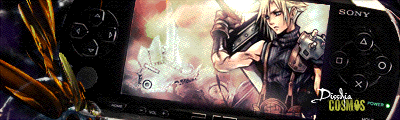
I love the text. xD God, I'm such a sucker for text aren't I? The zorro look-a-like Z looks amazingly well with the dropped opacity, and then the bright continuing letters of his name, along with the decorative font underneat it- OH RIGHT, the sig!

The colours are gorgeous, the little picture/film roll things at the corners look nicely, and almost make him look like a pirate, it has that old map feel too it. :wacky: The only thing I can add, is that it could've used a bit more blending around the render, but either way, really nice sig.

5)

25gwbnt.jpg


Really nice. The cherry/crimson red looks gorgeous. Really nice as well seeing most sigs with Cloud in it are blue, and me no likies blue. xD The font is simple, yet effective. The small decorative text is also a nice add- here I go again about my text. -_-

The image is nicely worked into the whole of the sig, a thicker border to round it off looks really nice.

One of my favourites.

6)

2yuzsiw.png


Really nice. Although I'm not sure about the three dots before Dissidia. =/ The whole image is really nice, although it does not really have a focal point, maybe that was the idea? The blurry feel it has look really nice, and the simple border goes really well with it.

7)

sotwcloud.png


Omfg. Really. Really. Nice. Definitely my favourite out of the bunch so far. The reactors in the background, (which Im guessing is the midgar wallpaper) looks really amazing, Cloud's coloured in nicely to suit the whole colour scheme. The C4D at the bottom looks gorgeous and really gives off that Mako flow idea. Omnomnom, the text is simple, I think it could've used a smaller line underneath it, perhaps, but it looks nice.

8)

PSP-1.gif


I rofled really really hard. Definitely my second favourite. If not only for the gifs running around. It made me laugh so hard. I think this looks more like an add... Hmm... The text looks nice, nicely placed as well, but I'm not sure about the image in the PSP, even though it gives across the idea really nicely. Only thing I'm not sure about, is the C4D on the left side. =/ Overal Cloud is blended in really nicely, and major props for the gifs. So cute. xD

9)

jq2jk7.png


Simple. Pretty. Text is lovely, the overal sig feels a bit empty, and I'm also not sure about the yellow border... =/ BUT, I love the faded pics on the background, and the little C4D (lets call it that) pieces around Jecht. Overall a really nice piece.

10)

j6r1xz.jpg


Pretty. Clean image, nicely positioned image. Amazing font I might add, but lets not get me started about the text again xD LOVELY uneven border I might add.

The colours look great too.
----------------


Even though I considered voting for number 8, cause I do love the gif in the sig... My vote goes to number 7. The whole Midgar/Soldier feel just... I dunno... I love it. I absolutely love it. :gonk:
 
I almost voted for 7, because of how it all went together...but I decided to go for 2 because it seems so stunning to me.
 
I'mma voting for 7. It's got a really nice effects layer and the text suits it well. Got an awesome dark feeling as well. Well done to other people who entered! :monster:
 
#10 gmv, purely for it's intense, standing out brightness. Yeah, it just stood out the most for me, and forced me to look at it over and over. :D
 
I voted for No. 5.
The C4D render(s) is used very effectively and I like how it seems to be behind Cloud but it also goes over his arm. Render and C4D intertwining... very nice.
The dots of red work very well with a character normally associated with blues and purples.
The text is well positioned and I really like the small text underneath it.
The different parts of the signature seemed to click very well and so overall, No.5 gets my vote.

Oh, and well done to all those who entered. :monster:
 
Last edited:
#8 did it for me. The placement of cloud inside the psp was very inventive I thought. My roommate has the game and when she finishes it I am so playing it. Even though I haven't played it yet I do know enough about it to know that whoever made this sig really knows Dissidia.

The chocobo running across the sig like that was so cute and I'm very happy that someone did that with a sig. For those of you who haven't played the game. A chocobo actually runs across the screen that way when you do certain things. ^_^
 
I was torn between 3 and 5. I LOVE the Text and the rendering/brushwork around Kuja's hand. It looks wonderful, and i like how Warrior of Light is blurred out. it actually took me like 3 minutes before i noticed that there used to be another person in the picture. ^_^

I love the rendering around Cloud in number 5. it looked great, and kinda reminded me of like a powerful aura around him and looked really nice.

In the end i voted for 3. it really pulled me in the second i looked at it. Great job to whoever made it, and great job to everyone else as well. these entries are all wonderful.
 
No. 8 for me.

I admire it's 'out of the box' approach, so to speak.
 
I'm voting for number 3, I think it's absolutely brilliant in every way. The text, colouring and effects are practically perfect :yay: Well done to the person who made it!
 
Holy moly I just realised that I made this a five way tie. :gasp:

Someone break it please! :gasp:

Anyway I voted for #10.

It is absolutely gorgeous!

I love the warm colours and the detail in the background! Onion Knight is well blended in with his surroundings and the lighting is spot on!

I also think that this image in particular was a brilliant one to use!

The text is done brilliantly and I think it says 'Kefka' behind it? Not sure. XD

The border looks lovely and rounds it off nicely!

Such awesome detail within this signature! It really is an awesome work of art!

Well done to all who entered!
 
There, broken, I chose No3!
I love the smooth texture to it not to mention that the stock was placed perfectly IMO, one starts out with a beautiful stock and is most likely to get a beautiful signature which in this came went with it.
Not to mention the text looks beautiful, in the end tis my fav sig. <3
 
Well done Coco for winning this week!

1) Penelo
2) Hope Estheim
3) Coco
4) Ryuuki Corvin
5) Stevie Nicks
6) Kandy-Sugar
7) Lagunas Dream
8) Axis
9) Mage Masher
10) Mitsuki
 
Back
Top