SOTW 137 Voting Thread!

SOTW 137 Voting!


  • Total voters
    23
  • Poll closed .

Saga

ice ice baby
Veteran
Joined
Aug 16, 2007
Messages
3,123
Location
:inmypants:
Gil
0
The theme this week is Pokémon. Please remember, that while posting isn't necessary in order to count your vote, it is encouraged.

Also, please remember that you CANNOT vote for your own entry, and you will be disqualified from this SOTW, and the next two SOTWs if you do so.

Here are the entries I recieved!:

1)
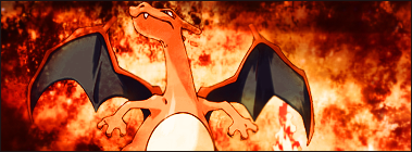
Charizardcopy.png


2)
fns17n.jpg


3)
25snz0h.png


4)
poke.png


5)
charmander.jpg


6)
27y1g5k.png

 
I went for two, because it looked different to all the others. I like three too, but Mew is too cute. Good luck to all who posted entries.
 
Mew for the win. Not only is he probably my favorite Pokemon, I rather liked the overall design of the sig. :D
 
I went for two. It's very simple, but effective, and Mew fits nicely in there. Great job everyone.
 
Number 3.

The colours are beautiful. :gasp: The little light bulbs looks gorgeous, and the depth in this tag is great. I think the text could've used some work, but the colours. :gonk: They're gorgeous. :gonk:
 
I gotta pick number two. It's pokemon picked and color scheme is my favorite. It's made beautifully. And there's not a thing wrong with it.
 
I voted for #6.

It's so pretty. <3

I love the serene feel about it and the colours are all so gorgeous together.

The lighting on the wings looks awesome and I love the texture in the background and the pretty little brushes here and there.

Awesome work on this one!
 
My, oh my.

Definately a toss-up between entries 2 and 3. I can tell that a lot of hard work went into both of them, and the results are two gorgeous siggies. I wish I could pick them both =(

Ugh...I'm going to have to go with number 2 because I just love the little specks of light floating around the pokemon. That's a subtle, but nice, touch.
 
#3 gets my vote, a very well done XD001/Dark Lugia/Shadow Lugia signature, love the colors, and the background, the grid-like effect looks almost digital, and that ball of light charging up, the shining effect it gives off is stunning, amazing how artists capture such details flawlessly, kudos to the entrant of this, it deserves to win imo, but it has a tough road ahead yet...
 
I love the different kinds of elements applied in #3. Gorgeous! Although I'm not really a fan of purple, I can get past the colors and really look at the details here, which was executed very nicely. Loving the pink touch in the BG as well as the light orbs surrounding Lugia. The use of C4D is very apparent but I think that was the whole purpose due to the style of the signature (for instance, the use of wireframes) and I really like it. The slant vertical and horizontal lines was quite unique I thought. Very bold of the artist to approach this kind of level. =]

A special mention to 2 and 6 as well.

Great job to everyone who entered!
 
I really liked #2


Its very clean cut and nicely done. The background is fantasic and makes Mew look great! Haha =P. I loved the colors incooperated in the siggy and I really enjoy the great quality of the image it's very crisp and fresh.

Good luck&job to everyone! =]
 
My votes for 2. Love Mew so much :) The colours and image are used well together. The stock renders really do add the brilliant finishing touches to the signature.
 
I voted for 6.

It's a bit flat IMO, but I do like the lighting effects and colours used. The half border is very nice and I think the textless approach was a good one. Text probably would have taken away from it.

I though 2 was also a nice tag but I can recognise the artist who made this because they've made similar looking tags before. I've seen that C4D used before as well. It just didn't look that different and was a bit safe IMO.
 
Back
Top