SOTW 27 Voting Thread!

SOTW 27 Winner?


  • Total voters
    11

Warbsywoo

Hellodia.
Veteran
Joined
Apr 15, 2007
Messages
4,891
Age
34
Location
California
Gil
1
Theme: Horror Movies

1.)
residentevildamnationsi.png


2.)
JEFFGIVESUP.png


3.)
thingm.png


Good luck!
 
Oh my god, I love 2 and 3. 1 is good too, I love resi. This is the toughest vote to make in any of these I've seen :hmmm:

Ok, I'm going for number 2. I like the lighting and the echo of her face (does that even make sense? :/ ). The text also fits really well. That's all I've got :$
 
These were too scary :(

That shot from The Thing is so creepy :sad2: I HATE that movie...

AND WTF WHO DID NUMBER TWO. LIKE HOW CAN YOU ACTUALLY WORK ON THAT IMAGE. I'd be too scared :sad2:

Anyways I'll vote 2 because it creeped me out the most and I think the effects were the best. (they helped to make it even creepier!)
 
#2 that is all.

#1 is all sunshine and rainbows :rofl:

#3 :| scary motherfucker. I would have voted for it, if the text wasn't so hard to read. I can barely make out that it says The Thing.
 
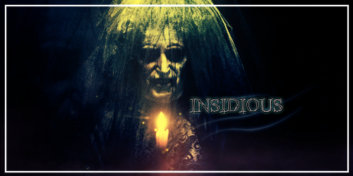
WHY DID ANYONE HAVE TO MAKE A SIG OF INSIDIOUS WHY WHY WHY :damon: IM GONNA HAVE NIGHTMARES AGAIN
SO THANK YOU!! :toni:

2 GMV

it's scary and pretty at the same time. I like the border, it's unique but I also like the double imaging of the scary lady.
 
1.) It's nice design-wise, but it soooo does not fit the theme, not even in the slightest. :sad3: A for admirable effort.

2.) Okay, now this is fucking creepy as fucking hell. You got a nice dark, eerie background, and the lighting really adds a sense of horror, plus it's just plain creepily good.

3.) This one is more subtle, but it gets the job done. I like the lighting, but at parts it looks not as creepy as number two.

For that reason, I shall vote for numbah 2. :ryan:
 
2 outshines the rest with everything. Placement in particular is far better than the other two.
 
Ooh this is tricky. :hmmm: All are well composed. :)

#1 has some beautiful colours. The contrast, on the whole, is pretty good too! :) I kinda like the font used, but I feel the piece would have been more well balanced had the text been placed on the right hand side, somewhere just below the middle vertically. :)

#2 has a fantastic border and superb text! ^_^ The effects are quite spooky too. :wacky:

#3 is well composed and the blurriness is quite spooky, but I do feel it would have been better had there been a sharper part, perhaps something popping out of the gloom. :hmmm: A claw, maybe? The text is pretty good - the font works very well! ^_^

My vote goes to #2 . :)
 
Congratulations to Jeff & Kira [Sexual Tyrannosaurus & Six] for winning this week's SoTW!

1.) Setsuna F. Seiei
2.) Sexual Tyrannosaurus & Six
3.) Dragon Mage
 
Last edited:
Back
Top