SOTW 3 Voting thread.

SOTW 3 Winner?


  • Total voters
    7
  • Poll closed .

Six

𝗦𝗼𝗹𝗶𝘁𝘂𝗱𝗲 *★.• ·
Staff member
Admin Support
Social Media Team
Veteran
Joined
Mar 24, 2009
Messages
11,759
Location
Saturn.
Gil
1,924
Theme: Freestyle.

1.
Robert_DJ_bnw-1.png


2.
FreeStyleSOTW3.png


3.
1zf7leb.jpg


4.
219yyu.jpg


5.
AlYa1.png


6.
freestylesotw2.jpg


* Entrants are not allowed to vote for their own entries.
* Voting ends in 7 days.
*Feedback is greatly appreciated, and highly encouraged.
 
So, these are actually some good ones.

1.) The black and white really works. Whether it's fractals, or just some sick C4Ds in the background, they really add a great look to the BG. The text could definitely be a lot better, but it's not too bad.

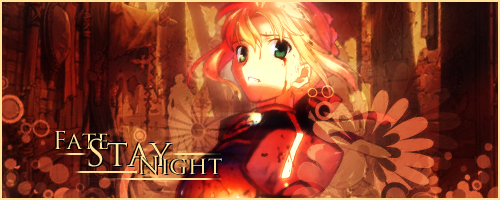
2.) A little too bright on the face, i must admit. However, I do like the overall look to the tag. Text is pretty cool.

3.) Aside from the icky green, this tag is the best up there. It's balanced, and looks really realistic. (y)

4.) I like what you were going for, but two things bugged me. First off is the height. I don't know about you, but it just seemed a bit too high. :hmmm: And secondly, the text far out from everything else. I don't know if that was intended, but I just felt it was unneeded.

6.) Really interesting, at the most. It has a nice messy compo. I think concept-wise, it's the best up there. Also, text is the best I've seen.


I believe I will give my vote to #6 just because I thought it was the most original.
 
I really loathe Robert Downey Jr but sig one looked so good so I had to go with it hahaha.
I love black and white sigs and it just caught my attention more than any of the others.
Nice work creator of number 1
 
You should vote for the best up there gfxcally, which is what I shall do. :grin:

I am voting for number 2!
FreeStyleSOTW3.png

I love this one. I think it's got a wonderful balance between the focal(the girl) and the font! The font itself is just flawless. I love how professional it looks. The awesome lines around and under the words is a really cool and unique touch. I am def liking the vectors around her and the bottom of the sig, as well. It's just very nice. I like how every thing seems consistent. There's nothing that pops out to me that gives me the impression that it doesn't match. I love the color scheme as well! very warm and easy on the eyes!!

Oh, the only thing is-- I myself find that borders take away from the focus of a signature. and that said, I would suggest to either make no border or just leave it to either the bottom or the sides... not all the way around the tag though. But that's just my taste! :P

Awesome job nonetheless! It's just a splendid signature. A job well done to the creator! :ryan:
 
1. This was really nicely made, and it was tough choosing between this one and 2. But it didn't look boring even thought it was black and white (which is what I normally think of black and white sigs).

2. I voted for this one, I love the lighting and the text in the end is what made me vote for it. It's really nice text :ryan:

3. This one I originally was leaning toward, I love the effects. But I'm not a fan of the text personally :/

4. This one is similar to something I made :lew: Although you blended way better. I do like it, but it really needs some lighting or sharpening since because Noctis looks really dull. And I think the corner text doesn't really fit since Noctis is all the way on the other side so it leads the middle looking bare.

5. I love the effects on this one, the only thing is the girl looks a bit dull. The whole piece could use a little more brightening to it. I love the lighting by her head though.

6. I'm not really sure what I think of this piece :hmmm: It's quite different , and it has nice lighting, but it's a little harsh looking. But that's just me :lew:

Look at me with all my feedback :star:
 
I really like the colors used on 2 and it fits Saber. The text is great as well. I love the Fate series :ryan:
 
Going for the first one here as well. Love the shiny gloss the signature has, and I really like the texture that was used. The bubble like thingies add to the shine. Really liked #6 as well, was really original, I thought.
 
Congratulations to Lirael for winning this week's SOTW.

1. The Meddler
2. Lirael
3. P Butter Snaps
4. Taco Farron
5. Sexy Beast
6. Richard B Riddick

Thanks for voting & entering.


[Thread closed & archived.]

 
Back
Top