Navigation
Install the app
How to install the app on iOS
Follow along with the video below to see how to install our site as a web app on your home screen.
Note: This feature may not be available in some browsers.
More options
You are using an out of date browser. It may not display this or other websites correctly.
You should upgrade or use an alternative browser.
You should upgrade or use an alternative browser.
SOTW 57 Voting Thread
- Thread starter Casanova
- Start date
- Tagged users None
- Status
- Not open for further replies.
Submission 5 is like awesum, i love the way that the picture blurs into the background and also how the colours go with the images, very nice
- Joined
- Aug 28, 2007
- Messages
- 13,511
- Location
- Manchester
- Gil
- 222
- FFXIV
- Bambi Branford
- FFXIV Server
- Lamia
Number 3. It stands out to me more than the others by a mile, I love the image and the background. It's just really cute 

- Joined
- Dec 14, 2006
- Messages
- 11,628
- Location
- California
- Gil
- 0
- FFXIV
- Mitsuki Calei
- FFXIV Server
- Lamia
- Free Company
- Gaia
I'm gonna have to go with 5 here. I absolutely love the smudging effect and color theme. I can totally feel the power of the tag just by looking at it and its use of effects in the BG and surrounding the subject. Great blending and flow! =O
I'm going with 3 this week.
Ok where to begin, I like the anime character and how its done so that she fits in with the background but still keeps the character visible. Its a bit small in size but overall is good quality.
It gets a 7/10 from the Hunter and no special comments.
Ok where to begin, I like the anime character and how its done so that she fits in with the background but still keeps the character visible. Its a bit small in size but overall is good quality.
It gets a 7/10 from the Hunter and no special comments.
#5. It was such a close tie with #1 and #5, but I really like the effects in #5, so, it got my vote.
#3 for me, I love the colors and the blending, and there's something about it that makes it stand out more than the other signatures.
What happened to the second one there? =/
Anyway, like others said, the colours in the third are great. So that one.
Anyway, like others said, the colours in the third are great. So that one.
Five.
The effects are just outstanding. The way the render flows with the rest of the banner is top-notch. The colors are excellent too. A very good job, to be sure. =)
The effects are just outstanding. The way the render flows with the rest of the banner is top-notch. The colors are excellent too. A very good job, to be sure. =)
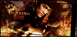
Its between 3 and 4 for me. Pity 3 doesnt have a border as I cant stand work without borders. So Im going for 4 as it caught my eye first and its such stunning work.
All the sigs look pretty good and I want to pick which sig best portrays the theme of martial arts, but it's hard to decide between them 
I think I'll go with #5. I like the way the character is in motion, and the smudging/blur around them enhances that I think.

I think I'll go with #5. I like the way the character is in motion, and the smudging/blur around them enhances that I think.
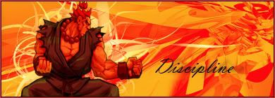
5, most definitely. The stock picture blends in seamlessly with the background, whereas number one's sticks out unpleasantly.
- Status
- Not open for further replies.


