SOTW 61 Voting.

Choose your winner!


  • Total voters
    10
  • Poll closed .
Status
Not open for further replies.

Six

𝗦𝗼𝗹𝗶𝘁𝘂𝗱𝗲 *★.• ·
Staff member
Admin Support
Social Media Team
Veteran
Joined
Mar 24, 2009
Messages
11,759
Location
Saturn.
Gil
1,924
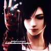
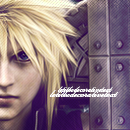
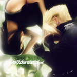
Theme: Freestyle icon set of 3.

1.
5vyr.png
awp7.png
e0x.png


2.
100x100_zpsd1156ff5.png~original
130x130_zps7ceb1f9c.png~original
150x150_zps8141a834.png~original


3.
zuir.png
yk2.png
hg26.png


*
Entrants are not allowed to vote for their own entries.
* Voting ends in 7 days.
* Posting feedback along with casting a vote is highly appreciated.

 
These sets are lovely. Well done guys! :)

My vote goes to set #1 . There is unity between these icons. The colours and styles go together, but they're different enough to feel unique too. I really like the way each image has been framed, the simple effects and the font in each, although the text in the middle icon is a little less snazzy than the text in the other two. The text in the third and largest icon is my favourite.

The images are framed really well in the second set too, but I'm not too sure about the darkness in the first icon and the blurry light/dark feel to the larger icon. The colours and depth in the second icon are lovely though. I think I can see some faint scan lines, which I really like! The text in the second piece is well placed, but the text in the smaller icon makes it feel a bit crowded. :hmm: I can never place text in a small 100x100 icon though. :wacky:

The third set feel less like a set; each has a different feel to it. The first is touched by a fiery light; the second has a natural, forestey feel and the final piece has a very smooth, glossy (almost laminated) feel. The images have all been framed well and I like the fact you haven't used any text in the final icon! The second icon may have benefitted from some text in the centre of the bottom third, over the character's arms. You may have tried this and decided against it though!
 
a lot of my same thoughts are the same as judy's. that said, 1GMV cuz it is the best in regards to being icons. although they don't use topaz like the second set and even though they're not as glossy as set three, these icons look like actual icons. 1's set has nice usage of borders, wonderful text placement and well used stocks. i wish it had more color-differences like set 2 & 3 have but I still can't deny the fact that out of all of the entries, 1 keeps to the theme best. 1's icons look like icons while 2 & 3 look more like crops from sigs. that said, all of them are graphically beautiful and my choice in picking 1 is in no way saying the other icons aren't good, cuz they are good. they're all very good tbh. :lew:

my fav icons are the following ^_^
e0x.png
150x150_zps8141a834.png~original
zuir.png
 
I voted for 1 and Lirael pretty much said exactly what was on my mind, so thank you because I don't have to type it out. :mokken:

My favourite is the third and largest icon in set 1 because it looks like she's holding a big blue dildo and it made me laugh so bonus points for that. :pooley:
 
Lmao.... Ewan... :sad3: I thought the same!

My vote definitely goes to #1 . I think the whole set looks very polished. I've never been strong with my icons, then again, I don't really enjoy making them. Major props to those who can, AND make them look good!
 
Ooo, close call! Congratulations to Galadín for winning this week's SOTW!

1. Galadín (6 votes)
2. Six (4 votes)
3. Yu Narukami (0 votes)

Thread closed.
 
Status
Not open for further replies.
Back
Top