SOTW 62 Voting.

Choose your winner!


  • Total voters
    9
  • Poll closed .
Status
Not open for further replies.

Six

𝗦𝗼𝗹𝗶𝘁𝘂𝗱𝗲 *★.• ·
Staff member
Admin Support
Social Media Team
Veteran
Joined
Mar 24, 2009
Messages
11,759
Location
Saturn.
Gil
1,924
Theme: Set render.

1.
0g1wFvD.png


2.
SOTW62_zpsefcf3781.png


* Entrants are not allowed to vote for their own entries.
* Voting ends in 7 days.
* Posting feedback along with casting a vote is highly appreciated.
 
These pieces are very different from what I thought this SoTW would deliver- which is a good thing ^_^

#1 :
I love the flow of this signature and the displacement effects are well executed. The background works well with the render and the colours are spot on. The text seems to me to be placed a bit too low and in a way ends up slightly unbalancing the over all piece. I do like the font style however and the two colours used on the text were well chosen. All in all, I do like this signature but at the same time I feel that it is missing something; what that is, I'm not too sure on but it does feel a bit empty.

#2 :
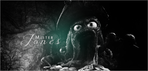
What I like about this piece the most is the lighting and the fact that the creator chose to use black and white to set the mood. The text works well and the over all brooding, grundgy background make this piece both interesting and a bit different. That one teal lighting effect is a good touch since it breaks up the starkness of the piece whilst staying true to the feel of it. Kudos on the scanlines, you pulled it off with style!

Good work on these signatures, they show time, effort and a different approach than what I for one would have expected.
 
Last edited:
Yeah, while I do feel that the first signature is kinda empty, I feel like it does the job of highlighting the render. Number 2 is really dark, and I don't think it highlights the render enough. Maybe a little more color would have made it stand out more.

Anyway, #1 got my vote. I think it fits better with the render overall.
 
Number 2 gets my vote. Both are very well done, I kinda tip toed around the two for awhile since I do like the colors of #1 , but overall I like how #2 was pulled off. Made it look like the character is reaching out in the dark, thus giving a different atmospheric perspective. Those are always tricky to do, but the composition helped a great deal.
 
Vote: #1 .

I liked how the borders of the subject were broken apart into the rest of the image. The colors aren't saturated. It wasn't too dark. The subject was bright like the rest of the image. The subject was also sharp.
 
Congratulations to this week's SOTW winner: Hayabusa! Close call, Raul!

1. Hayabusa
2. Six

[Thread closed]
 
Status
Not open for further replies.
Back
Top