Tezcat's Designs

Tezcat

The Instant Classic
Joined
Aug 17, 2009
Messages
20
Age
38
Gil
0
I like to think I'm alright in Photoshop, so, here are a few of my more recent creations:

sheldonsignature.png


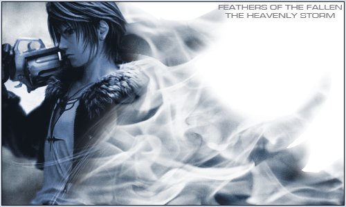
Squallbannercopy.png


Shinji.png


I've not made anything in about a month but plan on making some more stuff when I get time to have another crack at photoshop, who knows, maybe I'll go with a different colour to blue =p
 
Last edited:
Lovin the Squall one! I like the smokey affect you've placed around him. Very nice! Can I ask where you got the image of him? It's awesome.
 
I like to think I'm alright in Photoshop, so, here are a few of my more recent creations:



Squallbannercopy.png


The squall tag looks good man, hes blended in brilliantly however the text is way out of place. Keep your text close to the tags focal point, that way the eyes isnt looking about, its fixed in one area. If you move the text closer to the focal this tag will look a million times better man definately.
Keep posting =)
 
As said by the posters above, the Squall one looks great!

Fantastic blending and the colour theme works well.

The lighting is done well and the border looks excellent! I like how you kept it the same blue as in the signature and then stroked it on the inside with black.

The only thing I can suggest (which LD has already said) is to bring the text closer to Squall.

It's hard to know where to look when they're so far apart.

Other than that great work. =)
 
Cheers for the comments, not made anything new in a week or so, will get on it though

Rinoa said:
Can I ask where you got the image of him?
I got sent a link to it by a friend on another forum (the sig was for him). It's a Dissidia pic that had Sephi in it too: Here it is
The smoke in the bg was meant to be shaped a bit along the lines of looking like Griever
 
That's a really good sig, especially considering the size of it. The colour of it flows throughout the entire sig which really makes it effective, especially with the smoke effect. Great quality stock, lighting is fantastic and I like the smoke effect, it's original. :-)
As already mentioned, just move the text closer to Squall and it's even better. :)
 
Back
Top