Navigation
Install the app
How to install the app on iOS
Follow along with the video below to see how to install our site as a web app on your home screen.
Note: This feature may not be available in some browsers.
More options
You are using an out of date browser. It may not display this or other websites correctly.
You should upgrade or use an alternative browser.
You should upgrade or use an alternative browser.
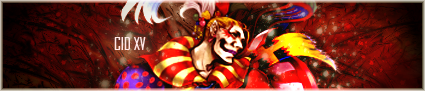
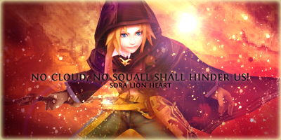
Cid's Newbie Graphics
- Thread starter C i d
- Start date
- Tagged users None
Quite good actually as it's getting there. Again, this could really do with being saved as a png file. For the text, it's probably just me being fussy here, but I'm not a fan of text being by the lower corners of a sig. Try moving it and "Viola" up towards the centre left and see what you get.
I asked for the Text to go there. I usually like my Text in the corners. so don't blame him C:
I asked for the Text to go there. I usually like my Text in the corners. so don't blame him C:
thanks :3
Though sometimes I agree that corner texts do not work in certain cases.
Anyway, I experimented further with the sig.
SummonerAmaterasu
here take it (if you prefer this one)
")
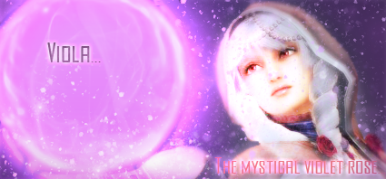
(sorry but the hand accidentally disappeared in the process, and it will take a lot of effort for me to bring it back. But at least, it now appears that the hand is behind the orb)
That looks much better than when it was saved as a .jpg  Although I would suggest a border
  But that's just me. I've always disliked how sigs look without borders
Although I would suggest a border But that's just me. I've always disliked how sigs look without borders 
how's this
Ai Haibara from detective conan (case closed)
EDIT:
small signature (for the other forum I am in)

These are pretty good, I like the font you used on the Mog one, and the border goes with it as well, it looks good although some form of lighting would make it pop a bit more. The effects and lighting on the first one are great, it's good to see you improve so early on. Good job!
- Joined
- Feb 25, 2010
- Messages
- 3,732
- Age
- 31
- Location
- Southend, UK
- Gil
- 0
- FFXIV
- Yuno Mizuno
- FFXIV Server
- Lich
- Free Company
- Silver Lining
much better
positioning on this sig is much better and blended in just right ") great job cid
great job cid
can u see the quality difference between png and jpg
... also looks like u have added lighting now and it made the signature look epic some great work you got here.. just keeping looking at tutorials to find new ways on making signatures XDDraklor
thanks. Yeah I had almost always wanted to add borders, but strangely I always forgot to add them lol.
Kitty-Urie
thanks
I am still in the process of learning lighting and stuff.
Stevie
I know right
I should have saved everything in PNG from the start.
thanks. Yeah I had almost always wanted to add borders, but strangely I always forgot to add them lol.
Kitty-Urie
thanks
I am still in the process of learning lighting and stuff.
Stevie
I know right
I should have saved everything in PNG from the start.
- Joined
- Feb 25, 2010
- Messages
- 3,732
- Age
- 31
- Location
- Southend, UK
- Gil
- 0
- FFXIV
- Yuno Mizuno
- FFXIV Server
- Lich
- Free Company
- Silver Lining
while ur online.. if u don't know how to make a half border.. here a quick tutorial that i made on how to do it
http://www.finalfantasyforums.net/showthread.php?p=960840#post960840
http://www.finalfantasyforums.net/showthread.php?p=960840#post960840
Thanks for the improved siggy! I like it better than the older one!
Thanks for the improved siggy! I like it better than the older one!
you are welcome
hmm what theme/character should I do next? ideas? XD
- Joined
- Feb 25, 2010
- Messages
- 3,732
- Age
- 31
- Location
- Southend, UK
- Gil
- 0
- FFXIV
- Yuno Mizuno
- FFXIV Server
- Lich
- Free Company
- Silver Lining
Very Nice it a bit bright round the face (but i say this to everybody when i comment about lighting, may just be my monitor
) but apart from that a very good signature there EDIT: Yuna
 just cuz she win
Very Nice it a bit bright round the face (but i say this to everybody when i comment about lighting, may just be my monitor
EDIT: Yuna
oh yeah a Yuna sig would be cool
I like her character design. She's so beautiful :3Kay will try that
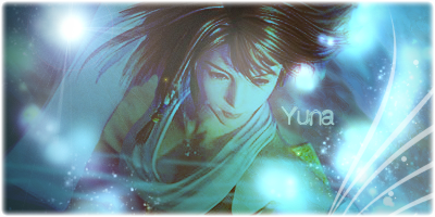
how's this one? I am personally satisfied, except that the render is of low quality
 that's just too bad.
EDIT:
oh I forgot to mention this.
I found a good way of making borders (as seen in the Yuna sig).
What I did was:
-create new layer, place it on top
-Fill totally with black
-change layer setting to 'screen'
-this should lead to a totally transparent layer
-enter blending options
-set inner glow
-border should appear
-choose the suitable colours, glow size, etc
What do you think?
Last edited:
- Joined
- Feb 25, 2010
- Messages
- 3,732
- Age
- 31
- Location
- Southend, UK
- Gil
- 0
- FFXIV
- Yuno Mizuno
- FFXIV Server
- Lich
- Free Company
- Silver Lining
how's this one? I am personally satisfied, except that the render is of low quality
EDIT:
oh I forgot to mention this.
I found a good way of making borders (as seen in the Yuna sig).
What I did was:
-create new layer, place it on top
-Fill totally with black
-change layer setting to 'screen'
-this should lead to a totally transparent layer
-enter blending options
-set inner glow
-border should appear
-choose the suitable colours, glow size, etc
What do you think?
wow i never through of that for a border.. might try that today
and yh great signature liking the text and good size 
Wow you've really improved in such a short amount of time! I love your yuns one and the full metal alchemist one!!! They're really bright and great to look at! I'm glad you've taken the advice given and have put it to practice so well!
I hope you're happy with the results because you're really improving
I hope you're happy with the results because you're really improving
Wow you've really improved in such a short amount of time! I love your yuns one and the full metal alchemist one!!! They're really bright and great to look at! I'm glad you've taken the advice given and have put it to practice so well!
I hope you're happy with the results because you're really improving
thanks very much
Yeah I am so glad that I improved. I experimented with and used lots of gradient and lighting effects.
anyway, new avatar:
EDIT:
lol now that you think about it, I should have entered this avi for this week's FFXII themed AOTW. But since I showed it to the public already, that's too bad. The deadline is today anyway.
EDIT2:
Since I am quite free today, I did another one
It's intentionally small btw.
Last edited:


Like WOW! This is amazing! The lighting, the colours, the smudging effects are all awesome, your borders are nice anyway but this is awesome altogether. I personally wouldn't have put the text over Zidane, but it seems to work anyway.
Great improvement, well done @Cid XIII-2