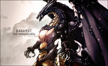
Oh this one is pretty cool!
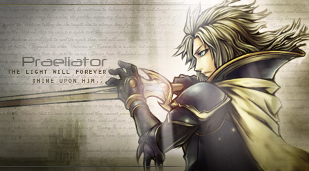
Nice clean looking signature. Vibrant and well lit.
I don't think the 'Death, be thy name' really goes well in the middle. Maybe if it was placed under Seiji?
Nice font used for Seiji too.
Otherwise, nicely done. =)
Thanks Kandy for the constant feedback
") I really appreciate it.
I really appreciate it.EDIT:
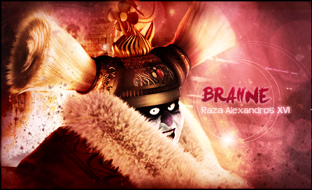
clan challenge 13 entry. Quite indifferent about this. Neither happy nor unsatisfied
Oh and a little update, I am having some big exams soon so it's likely that I won't make anymore sigs for now. That is until the end of November. I will be really active and free starting December.
Last edited:
 GFX is sooo fun!


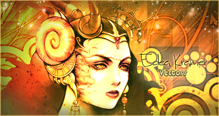
 it was a very nice sig, you should be proud!! Specially coz you've just started with GFXing and have already got your first win!
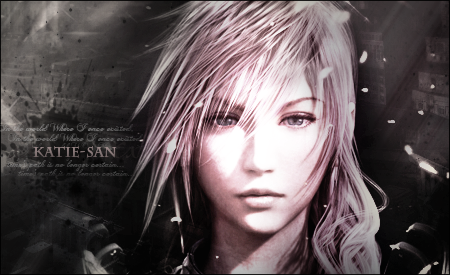
 and the text is great