Navigation
Install the app
How to install the app on iOS
Follow along with the video below to see how to install our site as a web app on your home screen.
Note: This feature may not be available in some browsers.
More options
You are using an out of date browser. It may not display this or other websites correctly.
You should upgrade or use an alternative browser.
You should upgrade or use an alternative browser.
Ike Creations
- Thread starter King Sean
- Start date
- Tagged users None
Oh wow great work on thhese!
You've done a fantastic job on the backgroudns and the blending is really well done!
Nice clean images are used adn the lighting is directed very well.
The font I think could be looked at. I personally don't think it suits the sigantures very well, but it's still decent. =)
Lovely borders for both round them off nicely. =)
Keep up the great work!
A siggy and a avatar. I think I did good with the text on the siggy 


I quite like this one.
The colours are pretty and I like the soft look about it.
I like the lighting around her and the blurred background makes you focus on her more which is good.
Pretty font used for the text and a nice border to round it off.
Nice and simple. =)
Good work!

Ooooo, nice. It looks like the Tifa sig I recently made, the colours anyway. I love it! I think the text is a bit too bold for this signature though, I think that if you would've used something more subtle it would've looked better, or even a thinner font, and less... squary...
The white smokey spots give a nice focal, although I'm not sure about the one behind her, it does distract from the bold text, which is a good thing. =]
I'm liking it so far! Keep going at it.
A signature that I made after a certain member linked a awesome render 
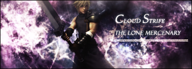
And the fail avatar that I made

And on an added note, which do you think is better suited to be my avatar?
This?

Or


And the fail avatar that I made


And on an added note, which do you think is better suited to be my avatar?
This?

Or

This is really nice!
I like the background.
The colours work in nicely with Cloud and the lighting is well done.
Good blending and the text is good, though I think it would look a bit better if it was positioned a little lower to the bottom.
Other than that, good work!
My newest signature 
Comments please
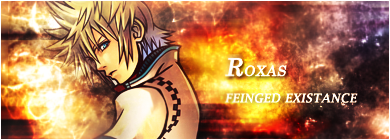

Comments please


Super Fast Comment!
Nice effects! They really fit with Roxas. I would have always thought you would need subtle effects and light colours but these work very well. Maybe to blend him in a bit more, I would place some of the fire effects over him slightly so it just covers the edges of him.
The text is also good IMO. I think the lines should be closer together though.
Other than that, nice work mate!

Nice work on this one!
The background has a nice firy look about it and the texture is really neat.
Good blending and you've got the focal spot on.
Text is positioned well, though nto a real fan of the font. Other than that great work!
Newest Siggy  Will update with the next one when I come back
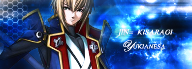
 Will update with the next one when I come back

Dude, that's pretty cool! How'd you design the honeycomb-like pattern on the left side?
Blazblue rocks!
I used a tech brush to draw that pattern. I had to lower it's brush size and I think I may have overlayed or color dodged the layer, too

Nice work.
I like the honeycomb pattern over on the left and it's blended in nicely.
The colours work really well with the image and I like the lighting coming though the background.
The text could be improved in my opinion. The fonts don't seem to flow too well with the signature.
I would also suggest a border too. Just to make it look more finished. =)
Newest SiggyWill update with the next one when I come back

I really like the colours and effects on this one, I like how the render is being blended a bit too, although I think you could develop that a bit further ^^
Like Kandy said, the text doesn't really flow and a border would give it that more "complete" look ^^
Keep up the good work!
Here are my attempts at text.......again  I tried like eleventy billion different things and these two pieces are the only two where the text seemed to work. Feel free to comment on anything!
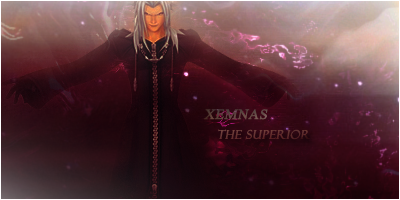

 I tried like eleventy billion different things and these two pieces are the only two where the text seemed to work. Feel free to comment on anything!

This one looks pretty sweet. Loving the colour of the background.
I love the blending and the smooth look it has about it.
The detail in the background looks really pretty and almost sparkles.
I think a little more light is needed on the focal though as it is a tad dark.
Text is decent and nicely positioned.
Keep up the good work!
This one looks different.
The image of Riku behind Riku is a bit trippy looking which I think is kinda cool.
The background colours look good. Nice and dark against Riku's lighter colours making him stand out more.
It's a little hard to read the text with the transparency but other than that good work!


