Lirael's Graphics

YunaSig1copy.jpg


I really, really like this sig :D You've used colours which I wouldn't have thought to put together like the purpleish pink and the blue but you made them work well.

The picture is blended really well, you're really good at blending I have noticed. I love the petals and the text and ugh it's just a really nice sig!!
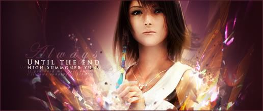
 
Was just looking at the past few pages. You really have some awesome blending techniques. :D

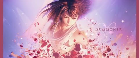
Yunasig535copy.jpg


I particularly like this one! The text is amazing. The textures and colors that you have used really complement with Yuna. I like how the lighting comes from the bottom of the sig. But perhaps you can blend Yuna's head on the right just a little more.

Awesome works!
 
UPDATE:

Hoorah, I've made something new! It didn't quite turn out how I wanted - I'm not having much success at the moment - but I tried. :lew:

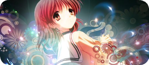
ClannadNagisaCompletecopy.png
 
ClannadNagisaCompletecopy.png


This is a really nice piece, I like the vectors that you have going on there, the lighting is nice, especially the flecks of light you have going around the sig. I love it!

Good job. :)
 
ClannadNagisaCompletecopy.png


that really nice sig you got there love the vectors you added lighting is just amazing and the rounded border works really well, the decision not to add text i agree with :).... great signature overall :)
 
Tangled.jpg


Not as fond of this as I am of my last one - it's ended up being a bit like the Yuna tag - but here we go! :)
 
Tangled.jpg


Not as fond of this as I am of my last one - it's ended up being a bit like the Yuna tag - but here we go! :)


Oh I love this! Especially the lighting. It does look like the Yuna tag, but I liked that one too. The characters are blended in nicely and the darkening near the borders works well here. I think the use of text will make it even better! Great work!
 
Tangled.jpg


Not as fond of this as I am of my last one - it's ended up being a bit like the Yuna tag - but here we go! :)

N'awh, this is lovely. I like the lighting and the colors,
but I think it's a little incomplete.
Maybe it would suit it good to have text or a border? :hmmm:
 
N'awh, this is lovely. I like the lighting and the colors,
but I think it's a little incomplete.
Maybe it would suit it good to have text or a border? :hmmm:
It has a border! ;)

Ooh, you're awesome at text. It's something I need to improve on. :sad: Could you perhaps add text to this sig so that I can learn from what you would have done with it? I just couldn't find the space for text... >_< You could post the sig here, if you wanted, so that people can see the change, or just PM it to me privately. No pressure though. :gasp:

On another note, would you like to make a collaborative piece? :)
 
Tangled.jpg


Okay, don't get wrong, I love the effects and everything. Their really neat, but I don't think they really go with the theme of Tangled. On that note however, I do love the lighting, and the shininess to the entire thing ^_^
 
Tangled.jpg


Okay, don't get wrong, I love the effects and everything. Their really neat, but I don't think they really go with the theme of Tangled. On that note however, I do love the lighting, and the shininess to the entire thing ^_^
I based the lights and shininess on the lanterns. :P
 
It has a border! ;)

Ooh, you're awesome at text. It's something I need to improve on. :sad: Could you perhaps add text to this sig so that I can learn from what you would have done with it? I just couldn't find the space for text... >_< You could post the sig here, if you wanted, so that people can see the change, or just PM it to me privately. No pressure though. :gasp:

On another note, would you like to make a collaborative piece? :)

The border blends in too much! >.<
I was thinking a half border would work nicely for it, even if it's the same color as the border that it has now.

Add text to it? Sure, I can do that; it'll be an example and I'll PM it to you when I get it done. n.n;

A collab? O:
>///>
*has never done this before* Sure, but I have no clue how to go about doing this. xD
 

Oh so pretty!

I love the lighting around the centre! It all looks so shiny and glossy!

Such lovely colours and the background is so pretty!

The only thing I would have a look at touching up is the white around the little green pet thing. I forget what he's called. XD

But other than that lovely work!
 
Here's another sig! :D

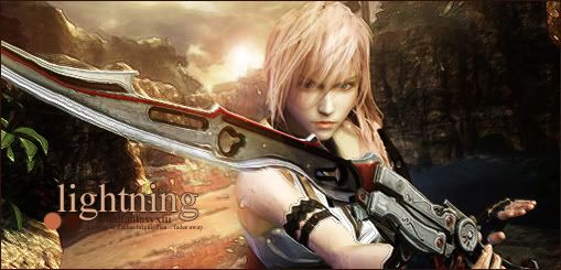
Lightningfdgd2.jpg


I'd like to mention @Sheikah and thank him once again for giving me advice on how to use text. I also think @Kyoshiro Seiji deserves mention since I quite liked his use of a background image and render to create a new complete piece... I've seen it elsewhere before, but seeing him work with the method so effectively encouraged me to try using it! :) I am quite pleased with the result.
 
SnowSerah2copy.jpg

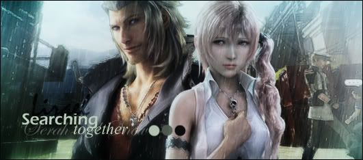
Another image-based sig... Not so sure about it... It all fits in together but it's a bit bland. :lew:
 
SnowSerah2copy.jpg

Another image-based sig... Not so sure about it... It all fits in together but it's a bit bland. :lew:

This is a really decent signature. It is a tiny bit bland though and I suggest maybe putting in a gradient in to blend the image together a bit more(Serah looks a bit bland compared to snow). You have really great placement and I love your fonts used in the text. ^^
 
This is a really decent signature. It is a tiny bit bland though and I suggest maybe putting in a gradient in to blend the image together a bit more(Serah looks a bit bland compared to snow). You have really great placement and I love your fonts used in the text. ^^
Haha, having read your comment, I can't help but feel the problem IS Serah. I wanted to base the sig around her but perhaps I should have used Snow. :hmmm:

Thanks for the comment! :)
 
No, no; the two of them fit fine together. They're standing close to one another which makes it easier to make them the center of attention. However, I can see what you're saying when you say the image is bland. .....I think it is and not just Serah; the two of them seem to be bland. I really think this signature could have had more done, needs more color and blending of the background.
The one person right next to Serah is fighting for my attention....
 
Back
Top