Lirael's Graphics

Here are some more bits and bobs!

A piece for Six!

TIfaforSix.jpg

ITS FREAKING PURPLE!!! Well done, this piece is absolutely stunning!!!! Would you mind telling me where you got that render from btw? :P

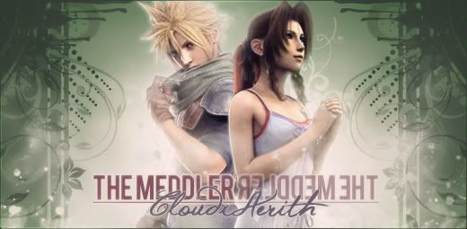
A piece for Cali/The Meddler :)
cali2.jpg

Oh. My. Freaking. God. Wow

This sig is soo good! I love the little flowery effects you've put around, and the sparkles!!! Its soo pretty! The only thing bothering me about it is the focal in the middle, its just a pet peeve of mine...maybe move cloud and aerith a tiny bit more to the right and then you will have made this piece flawless!!! I would also like that Cloud render...if its not too much trouble :P
Also, just a handy tip: I think you should experiment a little more with gradient maps...they're freaking awesome!!!

I'm rambling...sorry :P

Good job!!!!! :D
 
Here's a piece I'm very pleased with! :cali:
newsig2e.jpg


A very simple Rinoa sig. I wanted to keep it basic. :ryan: People are welcome to have this one...if anyone wants it?
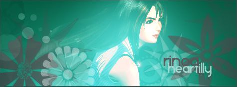
Rinoa3.jpg
 
Rinoa3.jpg


:jess: omg this is simple yet very awesome, the blending just sooooo awesome and the text goes great with how you done the peice :) great job judy keep up the workk :)

 
UPDATE

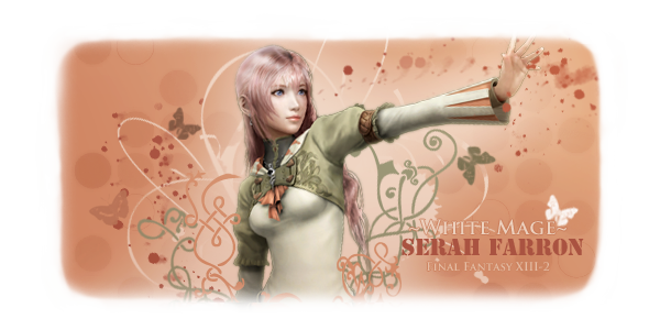
Here's a brand new piece, just made:
SerahWhiteMAge.jpg


SerahFadedcopy.png


And some pieces I don't seem to have posted here yet. ^_^

ResiEvilCallout.jpg


scifi2.jpg


setsize.jpg


popoutcallout2.png


AnimeCallout.jpg


SetColourCallout.jpg


Musicians-Demi.jpg


FFXIII-2CrosswordPrize.jpg

The winning tag for the FFXIII-2 Crossword. No one entered. :sad3:
 
Last edited:
setsize.jpg


More like this please <3. It's absolutely amazing. I wouldn't change a thing about the image itself, but just a little tip about when saving your sigs, avvies, and anything graphics-related. It's better to save them as PNG. I know jpg saves room, but PNG saves the quality, and that's what is most important ^^
 
Update: A few more pieces. :grin:

The prize tag for FFVIII Week!
MusicTagcopy.png


SOTW 3 - Freestyle:
FreeStyleSOTW3.png


A request from .Mosh!
Mosh3copy.png


The recent clan challenge:
Vivi2.png


I do believe my smaller peices are better. :hmmm: Methinks I shall return to smaller sizes for a while and see what happens! =]
 
UPDATE:
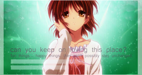
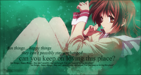
Sort of working with a theme here...

NagisaAgaincopy.png


NagisaSadcopy.png


NagisaHappycopy.png


A request for Martel. :ryan:
MartelSigcopy2.png


MartelSigGrassier.png


MartelSigGrassier4.png
 
Wow Lirael your pieces just get better with time! I see a major difference from your old pieces with this nice new batch of siggies. :3


MusicTagcopy.png

I like this one! The size and color are nice and have a subtle appeal. What I love the most though are those abstracty floral shapes in it. Is that some sort of brush? I've been looking for something like that for ages! :P


FreeStyleSOTW3.png

I really like the color used here and those patterns are teasing me once again. I like what you did with the text. It's simple yet the placement makes it appealing.

Vivi2.png

One of my favorite FF characters. I think I like this one a lot! The text bar on the side is done expertly and the blending of the background and the render is very nicely done. If you were going for a glowy effect with Vivi you certainly pulled it off here! He seems to be vibrating with magical energy. :P

NagisaAgaincopy.png

NagisaHappycopy.png


These two I think are some of the prettiest sigs you've made. I love the theme and the way the text is handled in these. The lighting in the first and second one are superb! Although I don't think the first sig's render blends too well in the green background the second signature is blended to perfection(seriously it's such an amazing piece I hope you include in your sig rotation).

MartelSigGrassier.png

I like this one better but Martel certainly had some gret choices to choose from. I liked this shade of green better though because it seemed to fit in well with the signature and not look too bland or too attention seeking. Just right!(And did I mention those abstract flower things are so cool?! Oh please share with me where you got them from! D=)

Overall you've got a really nice artistic style going on! I can't wait to see more work from you in the future. ^_^
 

I like these two!

The first one has clever use of dots. I am also a fan of the text. Nice lighting you have there, though if I were you, I would slightly fade that flower on the right hand side :hmmm:

The second one is really cute! I like how you use vectors at the back. I can rarely make them work! Green goes well with the character, and the overall feel, though I would perhaps decrease the saturation a little. But that's just me.
 
MartelSigGrassier4.png


Okay, let me first say that I do like the overall look to this tag, just some things I must mention.

First off is how odd the pink on the spring-green background looks. I do think it would have looked better with a more complimenting color aside from the pink. Perhaps Cyan or something teal-ish? On the topic of the effects, they do seem to be limited to a point. The girl seems to be just slapped on there. I am sure that wasn't your intention. I know that wasn't your intention, but based on the look of it, that is what it seems like. Another thing I feel the need to nitpick is the text. I know I am nowhere near perfect at text, but I know you can do better with text. In fact, I've seen you do better with text. I think if you were to coat the text with the green and pink you've coated the colors in the rest of the tag, I think it would come out much nicer, and also provide the text itself as a part of the tag and not a separate aspect.

I do hope you don't take this as me bashing your work. I'm just trying to help you out with some tips and advice. ^^
 
tumblr_m4iaiiWNjk1rot4hlo1_500.gif


How come this hasn't received ANY comments?
ResiEvilCallout.jpg


I cannot begin to explain how beautiful and perfect this tag is, but I will try. (bare with me, I get... a bit wordy about graphics so I might come off crazy for coo puffs as I go on about how perfect this tag is. :wacky: )

Anyway....

First off, the focus of Leon--his placement is boss. I mean, it couldn't have been placed more perfectly than this. But the main thing that caught my attention was the warm, soothing, yet somehow frantic color theme you decided to go with. The orange, goldenrod yellow, and that beautiful dark plum go wonderfully together to create this image as if there is a hectic crisis going on around him. This sort of graphical observational touch builds a story behind it and makes a signature not only look beautiful but makes the observer (like me) think that there is an explanation behind choosing the colors, and therefore setting the theme of the tag and IMO makes the tag automatically even better than before. Giving themes behind signatures is something I believe what makes a tag go from just sorta "brilliantly made with some nice C4Ds and vectors yet sorta dull" to vibrant not only in how it looks to the eye but what it stirs in the viewers mind.

Making graphics is an art form, and like all art--it stirs emotion in us or gives us a story. And you're piece sets a mood and a setting, it tells a story. So, BRAVO on the color choice.

Next, I'll get to the clipping mask text. Perfect! I think there's not a thing wrong with it. And to be honest, I'm a little jealous that you did it so well. I've been gfxing for 5 years now and I make clipping mask look like poo :lew: I also love love love the placement of the text, I think it's in a place that draws its own moment of attention but doesn't directly consume ALL the attention away from the focus (Leon).

The oil-y ripple effect lapping over the piece really adds to that "theme & setting" I was talking about earlier. It's a nice touch and it adds to the "theme" behind the piece. It almost makes the tag look as if it's water painted.

The only thing I think that should be added is a small border to the left and right--maybe make it white. :hmmm: But then again, this is coming from someone who detests borders in the first place :lew:

Also, I think you should do more stuff like THIS specific tag. You got a real eye for it. :ryan: Anyway...... would you mind if I sorta... like, wore this signature? :wacky: It's just so vibrantly beautiful and so epic I really just wanna flaunt it around.

:ari:
 
MartelSigGrassier4.png


Okay, let me first say that I do like the overall look to this tag, just some things I must mention.

First off is how odd the pink on the spring-green background looks. I do think it would have looked better with a more complimenting color aside from the pink. Perhaps Cyan or something teal-ish? On the topic of the effects, they do seem to be limited to a point. The girl seems to be just slapped on there. I am sure that wasn't your intention. I know that wasn't your intention, but based on the look of it, that is what it seems like. Another thing I feel the need to nitpick is the text. I know I am nowhere near perfect at text, but I know you can do better with text. In fact, I've seen you do better with text. I think if you were to coat the text with the green and pink you've coated the colors in the rest of the tag, I think it would come out much nicer, and also provide the text itself as a part of the tag and not a separate aspect.

I do hope you don't take this as me bashing your work. I'm just trying to help you out with some tips and advice. ^^

Thanks for all the constructive criticism. :) The GREENEST piece was my attempt to make the background more grassy, which Martel requested after I sent the first piece (with the more teal-ey hue). The text and effects were trickier to pull off in Photoshop Elements because it lacks some of the basic tools CS2 (my main Photoshop program) has; my PC with Photoshop CS2 broke down. :sad3: I finally have CS2 on my laptop! :cheer: Along with my better fonts. :ryan:

How come this hasn't received ANY comments?
ResiEvilCallout.jpg


I cannot begin to explain how beautiful and perfect this tag is, but I will try. (bare with me, I get... a bit wordy about graphics so I might come off crazy for coo puffs as I go on about how perfect this tag is. :wacky: )

Anyway....

First off, the focus of Leon--his placement is boss. I mean, it couldn't have been placed more perfectly than this. But the main thing that caught my attention was the warm, soothing, yet somehow frantic color theme you decided to go with. The orange, goldenrod yellow, and that beautiful dark plum go wonderfully together to create this image as if there is a hectic crisis going on around him. This sort of graphical observational touch builds a story behind it and makes a signature not only look beautiful but makes the observer (like me) think that there is an explanation behind choosing the colors, and therefore setting the theme of the tag and IMO makes the tag automatically even better than before. Giving themes behind signatures is something I believe what makes a tag go from just sorta "brilliantly made with some nice C4Ds and vectors yet sorta dull" to vibrant not only in how it looks to the eye but what it stirs in the viewers mind.

Making graphics is an art form, and like all art--it stirs emotion in us or gives us a story. And you're piece sets a mood and a setting, it tells a story. So, BRAVO on the color choice.

Next, I'll get to the clipping mask text. Perfect! I think there's not a thing wrong with it. And to be honest, I'm a little jealous that you did it so well. I've been gfxing for 5 years now and I make clipping mask look like poo :lew: I also love love love the placement of the text, I think it's in a place that draws its own moment of attention but doesn't directly consume ALL the attention away from the focus (Leon).

The oil-y ripple effect lapping over the piece really adds to that "theme & setting" I was talking about earlier. It's a nice touch and it adds to the "theme" behind the piece. It almost makes the tag look as if it's water painted.

The only thing I think that should be added is a small border to the left and right--maybe make it white. :hmmm: But then again, this is coming from someone who detests borders in the first place :lew:

Also, I think you should do more stuff like THIS specific tag. You got a real eye for it. :ryan: Anyway...... would you mind if I sorta... like, wore this signature? :wacky: It's just so vibrantly beautiful and so epic I really just wanna flaunt it around.

:ari:

Thanks so much Cali! ^_^ I'm so glad you like it and your comments are absolutely fantastic. You can certainly wear it! :D I'd change the border but I don't think I have the psd - it's on my PC! :sad3: I shall have a scout around though, since I have always used Photoshop Elements on the odd occasion. :hmmm: Nevertheless, it is officially yours! :yay:
 
If I have to make it small (not change it or anything jus make it smaller) is that okay? :hmmm:
 
The Meddler Of course! ^_^ I have made some rather large tags. :gasp:

Thanks so much to everyone for the comments btw! :)
 
Well, it's been a long time since I last posted here! :lew:

I made this piece in Elements, which isn't as advanced as CS2, and thus harder to work with. I went for something a bit different to before - something more grainy and rough!

SerahSigcopy.png


As always, comments and feedback will be much appreciated! ^_^
 
SerahSigcopy.png


this is really nice... im loving the way you used the image the render is for in the background, im also really loving the text that you are using here. it goes really well with the style of signature that you made here, i think the blending and the lighting could be better but apart from that you done a great job on this signature good job Judy :D
 
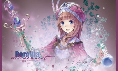
I absolutely love the Rorona piece. It looks really really good.
 
SerahSigcopy.png


this is really nice... im loving the way you used the image the render is for in the background, im also really loving the text that you are using here. it goes really well with the style of signature that you made here, i think the blending and the lighting could be better but apart from that you done a great job on this signature good job Judy :D

Thanks Stevie! Blame Photoshop Elements for the blending. :( There's no smudge tool with a scatter option!!! :ness: Blending can only be done with an eraser. -_-
 
Back
Top