- Joined
- Dec 14, 2006
- Messages
- 11,628
- Location
- California
- Gil
- 0


- FFXIV
- Mitsuki Calei
- FFXIV Server
- Lamia
- Free Company
- Gaia
Well, I guess I'll post my work here. I've only had photoshop for three weeks now, but I think I'm making some progress.
I'll try to post in order from when I first started although I didn't include few of the very first signatures I made.
-----------O-----------
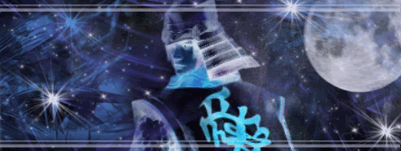
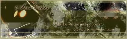
~Samurai~
*My 4th signature. As you can see, the samurai was inverted. Clearly, I was still experimenting.
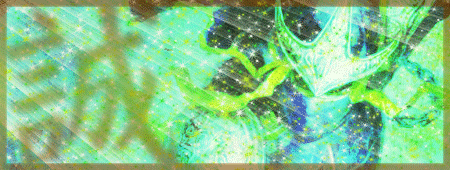
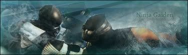
~Ninja~
*I didn't really like this one as the colors were way too bright, but I don't really feel like editing it.
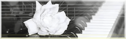
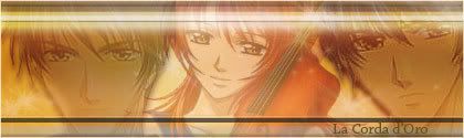
~Piano~
*A pretty simple one. I hope to do some more black and white theme later on.
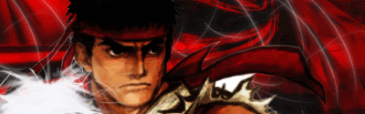
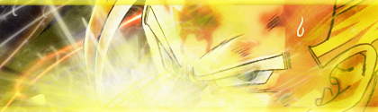
~Ryu~
*Probably one of my least favorite.
~Gohan~
*Ack, way too bright.
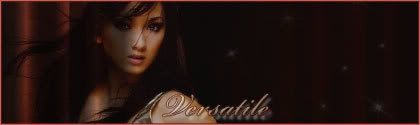
~Iya Villania~
*One of my favorite filipina actress. xD
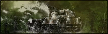
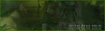
~Tank~
*I like this one a lot. I was trying to aim for more realistic colors.
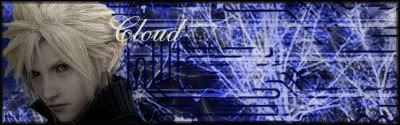
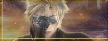
~Cloud~
*Oh gosh, I did not have fun doing this one. It was a pain and probably one of my least favorites too.
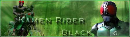
~Kamen Rider Black~
*Anyone recognize him? xD I kinda like this one.
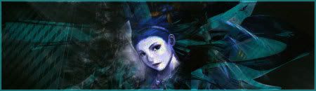
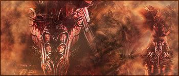
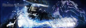
~Shiva~
*Saix wanted me to do an abstract or surreal theme...and so this is my failed attempt at it. >.>
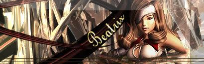
~Beatrix~
*This one's alright. Pretty shiny, I suppose.
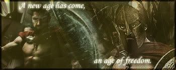
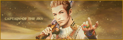
~Leonidas~
*I don't know what to think of this one. It's alright, I guess.
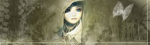
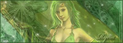
~Valkyrie Profile~
Don't know who she's supposed to be. I just thought this little girl's cute. I think out of all of them, this is my most favorite.
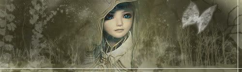
Different version:
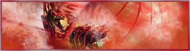
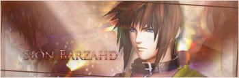
~Valentine~
And finally, the most recent one I did which I just finished a few hours ago. I kinda like it too.

...And that's that. I'll update when I have some more. I'm hoping that in a month, I can make my own signature shop. xD I still don't feel comfortable doing requests for people...
I'll try to post in order from when I first started although I didn't include few of the very first signatures I made.
-----------O-----------
~Samurai~
*My 4th signature. As you can see, the samurai was inverted. Clearly, I was still experimenting.
~Ninja~
*I didn't really like this one as the colors were way too bright, but I don't really feel like editing it.
~Piano~
*A pretty simple one. I hope to do some more black and white theme later on.
~Ryu~
*Probably one of my least favorite.
~Gohan~
*Ack, way too bright.
~Iya Villania~
*One of my favorite filipina actress. xD
~Tank~
*I like this one a lot. I was trying to aim for more realistic colors.
~Cloud~
*Oh gosh, I did not have fun doing this one. It was a pain and probably one of my least favorites too.
~Kamen Rider Black~
*Anyone recognize him? xD I kinda like this one.
~Shiva~
*Saix wanted me to do an abstract or surreal theme...and so this is my failed attempt at it. >.>
~Beatrix~
*This one's alright. Pretty shiny, I suppose.
~Leonidas~
*I don't know what to think of this one. It's alright, I guess.
~Valkyrie Profile~
Don't know who she's supposed to be. I just thought this little girl's cute. I think out of all of them, this is my most favorite.
Different version:
~Valentine~
And finally, the most recent one I did which I just finished a few hours ago. I kinda like it too.
...And that's that. I'll update when I have some more. I'm hoping that in a month, I can make my own signature shop. xD I still don't feel comfortable doing requests for people...


")
") , the other sigs are awesome too, especially the Vincent sig, its kick ass
, the other sigs are awesome too, especially the Vincent sig, its kick ass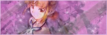


 That's what I forgot to fix! His fingers! I knew something was a bit off. I'll add something in the background while I'm at it. Thanks for the advices, Julius!