Mitsuki's Photoshop Beginnings

Status
Not open for further replies.
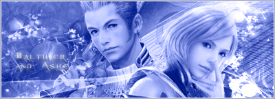
I LOVE that first Asian girl sig that you entered for SoTW!
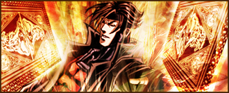
I still go with my opinion that the contrast of the light and dark shades of brown are amazing and somewhat reminds of a cappuccino >.<, the render was also suitably chosen and placed and I love the swirly brushes in the background :wink:

I only found yesterday that you've only been into gfx for a short amount of time, which stunned me, because some of your work is quite stunning!
 
Omg, Mitsuki these sigs are epic. Really nice keep up the good work!

I love that Silent Hill sig.
 
Thanks guys. =]

I only found yesterday that you've only been into gfx for a short amount of time, which stunned me, because some of your work is quite stunning!

Well, it's been around 3 months, so I had plenty of time to practice, I suppose. But thank you anyway. xD

Here's one I just now finished which took me (as usual) a couple hours to do.

Killzonecopy.png


I figured it didn't need a border so I left it at that. Text-wise though...still unsure. =/ Probably would've been better off without it, but meh, it'll do.
 
Better. Though I felt you could've done better with the text. >:( And I mean more creative with it, not do without it.
 
It's good but I don't like lighting it's just way too bright somehow and you can do better with the text.
 
I'm jealous. D:

I think it looks great Mitsuki. I really need to learn how to do lighing effects like that.
 
Still workin' with text, I know. xD That stuff is hard to master. >.>

Here's a few ones I've made recently:

Despair.png


Gambit.png


NinjaGirlcopy.png


NinjaGirlAvvycopy.png


Ichigo1copy.png


Ichigocopy.png
 
You wanted my honest opinion, so here goes xD


It looks good, and I really like the text, but maybe one or two more effects wouldn't hurt it. And the line going down the e seems a little random. But it's very good otherwise ^^


Now this one, I love. It's blended perfectly and the colors look great! A border would complete it though.


I like this set ^^ However, I'd love to see what the signature would look like if you used the effects you used in the avatar ^^


The first one is the better one, the second one is way too light, and it ruins that lovely effect of the light box and dark outline that the first one has.

You've improved loads since you first started though! Keep up the good work ^^
 
=] Thank you, Mark! It's a little different seeing constructive criticisms from you, but I daresay it's definitely satisfying. xD

The Gambit signature actually do have a border, but it's very faint. I'll see what I can do and change it a bit though. And I do like the first version of Ichigo, myself. =]
 
First one I won't comment on it >.>

Second I loved it in SOTW I was going to vote for it but unfortunately there was a better one you know the last SOTW was pretty hard to compete in >.> anyway I like the colors how much they fit and about the border I think you can change it to another color >.>

Third I like the effects in it, it's really awesome

Fourth I choose the first version you know I like Darker things >.>
 
Thanks for the comments, guys! I don't know if I'm improving or going backwards or what. :funnyface: But your criticisms always help in the long run. ^_^

Anyway, few more sigs here:

MM.png


I really enjoyed making this one. It might not be the best but I fell in love with his face there and decided to make into some kind of story as part of the signature. The M&M running away from an explosion as another M&M had exploded and he's running away from the same fate...as you can see by the orange color remnants that I used in the background. Of course it's hard to follow, and I'm probably the only one who can see the funny side to it. xD


BalthierandAshecopy.png


This I made for someone. I know it's basically like a no-no to put two renders in a sig, but I had no choice. =/ I wanted that soft, fluttery feel to it, but I'm not sure if I overdid it or what. I'm always using busy effects in my BG. >.> I know the text placement is also poor, but it was really hard to put it anywhere but on that spot.


JohnMorrisoncopy.png


Not sure about this one, but it was another request. She wanted some glitter effect, so I included some.


Neocroncopy.png


I actually like this one. I think this guy's from Neocron 2 or something. Didn't wanna add text as it may only ruin the sig. But yeah, I wanted that tech-feel and at the same time blend the render and background together really well, to kinda camouflage the subject a little.


So yeah, comments and such are always welcome. =]
 
1st signature: I really like it >.> it's very good I like the effects and the colors good job doing it. ^^

2nd signature: I like it it's one of the best I've seen simple not much colors my liking but I don't like the text much, still it's great overall.

3rd signature: I like the effect but I don't like the real life and those things signatures . >.>

4th signature: I'm sorry I don't like that one and I can't make much of it really. >.>
 
First one.
Ya used a nice stock in this one, background colors match pretty well and the render isn't all blurred over or whatnot ><
I like your little explanation too xD

Second one.
Everything is nicely blended and the 2 renders do not block eachother or anything, so as far as that " 2 renders is a no-no", you did pretty good with what you had to do. Text is a tad bright and fades in the background .

Third one.
No clue who it is, but nice stock, nice text, good blending. Not too much in the background is good.

Fourth one.
Don't like the whole "mirror image" feel of that.. whatever it is xD It kinda clogs up the main image and makes thinks seem crowded.
 
Lol really shows how different all our styles and preferences are. Those ones that I don't really like is liked by others, while those that I like isn't really well-liked. :wacky:

Okay, I worked on all this yesterday. Yes, it took me like 12 hours to make all these sigs/avatars. I was on a roll! This is a little different from my typical work since I wanted to try that soft-feeling to it and not overdone with effects. Quite surprisingly, I enjoyed doing them. =O

Yunacopy.png


OnegaiTeacher2.png


RoronoaZoro1copy.png


Cloudcopy1.png


Cloudcopy.png


Cloudavvycopy1.png
Mizuhoavvycopy.png
RoronoaZozoAvvycopy.png
 
I like them. :monster:

Neat and simple, very nice. The Cloud set looks especially good.

Good work, Mitsuki.
 
Aww, there are awesome nice job especially with the second one the colors just fit greatly, and I see your lighting skills improved. ^^
 
My favorite is the third one.Everything in that sig is perfect for me and you've blended the stock very nicely with the background.
 
I like the third and fourth signatures more.

You know, that Cloud signature just blew me away.

Fantastic, Mits! :monster:
 
Do you mind if I also comment on your tags that you made for the request(septhiroth,kuja)?
I think they're really nice.I gotta admit that your blending skills have improved a lot,keep it up.I'm expecting much from you.
 
Status
Not open for further replies.
Back
Top