Rate The Sig And Avatar Above You

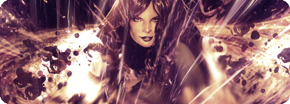
6 for avatar... looks like it was coppied from internet
and a 2 for sigs.... they are too short

unable to see picture
 
Last edited:
Avatar - 3/10, It's just one of Nomuras drawings in avatar size...

Sig - 2/10, 4 quotes does not a sig make.

For the record, Lady Rufus, your new stuff would have got 9 and 10 from me ;)
 
Avatar - 4/10, I dislike the colors for some reason =/

Signature - 3/10. Sprites bored me...

I concur...

Now back on topic.

Jeangrey.png


Avatar: 9.5
Nice avatar of Shakira and Beyonce, though I don't like the size, thus the -0.5 was given.

Signature: 10/10
Great background, and the stock is adequately merged with it. No edgy areas around the stock are seen, thus making the stock fit with the background. The effects around are also, great, and I see some kind of fiery or "vanishing" effect below her arms and upper torso, nice. The shape of the signature is also great, different from the typical rectangular shaped signatures. Best of all, it is not completely purple :wacky:
 
L i g h t ♥;343430 said:
Sig: 2/10 - the background's kind of bleh, and I don't like the text. It's boring.
Avatar: 4/10 - sig crop, but it looks better.

sorry...

I kinda searched this thread and posted on purpose, for some reason expecting a similar comment. Don't apologize for being honest, sometimes a "bitter truth is better than a sweet lie", and I prefer it to be that way.Though I feel quite disappointed when it comes to my skills, I am sure your comment will make me think about dedicating more time to the background and try my best on a future signature. I guess for now it' s a "better luck for the next time". :shame:

Now back on topic...

Signature: 8/10
Looks ok for me, though I don't remember the guys in it o_O
Avatar: 7/10
Looks cool, though I can't see some parts of the avatar so well, must be my vision.
 
No avatar -1/10 lawls

The sig is confusing...is your car as fast as sonic? I'm not a fan of scan lines but I like what you did with the text 9/10
 
hey J.A

9/9
9/9

verynice! p.s who is that on your avi?
 
Avatar 7/10 - Too much goin on, dunno just doesn't catch my eye.

Signature 7/10 - Again, too much red man :D, told you this before :P, nice idea with the Rectangular tool, but you should have used a different setting, cause you can see where they overlap.
 
Huh? Its Balthier and a dragon thingy. How can you not see it:P

for that...:D

Avy- 4, too white
Sigy- 4, dont know whats goin on there. the top ones cool though
 
It's because I can't view certain images... And the siggy, It's 2 sigs, and the third one is a link to my sig shop, below that, it's the clans I'm part of, and then a small quote from Crisis Core. So what's the hard part, XD
 
AV: 8/10. Minerva was a fun boss, so, gotta give you props for that.

Sig: 8/10. I really liked the Aerith and Zack sig, but the sig in entirety has so much going on. xD Still cool, though.
 
9/10 Nice coloring, although I'm not too hot on the background. Overall very nice.

8/10 It's a little bigger than it needs to be, and it has that techno-ish background. I love the eyes and the coloring though.
 
Back
Top