Stevie's Graphics

Status
Not open for further replies.
update time

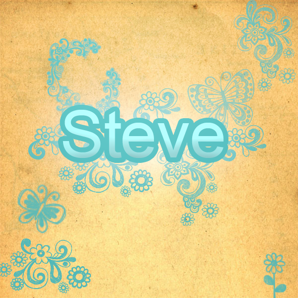
Textwork2.png


just a quick text work :) what do you guys think :P
 
Very nice and bubbly. =)

Love the shades of blues used and the patterns around the text make it really pretty. =)

The font is maybe a tad too plain for me personally because of all the fanciness going on around it. It still looks fantastic though!

Nice background too. Gives it a more finished look.

Awesome work!
 
It's good :)

I like the combination of blue and yellow. But text could probably be blended in a little more.
 
My sister requested a star effect.. soo i created her one :yay:

Star.png
 
I Come Armed with awards... and a signature :D

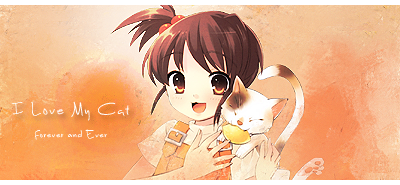
ILovemyCat.png


was trying out smudging :P.... think it came out pretty well XD
 
Oh very cute!!!

I love the peachy colours going on and the smudgy background! It has a really nice texture!

Very cute image and is blended in nicely. I like how the girls overalls match the colour scheme.

The font is very cute and sweet. =)

Such a lovely signature!

thank you very much.. the render matchs with the background cuz the background is the render... i just smudged it :P
 
just a very quick update 4 u :)

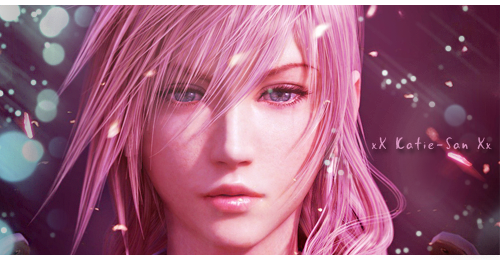
katielightningsigrequest2.png


just a request i did :)
 
just a very quick update 4 u :)

katielightningsigrequest2.png


just a request i did :)

I really like this one! Your color scheme on lightning is brilliant. The sig is refreshing. Nice effects on the background and lighting too. And your half borders always work well most of the time.
 
I really like this one! Your color scheme on lightning is brilliant. The sig is refreshing. Nice effects on the background and lighting too. And your half borders always work well most of the time.

thanks cid :jess:

oh yh i been meaning to ask what kind of tutorials do u look at.. cuz ur sigs are like soooo amazing :ryan:
 
thanks cid :jess:

oh yh i been meaning to ask what kind of tutorials do u look at.. cuz ur sigs are like soooo amazing :ryan:

Hey thanks too =)
I don't really look at tutorials (except when I want to know how to make rounded borders, etc). I think it mostly came from practice and also inspiration from others. For example, I was inspired by Kira's text placement and method, and also from other artists. But I still have lots to improve on actually.

Your works are great too. I think you should make more sigs in your free time :P just suggesting.

it is something i wanna get back into more :)
 
Oh very pretty! I really love the use of colour in this!

It's so bright and pretty!

Goes very nicely with Lightnings hair. =)

It's a very clean and lovely signature. Gorgeous colours, lighting and cute text. =)

Awesome work!

wow somebody likes my text choice???? that a first XD

thank you for the comments :D
 
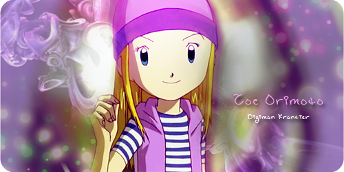
here a set i spent like almost two hours on today ;)

ZoeDigimonAvatar.png


ZoeDigimon.png


for the first time in like ever i used a C4D Render in my work... i never do that XD
 
here a set i spent like almost two hours on today ;)

ZoeDigimonAvatar.png


ZoeDigimon.png


for the first time in like ever i used a C4D Render in my work... i never do that XD

Hey this is an awesome first attempt at c4Ds! I like the colours and how it matches Zoe/Izumi. One problem that is not your fault is the render, because it's not of very high quality :P That's just too bad. Text is good, just need more blending. The textures and brushes at the background could have been blended in a little more too. But when I look at it as a sig by itself, it's really a cute, lovely sig :)
 
Hey this is an awesome first attempt at c4Ds! I like the colours and how it matches Zoe/Izumi. One problem that is not your fault is the render, because it's not of very high quality :P That's just too bad. Text is good, just need more blending. The textures and brushes at the background could have been blended in a little more too. But when I look at it as a sig by itself, it's really a cute, lovely sig :)

the image a stock... and it was soooo hard to find a good stock of her :sad3: it was the best i could work with

yh i fail at text blending XD.... and yh it looked ok the blending on the pc but i noticed it once i moved over to the macbook.... it the c4d i think...

the background pretty cleaver... it her digimon blured out XD

Ah I see. It's kinda hard to tell between stocks and renders XD sorry

Hmm yeah I noticed her digimon form behind her, blended in cleverly.
 
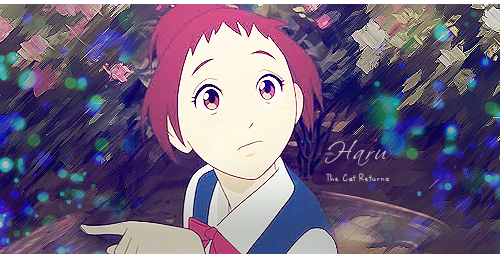
here a set i did cuz my old one wasn't high quality :P

HaruAvatar.png


HaruSignature.png
 
here a set i did cuz my old one wasn't high quality :P

HaruAvatar.png


HaruSignature.png
Haru! :yay:

I like the way you've framed this and the text is great! The use of brush strokes is something new in your work, isn't it? :) It works very well on the top half of the sig, since there's more going on. The bottom still looks nice and arty. :yay: Haru could have been blended in a little better, perhaps with some smudging that fades the further it reaches into the background. I still like the borders you use! :)
 
Status
Not open for further replies.
Back
Top