Lady Edea's Garden

Commission.png


Commissionavvie.png

I really like that avatar, the text is perfect and i love the blue colours, reaally nice work.
I think the signature would look better if the opacity of the render on the right wasnt lowered, its kind of an odd contrast between the 2 of them. But then agin i can see why uv lowered the opacity.
nice work :)
 
I think I'm addicted @_@

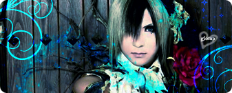
Tis Teru from the J-rock Band Versailles. I love him <3

Teru-2.png

Teruavatar.png
 
Very nice. I really like how the main image is black and white and then theres different colours all around it. The wooden fence is a nice addition to the background as well. Not too sure about the text on "glomp". Perhaps if it was turned slightly like the heart is it might work better. Maybe trying a border would make it better too? Anyways i really like it. Very cool new set!
 
I'm actually having trouble with borders, I tried them with the last Remnant Sig and ended up getting REALLY frustrated with it, and the glomp text is actually a brush, so i don't know how to modify it >.<
 
Wow Mixi your newest siggy is pretty good. Wow Mixi you are pretty good at this stuff!!!!;)) Your newest siggy I like the text and the background but am still freaking out at your Last Remnant siggy!!!
 
The borders are sometimes tough to find colours for, i know where you are coming from. For the text, i'm surprised that is a brush, I though it was just text. Thats really good job on that. If thats its own layer, try 'ctrl + t' see if that works. It should make a box around the text layer and then you can rotate it. Not sure if that would work because i usually just use text for text not brushes.
 
Put the text brush on a layer of its own. File > free transform and you should be able to move it to whatever angle you want it at. :gasp:

Teru is super kawaii. You've got your own style girlie <3 It's pretty ^^ Keep em coming ;))
 
Put the text brush on a layer of its own. File > free transform and you should be able to move it to whatever angle you want it at. :gasp:

Teru is super kawaii. You've got your own style girlie <3 It's pretty ^^ Keep em coming ;))


I can't >.< The heart and the glomp is all one brush. if I did that it would turn the heart too :gasp: lol See I never use text. I kinda suck at it, so i have loads of text brushes, and quote brushes :P Like I have FF7 quotes and FF8 quotes. lol

o_O and the image isn't black and white. thats just the way the guy looks lol. He's really pale and his hair is black and white. lol
 
Double post :gasp:

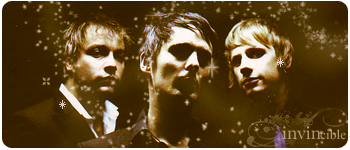
New set. I made three avatars since all three guys didn't fit in one :P

muse.png


Matt1.png


Chris1.png


Dom1.png
 
Very great stuff Mixi!!!! Lol you know what your doing oh and your new 3 guy siggy is very good I like the text invincible. The colors were good also. Nice job Mixi. Nice avvys too:)
 
New stuffs. ^_^ BTW anything I make is free to use as long as you credit me lol
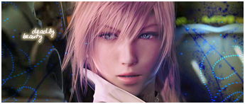
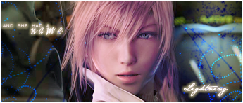
v.1
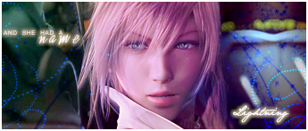
lightning1.png


v.2
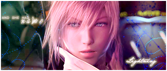
lightning2.png


v.3
lightning2-1.png


Avatar v.1
lightningavvie.png


Avatar v.2
lightningavvie2.png
 
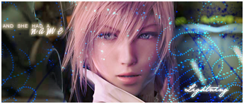
Omg Siren I love your lightning siggy omg its beautiful. Ummmm I do not know what to say the background colors are just amazing. Omg amazing siggy and lightning is awesome.
 
I definitely think that V2 is the best. v1 is good, but the text in v2 is just amazing. Makes it look that much better. v3 i didn't like because the blue dots were covering the face of lightning.

You are really improving Mixi, these sigs are so unique and they look great. Keep it up ^^
 
Thank you ^_^

The only reason I actually made v.3 was because when i went to make an Avvie from v.2 i though it looked WAAAAY plain. so i added the blue dots to add some spunk or summat lol
 
I think V2 is the best, the blue dots all over her face in version 3 really put me off it D= You're improving all the time though, Amanda ^^ It would be great to see you experiment with smudging and C4Ds too though ^^
 
You just like blue, don't you? XDD I like Lightning, I prefer v.2 tbh I like the colors in it, the text could have been better but it is alright.
Second sig is really good, though I'm not sure about the border. >.>

EDIT: I just noticed it wasn't a second sig, it was your current sig. XDD
 
lol I love blue. Blue and purple are my fave colors lol.

oh btw I Love your Mikey Way siggie. I've been meaning to tell you that lol. Mikey Way is ♥
 
okay been a long time simce I've updated. I was bored today and did this at home..
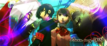
I'm obsessed with Persona 3 atm.


Persona3.jpg


persona3avatar2.jpg


Persona3avatar.jpg
 
okay been a long time simce I've updated. I was bored today and did this at home..
I'm obsessed with Persona 3 atm.


Persona3.jpg


persona3avatar2.jpg


Persona3avatar.jpg

Oooh, Amanda, this is your best update yet! Loving the colours used ^^ I can't wait to see how you'll improve though ^^

I think the text on the avatars could be a little bigger though, and the signature needs a border to finish it off ^^
 
Back
Top