Navigation
Install the app
How to install the app on iOS
Follow along with the video below to see how to install our site as a web app on your home screen.
Note: This feature may not be available in some browsers.
More options
You are using an out of date browser. It may not display this or other websites correctly.
You should upgrade or use an alternative browser.
You should upgrade or use an alternative browser.
Lady Edea's Garden
- Thread starter Aselia
- Start date
- Tagged users None
i actually don't know what tutorial i used to begin with I've been doing this for quite a while so i don't know what i used when i started.. i can attempt to make you one... though I"ve never done one before... I can try though 

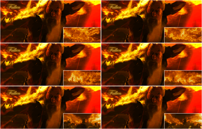
I really liked this one! The colours and shading look awesome and the whole movement of the signature looks great!
I love that little GIF you've added in down in the right hand corner too.
The text looks lovely and the colour of it is very fitting.
The simple border finishes it off nicely too. =)
I voted for this one!
I'll re-post my comments from the actual voting thread:
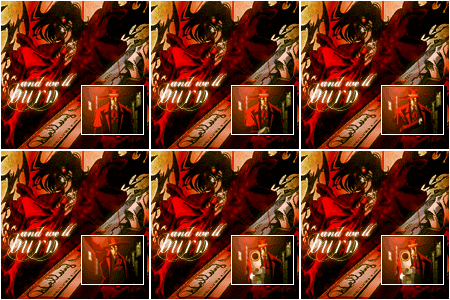
The size is suitable considering it has another image inside of it.
I like the fact that the maker used animation in it too. Don't see that very often in these comps.
The colours flow well together and although I think that the lighting could have been a tad better, it still looks great.
This one is quite colourful which I love!
I love vibrant signatures!
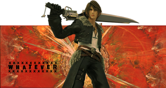
The simplicity is appealing and easy on the eyes. The lighting is great and I like the fact you didn't add a border. It doesn't need one urgently and looks great as it is.
The text also looks lovely.
I love the font and the two lines that create a border around it.
Great work again!
Okay so Please no one use this set as I made them for my next name change...
Well, I've been on a tad of a Justin Timberlake loving spree lately.... and he inspired me like never before!!!!!!
Seriously. I listened to both his songs and *NSYNC the ENTIRE time I made this set >_>
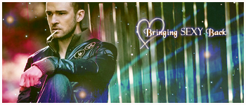

Well, I've been on a tad of a Justin Timberlake loving spree lately.... and he inspired me like never before!!!!!!
Seriously. I listened to both his songs and *NSYNC the ENTIRE time I made this set >_>

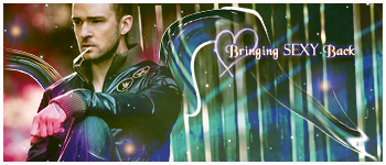
Wow this set is gorgeous!
I love the colours and the nice glossy feeling this signature has about it.
The blurriness in the background looks really good and makes you focus more on Justin which is good.
The little glowing bits in the background look really nice too.
The only thing I would suggest is to move Justin into the middle more and push the text closer to him. It looks a bit spread out at the moment.
The text is really cute and I like that heart behind it!
Where did you find that heart brush/stamp by the way. I love it! XD
The nice thick border rounds it off nicely!
lol. Thankies Kandy <3
I would move him more toward the middle, but its a stock, so i couldnt move him around as freely as i would have wanted to....but i saw that picture when looking for good pics of him, and i just HAD to use it lol
and as for that heart brush.... you can download the set with them here.
I just went ahead and uploaded it to my Mediafire...
and on a side note, my Windows Media player LOVES *NSYNC tonight...lol
Thank you so much for that link!
I've been wanting that brush for an age now!
I've been wanting that brush for an age now!

Original:
New:
The liquefy effect does look interesting, though I think it also looks a tad messy over on the right.
It looks pretty over on the left next to Justin though. XD
I honestly prefer the first version. It looks a lot cleaner and less busy. =)
Though experimenting is always good!
Keep up the awesomeness!
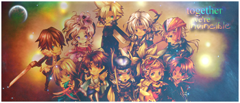
They're really excellent! The mini FF characters are really cool  I've never seen them before.
Anyway, the colour scheme is bright and interesting and the background is nice with the moon/planet in the top left. The cloudiness works as well IMO. It has real sense of togetherness Well done.
 I've never seen them before.
Anyway, the colour scheme is bright and interesting and the background is nice with the moon/planet in the top left. The cloudiness works as well IMO. It has real sense of togetherness
 Well done.
Very cute set!
I like the moons and stars surrounding them in the background and the colour scheme works brilliantly!
The lighting is well done! I like that haziness you have over the top of the characters.
I would suggest moving the text down the bottom and sitting it on top of the characters in the middle. Not so that they're completely covered, just covering their bodies a little, not their face.
This will help establish the focal point better in my opinion.
Keep up the great work!
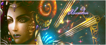
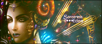
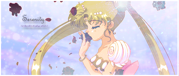
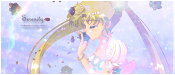
This one is my favourite out of the two.
I like the softness of it and the glittery specs throughout the signature. It's very pretty.
Also that large patch of blue right next to her head is rather striking. I think it helps bring more attention to her as well.
I prefer the text in this one. It's much more fitting and the font is gorgeous!
Overall this is a lovely signature. <3
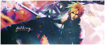
I love this set, it's the best work you've ever done. I prefer this version, as it's still vibrant but not in a in-you-face sorta way, in the other version, Cloud's face is yellow, which is a little too much. This one's lovely. The blending is superb.
I love how simple this one is, the text is really pretty too, and I love the use of lighting. It would be interesting to see how you would blend her, but it's a really pretty sig Amanda.
You're improving all the time!
 Keep it up dearie!