Lady Edea's Garden

That isn't bad, what program are you using to create that if you don't mind sharing?

I use photoshop but that doesn't seem to have the same type of graphical outlines that photoshop has. It looks far too authentic like it was made by a professional, like Atlus themselves did it for Persona 3.
 
That isn't bad, what program are you using to create that if you don't mind sharing?

I use photoshop but that doesn't seem to have the same type of graphical outlines that photoshop has. It looks far too authentic like it was made by a professional, like Atlus themselves did it for Persona 3.

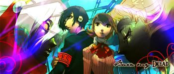
I use photoshop. I just took a stock image of P3 and just added random effects to it... its a random P3 wallpaper i have at home
 
That explains it, here I was thinking the characters looked much too authetic and not just fan made but it is possible to create character sprites almost the same as the real thing. I know of a few of them for various games that are still in the works but most of them are for 2D sprites in older generation games.

You need game creation software and a program to let you create them more modernized and you might as well try to create the entire game while you're at it, just think of a story... If only it was that simple.
Photoshop is a professional program and game companies do use it.
 
Persona3.jpg


This ones quite nice it has a good smooth look to it however i dont think the flower brushes fit to be honest, i would definately suggest removing them and trying something else. THe text is quite hard to read aswell, maybe try a different font and have it placed nearer the stocks. I ike the tinges of blue a lot though they look a bit clashed beside the red.

persona3avatar2.jpg


Persona3avatar.jpg


I like both avatars, i would be more than happy to use them. Good placemnt of stock, the text could use some work but overall theyre really good.
 
new stuff.. This pic is actually of an action figure believe it or not. i think i did pretty good to make it look non action figure-y
MitsuruAvatar.jpg


MitsuruKirijoSig.jpg


Mitsuruavatar2.jpg


mitsuru2.jpg
 
Last edited:
new stuff.. This pic is actually of an action figure believe it or not. i think i did pretty good to make it look non action figure-y
MitsuruAvatar.jpg


MitsuruKirijoSig.jpg


Mitsuruavatar2.jpg


mitsuru2.jpg

Oooh, that's really pretty Amanda! However, I think it would have been more effective without some of the brushing. The left side in particular looks out of place. The text is a little too small, so if you made that bigger, it would look a lot better.

Keep up the good work though, you're really getting better ^^
 
new stuff.. This pic is actually of an action figure believe it or not. i think i did pretty good to make it look non action figure-y
MitsuruAvatar.jpg


MitsuruKirijoSig.jpg


Mitsuruavatar2.jpg


mitsuru2.jpg


I think theres to many colours that clash with eachother. Try adding a gradient map on soft light blending mode to help make them blend together better. I dont think the Floral brushes to the left fit either.
I like the effects behind the girl, they look good, that circley thing really gives the render good placement, i also prefer the versions without text.
Well done =)
 
since i havent done anything in like ever before these past few, im slowly relearning PS and how i like my siggies, lol

FF8.jpg


ff82.jpg


ff8avatar.jpg


ff8ava.jpg


Original stock:

FinalFantasyVIII.jpg
 
Last edited:

That's definitely your best work so far Amanda! I love it. The text in particular is amazing. It would have been pefect if you could edit it so Squall was a little higher though, his placement is a little dodgy.

Nice to see you making stuff again though, Amanda ^^
 
This will be my next set, After being Mitsuru Kirijo I plan on being Raine Sage... from Tales of Symphonia...

rainesage.jpg


RaineAvatar1.jpg
 
This will be my next set, After being Mitsuru Kirijo I plan on being Raine Sage... from Tales of Symphonia...

rainesage.jpg


RaineAvatar1.jpg

Ooh, Amanda, that's your best work so far! I love how blended it is, and the colours ^^

Although, I'd make the text a little bigger, and as far as brushing goes, I'd try to avoid brushing over her face, since you want that to be the focal, so the white spots on her face sorta take away from that.
 
the white spots are actually a part of the spell she is casting in the stock... so yeah... lol but other than that its good? ^_^
 
Just some recolor work... it was originally going to be for my SOTW 102 entry... but i had a much better idea instead...

Original:
ron_hermione.jpg


and the recolor, which is true to the book!!!

RonandHermionerecolor.jpg
 
Oooh, Amanda, that's really impressive ^^ It's perfect! xD Well done. I know a lot of people wouldn't have had the patience to do that. xD
 
Something new as well as some sigs I made aaaaages ago... yet somehow forgot to post in here >_<

new:
balambgarden-1.png


balambgardenavvie-1.png


balambgardenavvie2-1.png


old stuffs:

TidusYunaFallingaway1.png


TidusYunaFallingaway1av2.png


TidusYunaFallingaway1av.png


kosmos-1.png


kosmosavvie-1.png


kosmosavvie2-1.png
 
Last edited:
That colour editing in the Hermione picture is amazing! I love that bluey colour by the way.

How did you manage to do that by the way? It's simply gorgeous!


Lovely work on this one.

the image in the middle is quite striking and the lighting is well done. The only thing I would suggest is that you tone down on the effects surrounding the focal point and blend them into the background more.

There seems to be a little too much which distracts the attention away from the main image.

I love the font you used for 'starlight' and the placement of it in the signature looks great but I would suggest moving it down to the bottom right hand side in the avatar. =)


Oh my gosh I love this image of Yuna and Tidus. =0 Coco made me the loveliest set with that image!

I love those little blue dotted swirls you have in the signature and the colouring is s simply gorgeous!

The glow upon their skin looks so beautiful and the whole signature gives off such a passionate vibe.

The text is placed very well and the font chosen looks really really nice!


Pink and purple! Such pretty colours!

I really like the image you used in this one and the effects behind her. The little starts looks cute in the background and the highlight of pink around her face looks like a cute love heart. Not sure if it's meant to be a love heart but it looks like one. =P

Lovely highlight of pink around the text and the font chosen in both lines looks quite excellent.

Well done on these! Post more soon!
 
Last edited:
Thank so much for the CnC ^_^ Um... for the Hermione recolor, I used the color replacement tool, and found a shade of blue that I liked.... It took quite a while to do it though >_< I remember the Tidus/Yuna siggie Coco did for you... it WAS lovely ^_^ ACtually my Tidus/Yuna siggie is one of my favorite sigs I've made ^_^ For the KOS-MOS sig, I actually think that most of the stuff behind her was already in the pic, though I really don't remember... I did it months ago, How exactly do you mean blend? I've tried using blending before but I never like how it turns out. Every time I've ever tried it turns out looking messy and I end up erasing the blending...
 
No worries! =D

When I say 'blend' I mean, just fade the effects or whatever it may be into the background a bit more. Kind of camouflage it in a way.

So you can see it's there, but that it's not so in your face and distracts the audiences attention away from the main object we're meant to be looking at.

Lower the opacity a little so that it isn't so bright, or so that it's not as bright as the image.

I'm no expert, but that's what I do anyway. XD

Hope I explained myself a little more and didn't just confuse you. =)
 
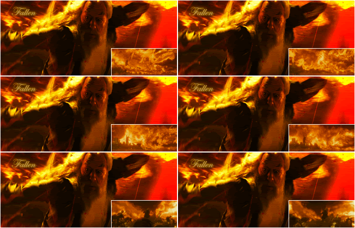
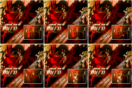
These were my SOTW 102 and AOTW 52 entries

dumbledore3.gif


alucard1.gif


and i know that someone asked this in the SOTW thread.. the dumbledore image was a .gif file i found on google and liked. Idk how they got it though...
 
Back
Top