Lady Edea's Garden

I could have sworn that I had commented about your stuffs before.
Dissidia.png


I just have to say that this is so CUTE!! The colors that you chose go very nicely with the picture. ^_^
Cloud2.png


Cloud2av.png


Cloud2av2.png


On your cloud sets I much prefer the second set. The first set is beautiful (I'm a fan of bright colors), but the colors are a too harsh. In the second set the colors are still there but they're much more toned down. That's why I say the second one looks better.

I just realized where I have seen that Cloud picture before... my roommate has it hanging up on her side of the room!! XD
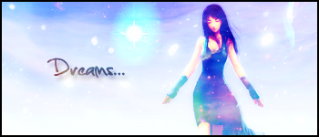
serenity.png


serenity2-1.png


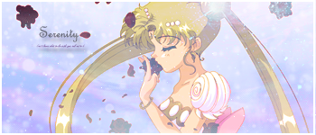
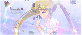
^^ I love what you did with these. They are both very beautifully put together. The graphics are very nicely done as well as the text. I'm leaning more towards the top one out of the two of them. The graphics and effects that are in the bottom one are a great add and give it a very soft feeling, but it almost makes it a little hard to see. Now that I look at the top one... it just looks a little plain... :/ I like both of them though!!

Good Job!!
 

I prefer this version of the two.

It's colours are a lot softer and much more pleasant.

The texture is lovely and the blending is really well done.

The text is also really nice. You chose a lovely font.

Nothing much to say except well done!


Awe I simply love this version!

I prefer the lighting in this one. It seems more blended as well.

The colours are simply gorgeous and the softness of it is so pretty!

Lovely detail in the background too! It all feels so magical. XD

Beautiful font used as well. <3

Keep up the amazing work!
 
Thank you all for the comments ^_^

New stuffs. something neat about the Cloud, Sailor Moon, and this Zack signature here... all the starry glitteryness is actually pictures from the Hubble telescope, placed on top of the stock and set to lighten. they make for amazing background stuffs ♥♥♥

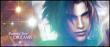
Zackdreams.png


Zackdreamsav.png


Zackdreamsav2.png
 

This is just pure sexy!

I simply love the texture of Zack's skin! It's so soft and flawless!

The greens and blues look gorgeous and the sparkly look is beautiful!

Love the lighting and the text is gorgeous! Lovely placement and good choice of font as well!

Keep up the fantastic work!
 
Thank you all for the comments ^_^

New stuffs. something neat about the Cloud, Sailor Moon, and this Zack signature here... all the starry glitteryness is actually pictures from the Hubble telescope, placed on top of the stock and set to lighten. they make for amazing background stuffs ♥♥♥

Zackdreams.png
Definitely, one of your best, it's quite an epic sig if I do say so. The Zack focal definitely gives the sig an overall "dreamy" effect, which combined with the soft lighting gives it a very nice, soft look. The effect on the right hand side is brilliant and I really like the space effect on the left, it gives the sig a very nice complexion. Font is also very good.
Ace sig, keep up the great work!
 

Gorgeous. Love the colours, the little sparks of light.

It's super gorgeous xD Really love it. Simple back border to round it off nicely.

I also love the current Edea sig you have, the colours are gorgeous in that one, and I love the text. Absolutely LOVE it on that sig.

Keep it up!
 
Before i post my new stuffs I need to put something i forgot to before :gasp: credit on the stock images used the cloud and zack images were drawn by Negshin
The Sailor Moon was drawn by Kalisama and the Edea was drawn by lyxia

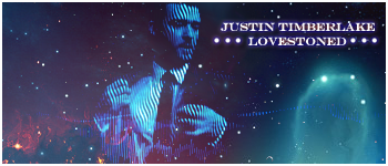
Okay now on to my new Justin Timberlake set.

JTLovestoned-1.png


JTLovestonedav150-1.png


JTLovestonedav100-1.png
 
Last edited:
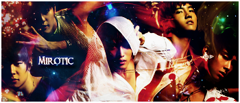
DBSK.png


I just made this. I'm trying new things with hues and stuff.... I kinda wanna learn how to use C4Ds better too :gasp:
 
:gasp: Double Post... But I wanna make sure these get seen... >_> I'm REALLY proud of this set:

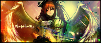
FireinTheSky.png


FireinTheSkyAv1.png


FireinTheSkyAv2.png


:se7: I LOVE this set ^_^

Credit for the stock goes to Masterbimo
 
Ooh, Amanda, now THAT'S pretty. I think it just needs a light source and some text to complete it, but overall, I think I'd agree with you saying it's the best thing you've ever done :yay:
 
Lighting and Text....

Well I made one with text to begin with... but I preferred the textless :gasp:

I added lighting to it as well:
FireinTheSky2.png


and one with lighting and no text:

FireinTheSky2copy.png
 

I prefer the textless version too. XD

The colours are just so pretty in this one! I love the glittery effect it seems to have and the lighting is very well done too!

It has a nice glossy smooth feel to it and the sparks of colours coming from the right looks cool. <3

The girl is blended in well and the focal is well established.

Very very pretty signature. Keep up the beautiful work. <3
 
I like this version better than the one with text. Text is never an easy thing to bring into an image so its no big deal. =) The colors and position of the image are very well done and the light effects around it give it a special look,. its very pleasing to look at. Really, I don't think it even needs text at all.
v.v you're good with CD4, dammit I'm outta the loop here :gasp:!
:monster:
 
lol Thankies Ryuuki This is actually my first time using a c4d that wasn't made from a picture taken by the Hubble Telescope lol. That set was actually just meant to be me experimenting with c4ds and stuff, but I LOVE how it ended up <3
 
it is an excellent set .Edea, The colours go together really nicely.
I love the way you have used the light on it too. Everything works in this set.

Very Well Done
Keep going:D
 

Beautiful work!

As always the colours are gorgeous and the lighting is well positioned.

I like those colourful sparks coming from the bottom right hand corner too! They're very pretty!

The background looks cool. Was that originally there?

Lovely sparkles throughout the signature and the border rounds it off nicely.
 
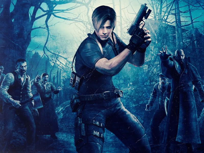
^_^ Thankies Kandy! Yesh, that is the original background. this is the stock I used for it...
Leon_S__Kennedy___Wallpaper_by_Stre.jpg


Back
Top