Lady Yuna's Graphics

Status
Not open for further replies.
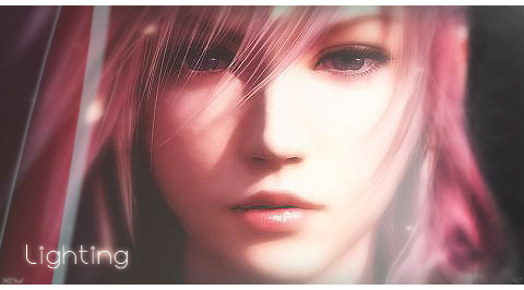
Steve, just a query, are you meaning to spell Lighting? I just wanted to point out that if it's her name it's Lightning, there's an n missing in some of the tags, just thought I'd let you know, unless it's intentional in which case I'm sorry :gonk:
DarkShadowSigRequest1.png


I quite like this one, with what you have done with sharpening and blurring of Lightning's face, the lighting is pretty good too, although there are a couple of things I'd wish to point out. In some of the sharpened places, they seem a little too sharp, the most noticable part I think is her mouth, maybe throw in a bit of texture and it would look nice too, loving the font though :)

Keep it up!

slaps self in the face..... dam i hate spelling :( stupid square spelling names weaidly XD no i failed at spelling thanks for pointing out

yh the mouth bugged me to :( it looked weaid after sharpening :( but hey ho.... still when looking at an stock i get confused with what to do... it my next step of action... llearning things to do with stocks
 
I come to you with a sig :wacky:

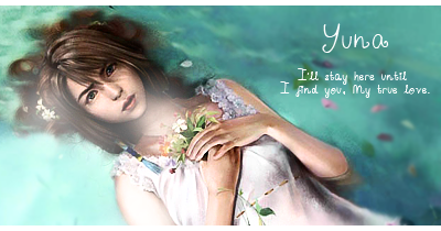
YunaWhiteDress.png

I liked the image... so i tried making a sig out of it, I mainly changed the brightness and contrast... I also duplicate the layers with the image and added different blending options. Finally i added lighting and sharpen, blued and added text... i quite like it :) comments people or i might have to do something :hmph: options.
 
That Yuna sig is SO good! The font fits nicely with it. Tis gorgeous :)
 
holy crap i not updated in a while fail XD

anyway here my entry for the 7th clan thing XD

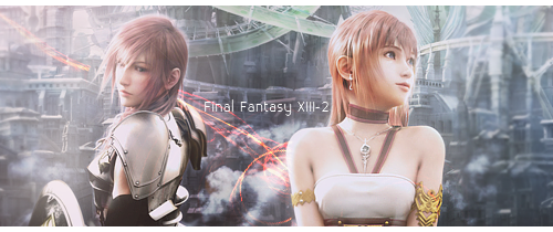
FFXIII2ArtWorkSig3.png


I sooo wanted to use the picture but i am not to happy with it :hmph: I just find it too simple for my liking XD which is an epic fail to me :P
 
Whether you like it or not, you have honestly improved ever since you first started out, and I mean majorly. :lew:

Even though the renders still stand out a bit, I think you did a nice job on blending them in, and toning the colours down so it's balanced out with the background. You can't have a nude skin colour on a green background for example, it doesn't blend and will look slapped on :lew:

Definitely enter Clan Challenge #8, too, Stevie! It's a nice practice, plus you help out your clan. :lew: Double win!

it wasn't a render it was a stock image with effects added to it XD

yh i'm entring clan challenge 8 :D i'm also gonna do a few signatures tonight just for fun XD i'm looking into using textures for effects :yay:

and thank you for them kind words :) you get +rep for that ;D
 
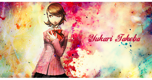
i'm on a role XD decided to create a persona sig as i am playing the game right now and i'm loving it XD..... i decided to try effects lighting using textures the lot :wacky:

PersonaSig.png


It looks good but the blending method i did has seem to have covered up the lighting a bit... :D I wana go looking for effects C4D Renders at some point :D
 
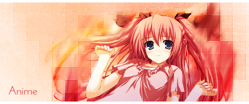
dam this is simple... i had a major block with techniques today and i just couldn't think of stuff and all my signatures i was making was like :hmph: soo i went back to basics and started looking at tutorials this eveing and after looking at them 4 3 hours and trying many different things and failing i came up with this

AnimeGirl.png


it kool but it just seem rubbish compared to what i been doing recently i was just trying smudging to blend in the render into the image...sooo me thinks it a fail for this one but what do u guys think :sad3:
 
Ummm...don't suppose anyone could make me a new Cloud sig please? I have over 150 points (Darn it) to pay.

I want a cool picture of Cloud..maybe him in action or so.
And my name faded in the top right maybe.
I want some cool effects in too (You decide on the effects).

And....yeah thats my request.

Ex-Soldier Cloud do you mind putting this in the request section :grin: this thread is for showing my work and getting comments on them ;) soo i would like to keep it that way..

also i'm thinking of opening a graphic shop but i'm not sure.. comments guys :wacky:
 
AnimeGirl.png


I think this is absolutely your best piece to date. The blending is outstanding from your usual works, even though a tad messy with her hair, I love how clean it looks. The checkers board on the image looks very neat too. I'm actually really liking this signature except for the text, I think it's a little too bland and slapped on, which lets this gorgeous piece of a signature you created down. If text doesn't seem to work, try leaving it off. =)

thanks kira for the awesome comments :D i hate text on a signature with a passion :/ sooo yh i agree that the text ruined the signature :/ but the good thing with me now is that im not frighten to try things and im trying things on tutorials that looked scary 6 months ago :D which is kool :D
 
Just a quick update :D something that i made this afternoon :D i quiet like it consiering i was limited on resources i had due to my being on holiday XD

AnimeGirlSignature.png


What do you guys think?
 
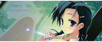
Just a quick update :D something that i made this afternoon :D i quiet like it consiering i was limited on resources i had due to my being on holiday XD

AnimeGirlSignature.png


What do you guys think?

On this one, I like the positioning of the render/stock quite a bit. (I'm assuming it's a stock; it certainly looks like one, that is.) However, the dot on her leg looks odd, and the leg itself looks odd with the coloring. It's off colored from the rest of her skin and it just stands out as strange. The dot on her leg is too bright for that part of the signature I would say as well.

The text seems shoved up into the corner, and I probably would try different fonts in the same sig, such as a curly fancy font for the top line such as Scriptina and a simpler font like Times New Roman for the second line. I would also move it down and to the right. If there was more space between her head and leg, that's where I personally would shove the text.

OVerall, I prefer the right side of the signature, since the left looks somewhat washed out and I'm not entirely sure how this was done. XD

I think you've improved greatly though, I just went through your entire thread. I'd usually comment on everything but instead I chose to give you a long crit on this most recent piece. I would like to say that I agree with Kira about the signature you posted before this one. It's probably your best piece and honestly, I'd like to know how you did it. XD I can sorta figure it out just looking at it... but I'm not sure. Brilliant job on it.

If I don't notice, give me a poke when you update again, I'd like to see it. <3

Edit: If you're using photoshop, I'd try things such as outer glow and stroke in the blending options on your text. I also tend to use black text on overlay, which is what was done to the text in the Miku sig I'm currently using.
 
Haha thanks lool i like the anime one best lool i must of done something right on that one :D if u want i could make a tutorial on how i made the border once i return from holiday :D
 
Just gonna place this here.... is my sig from the last clan task... i got two votes and some good comments :D almost won it lost it by one vote :wacky:

EmmaWatsonSig4.png
 
EmmaWatsonSig4.png


Yeah, this one is pretty sweet. The BG is great, but I'm feeling a lacking of Emmas body. I don't mean that in a pervy way:-)wacky). I feel that the height could've and could still be risen to 350 or something, or perhaps reduce the size of the Emma stock, and the height can work here. That red stuff around her hair doesn't really fit IMO.

I have nothing against the lighting, but maybe there could be a bit of darkness throughout the bg, and through in a red-orange lighting on Color Dodge or a darker shade of the same color on Linear Dodge.

I really do think the text could use a different font, but - and this is just me - it would really look better if it was behind that purple-orange thing. It would blend it in nicely or at least make it not so random or as a last-minute add-on.

Aside from all that, it's cool. :3
 
Got a big update tomorrow :D gonna hopfully get 5 signatures up as im gonna be able to use the wifi connection in the clubhouse for a bit sooo im gonna do an update here.. hopfully create my bio for the clan and download the ff type 0 demo :D sooo i been trying different techquies with blending and lihting :D sooo i hoping you guys will comment on my new work :)
 
Status
Not open for further replies.
Back
Top