Mitsuki's Photoshop Beginnings

Status
Not open for further replies.
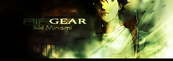
Been reading tutorials, have we? :cassy:

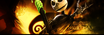
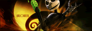
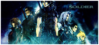
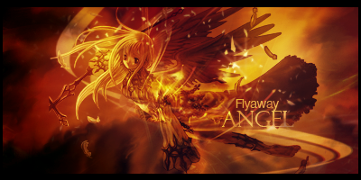
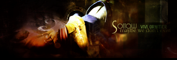
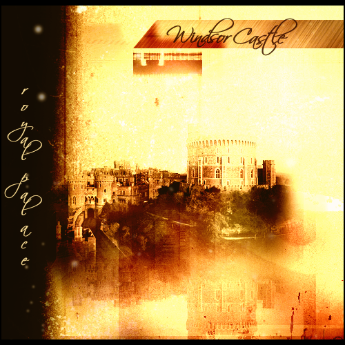
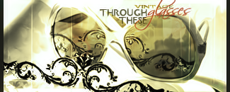
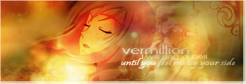
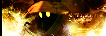
Your latest work is very artistic, different to what I'm used to seeing from you but in the best possible way, really. You've obviously been experimenting and it all works. Great colour schemes, great text usage, great border placement.

All in all, I love it. Well done. :monster:
 
Not really. Yeah I looked at some but I cannot seem to follow one successfully and tend to lose my way after the 5th step. xD The only one that I followed successfully was a button tutorial, and even then I'm still missing a few steps, but I just improvised. xD One step took me over 30 minutes to finally figure out. >.> That's what I dislike about tutorials...they expect you to know everything.

Anyway here's a few more updates.

LPButtonv1.png


Tada, button button button!

Bruce.png


Meh, not too crazy about this, although I do like the slightly 3D reflected-look to it. (2nd layer).

Boy.png


A bit too dark, but I wanted to bring out that focus on the character.

AbstractDice.png


A bit different style here. More clean and just a very simple design.

Cloud-1.png


CLOUD1.png


Request for someone. I think this is my first time working with grunge...so I'm not too sure about this particular one. I probably should've done without the subtle scanlines.

Garnet.png


KujaTrance.png


MarioandYoshi.png


KujaAvatar.png


GarnetAvvy.png
 

The best of the bunch!

1: I recognize the sig. I love the glossy effect on it and the tilted border is just so unique.

2: Like I said in LP. ;)

3: I fell in love with this tag. Seriously. Great image and great colors. It's so pretty.
 
Thank you, Coco. ^^

Anyway some updates. I feel like I'm slacking with GFX lately and had gotten pretty rusty. =/ Dunno if inspiration is just not kicking in or what.


Vintage2.png


AirGear-1.png


vermillion1.png


Rosa.png


Rosa1.png


^^ Tried something different with text this time.


And this one is my 2nd LP. A little too dark, I know, but lately I've taken a fancy to darker themes.

ResidentEvil.png
 
Thank you. ^^

And here's a few more updates. Man I'm on a roll this week.

Yuffie1.png


Yuffie2.png


Smallville.png


Stella.png


Rydia2.png


Vivi.png


YuffieAvvy1.png
StellaAvvy.png
StellaAvvy2.png
Misasdoll.png
SoraAvvy.png


All of these are requests I did, except the Smallville one and last two avatars.
 
Im instantly in love with your work, because you've done a smallville GFX :)

No but seriously, I love your Vivi one, everything blends together so well and Vivi stands out just right. The Smallville one is very clever, you managed to get all the characters in the right place IMO, and the Smallville lettering in the background works really well.

Tom.
 
Thanks, although that Smallville one is actually a render, so the character placement was already that way to begin with. xD

Anyway, here's Darth.

DarthVader.png


Not too sure about this one.
 
When you first see it, you go: "What is that thing?" And it takes you a couple seconds to realize that it's Darth Vader. Dunno if that's a bad thing or not. :monster:

I see you tried to blur the hand a bit (if you didn't, my bad :P
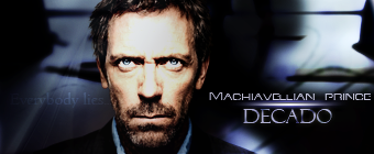
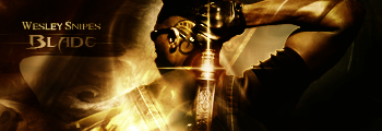
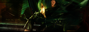
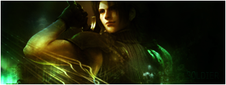
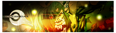
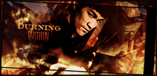
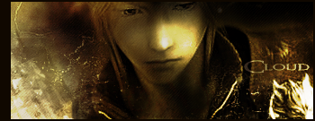
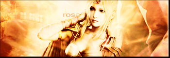
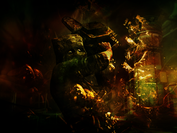
) but it's the shine that draws my eye away from the head. I don't know if moving the whole stock to the right a bit might help that out.

Like the colors though. :updown:

EDIT: Or make the hand dimmer and the head shinier? Dunno.
 
Wow, loving the Vivi one. I envy the lucky person who you made that for. Oh, that would be me :D 
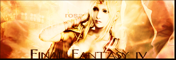
And btw, I love most of your work.

I've been meaning to try making some sigs myself but Photoshop seems way too complicated :( Oh well.
 
Thanks for the C&C. ^^

And time for updates. There's quite a few.

This is probably one of my favorite tag. xD Took me over two hours to do this, and at first I didn't really have anything in mind, but as I experimented around, it came down to this. I'm definitely satisfied with it.

PSPFFF3.png


PSPAvvy.png


Made this for Decado. He wanted "clinical colors" so my color theme was quite limited. There's not too much effects since he wanted something "professional-looking" which I hope I achieved here.

HouseMD.png


Second version. I couldn't find a decent House logo so I had to create it myself. I think it's close enough. =/

HouseMD2.png


HalloweenNightmare1.png


Finally figured out how to do animated signatures! It's a pain, but here's my first try. Quality sucks since it's a .gif file.

HalloweenAnimation1.gif


TazAvvy.png


MinervaV4.png


Blade.png


Noctis.png


NoctisPrince.png


CrisisCore.png


Sephiroth.png


Genesis1.png


Zack1.png
 
*salivates* Damn, such sexy sigs ^^

I love how clean your sigs look and you make good use of effects without going overboard.

Your gif attempt is far from bad, so give yourself more credit dear. The light to dark makes sense, so good call on that ^^
 
It looks like you went Crisis Core crazy at the end..lol

The .gif sig wasn't bad at alll, it was pretty dang good for a first
 
I was just looking through all your work and I must say, I love your graphics! Great use of color and smoothness you have going here. My personal favorite is this one:
HalloweenAnimation1.gif


I haven't made an animated signature in a loooonnnggg time now that I have seen this. Brings back good memories for me. Hope to see more from you soon!
 
I haven't updated in two months. Kinda took a little break back in Dec. but I'm slowly getting back to it. I can't really say there's a major improvement. I feel like I've stayed in the same spot/style and it's a little frustrating. But here's the updates.


Angelcopy.png


TombRaider.png


Gundam.png


Doomsday.png


WindsorCastle.png


Electrivire1copy.png


2ezrz8n.jpg


Vivi1.png


xr8d3.jpg


8wjxvn.jpg


vzang8.jpg


2qk2pdt.jpg


9gy2xe.jpg


10e4lfq.jpg


210lxsk.jpg


zmb1vl.jpg


ww107o.jpg


a4ljyp.jpg


WindsorCastleLP.png


Thoughts? Comments?
 
I still absolutely adore your first Vivi sig. I don't want to downplay the others, because they're all incredibly fantastic but that Vivi one always catches my eye. You did such an incredible job with it. It's probably one of the very best I have ever seen in all the years I've sifted through people's online artworks. It really is the cream of the crop.
 
Mitsuki I do notknow what to say. I love every one of your siggys and they are all just so baeautiful or let me say sexy. Why are ye so good at this lol?
 
What I like most about your signatures Mitsuki, is that you have a very distinct style, but all your signatures look unique and professional. You can work with real people and cartoon/anime/video game characters, and that's a rare skill - most people suck at one or the other, but you're amazing at both.

I'd say your best work are your darker pieces, as there's always something subtle and unique about them, but your light pieces are always happy and pretty - like, your signatures match the mood you want them to convey.
 
Ehr like...whoa!!! o_O

That's pretty much how I am looking now at your tags Mitsuki. They're plain amazing and like General Beatrix said, you have a distinct style and your work with different kind of stocks is awesome to see. Your darker works have a nice touch, they're not my favourite though but overall it's obvious you have skills.

Kudos to you!
 
Status
Not open for further replies.
Back
Top