Navigation
Install the app
How to install the app on iOS
Follow along with the video below to see how to install our site as a web app on your home screen.
Note: This feature may not be available in some browsers.
More options
You are using an out of date browser. It may not display this or other websites correctly.
You should upgrade or use an alternative browser.
You should upgrade or use an alternative browser.
Photoshop Meddlings
- Thread starter Daenerys
- Start date
- Tagged users None
- Status
- Not open for further replies.
I made this yesterday - I don't like it that much, but Bambi said she really likes it so...


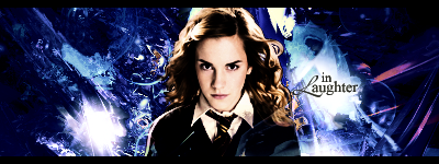
Hermione signature made today. Kinda tried to do something new -

- Joined
- Dec 14, 2006
- Messages
- 11,628
- Location
- California
- Gil
- 0
- FFXIV
- Mitsuki Calei
- FFXIV Server
- Lamia
- Free Company
- Gaia
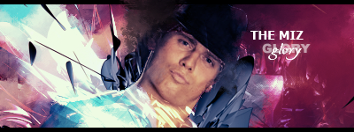
I like the Glory one. It's certainly different and the render just seem to blend so well with the BG. Probably my most favorite one of all the real-life tags you've done so far. The Hermoine one...just so-so. I think the dark blue's a little too overwhelming and it just looks as if the render was plasted on the BG.
I like the Tidus/Yuna sig a lot. The purple doesn't really bother me too much there, but it does seem a little messy somewhat. It's still a good touch though. The BG, of course, is quite appealing. Great job, Mark!
I like the Tidus/Yuna sig a lot. The purple doesn't really bother me too much there, but it does seem a little messy somewhat. It's still a good touch though. The BG, of course, is quite appealing. Great job, Mark!
I made this signature for Lisa, tried something new with the smudging -

4 newest ones, I kinda feel I'm stuck in a rut lately >_>

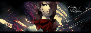

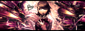


2nd and 4th are my favorite once.
In the first one there's to much filter effect and do not know if you used smudge or another filter effect on the right side as,but to tell you the truth it doesn't excite me too much.
Then there's the third one that it's somehow monotone.The stock isn't that great and makes the tag look kind of common.
- Joined
- Dec 14, 2006
- Messages
- 11,628
- Location
- California
- Gil
- 0
- FFXIV
- Mitsuki Calei
- FFXIV Server
- Lamia
- Free Company
- Gaia
They're pretty good. I like the 4th version the best since it's not too messy and the colors are pretty, although the first one is also quite interesting to look at.
This is one of the favourite things I've ever made ^^ -

Random Scooby Doo one I did when I was bored -

SOTW 52 Prototype -

Random Scooby Doo one I did when I was bored -

SOTW 52 Prototype -

- Joined
- Dec 14, 2006
- Messages
- 11,628
- Location
- California
- Gil
- 0
- FFXIV
- Mitsuki Calei
- FFXIV Server
- Lamia
- Free Company
- Gaia
First one for me, although I do like your other version that you entered for SOTW. I believe it's the same render...? But yes, first tag is better than the other two. Colors are quite good even though it's a bit monotone, but hey, I'm like one of the few who doesn't really mind monotone colors. xD The BG for Scooby doesn't seem to suit him too well, although I do love the color scheme there.
Lotsa updates here =O
This is a sig I made for Dragon Mage -

Jean Grey sig I made -
SquallxRinoa -
This next one, is a sig I made by taking a stock, instead of using a render -
With this one, I also used a stock, the challenge this time was that the stock was black and white, I made two versions, one with color, and one without color -
V1

V2
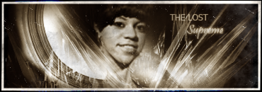
This is a sig I made for Dragon Mage -

Jean Grey sig I made -

SquallxRinoa -

This next one, is a sig I made by taking a stock, instead of using a render -

With this one, I also used a stock, the challenge this time was that the stock was black and white, I made two versions, one with color, and one without color -
V1

V2

- Joined
- Aug 28, 2007
- Messages
- 13,511
- Location
- Manchester
- Gil
- 222
- FFXIV
- Bambi Branford
- FFXIV Server
- Lamia
I love the one you did for DragonMage, it's really pretty and I love the background 

I love the SquallxRinoa sig it looks amazing. It would suit jagged borders as well =]
I love the 'free wind' sig as well, the render blends with the background really well!
Keep up the great work!
I love the 'free wind' sig as well, the render blends with the background really well!
Keep up the great work!

Lots and lots of updates here. Since I've neglected my thread for so long D=
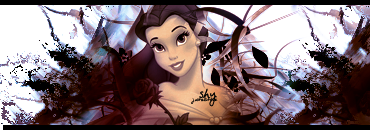
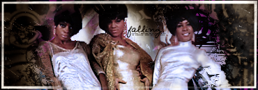

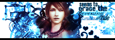
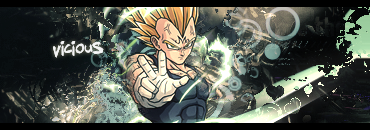

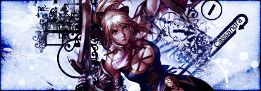





Phew. That was quite an update. C'n'C is GREATLY appreciated on any of the sigs =D


Phew. That was quite an update. C'n'C is GREATLY appreciated on any of the sigs =D
Thanks ^^
Anyhoo, here's a Kirby one I made =D

Now, when I showed it to Lisa, she suggested I made Kirby more Pink so...

And, here's a Nariko one =D
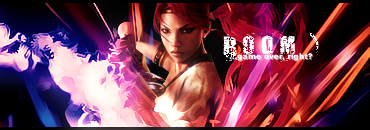
Anyhoo, here's a Kirby one I made =D

Now, when I showed it to Lisa, she suggested I made Kirby more Pink so...

And, here's a Nariko one =D

- Status
- Not open for further replies.